Real estateCard · For Sale · Open House
One broker’s kit,
and the pattern for her team.


00The project
- Client
- Kelly Qiu, Broker
- Practice
- Sell · Buy · Commercial · Lease
- Year
- 2026
- Type
- Bodoni 72 · Open Sans
Kelly Qiu is a broker who sells, buys, leases and handles commercial property. We made her the whole kit, for the pocket and for the lawn: a card, a For Sale sign, Open House arrows, and joint signs with Bill Song. Deep green is the ground; copper is kept for the band, the frame and the name, so from across the street you read FOR SALE first and her name second.
- 01Business card, print3.5 × 2 in, with bleed
- 02Business card, digitalfor sending by phone
- 03For Sale sign32 × 32 in
- 04Open House signs A & B24 × 24 in
- 05Joint For Sale sign, with Bill Song32 × 32 in
- 06Joint Open House signs, left & right32 × 32 in
01The card
Three and a half inches,
and the name goes first.
Portrait at the left; to its right the name in copper, the title and four services. A deep-green band runs across the card for the phone number, with email and office beneath and a WeChat code at the right. The reverse is all green, a fine copper frame, the four services ruled along the foot. A print file with bleed, and a digital edition for sending from a phone.
02For Sale
Thirty-two inches,
legible from across the street.
The sign is set in the order it is read. From furthest away there is only FOR SALE on the copper band; closer, the name, title and services; and only someone who stops needs the phone, email and office in the white panel. FOR SALE and the name share one Bodoni, so the sign and the card read as the same person.
- 1
FOR SALEBodoni 72 Bold on the copper band, nearly the full width of the sign.
- 2
The nameThe same Bodoni in the copper sweep, with the title and four services beneath.
- 3
The contact panelWhite, the phone number largest; shown here as pale bars.
Bodoni 72Name, headlines, services
Open SansTitle

03Open House
The band becomes an arrow,
one for each way.
The 24-inch Open House sign keeps the proportions of the For Sale sign and stretches the copper band into an arrow. Sign A points right and sign B left, so either side of a corner can be signed; under the arrow a white strip is left for the address, written on site.

04Joint signs
Two names,
one sign.
For listings with Bill Song there is a joint set: the same FOR SALE band, REAL ESTATE BROKERS beneath it, three resale services at the centre, the two of them either side, and their names and numbers mirrored in a copper band at the foot. Joint Open House arrows come in both directions.
05The team
One client file,
four brokers.
The pattern did not stop with her. Filed under the same client are cards and signs for three colleagues: Bill Song in navy and in green, Cecilia Yang and Kelvin Liu in green. One layout; each name and title their own.

Kelly QiuBroker · this page

Bill SongNavy and green editions ↗

Cecilia YangCard and signs ↗
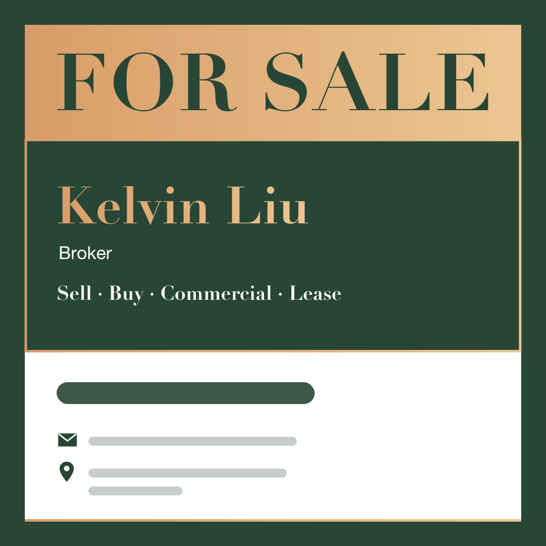
Kelvin LiuCard and signs ↗
