Day of Design
← All workCecilia Yang · 2026

Real estateBusiness card · Signs

Read from
across the street.

The Cecilia Yang name in forest green
Cecilia Yang’s three signs — Open House pointing left, For Sale, Open House pointing right — in forest green and champagne gold
Open House (left), For Sale, Open House (right) · re-set from the final files

00The project

Client
Cecilia Yang
Role
Sales Representative
Year
2026
Pieces
A card · three signs

Cecilia Yang is a real estate sales representative who works across homes and commercial property — selling, buying, leasing. In 2026 we designed her business card and the signs that stand outside her listings. One rule runs through all of it: forest green, champagne gold, and her name set large in a high-contrast Bodoni.

  • Name, type and colour
  • Business card, print and digital
  • For Sale sign
  • Open House signs, left and right

01Name and colour

A name in gold,
on forest green.

Her name is the logo. It is set in Bodoni, whose hairlines and heavy stems hold up on a 3.5-inch card and a 32-inch sign alike. The gold is never flat: a sweep from copper to pale champagne, the way foil catches the light. Forest green carries everything else, white panels hold what has to be read, and a single gold rule frames each piece.

The Cecilia Yang name in the champagne sweep
Forest green#284636
RGB 40 70 54
Champagne#D59B65 → #ECC791
a copper-to-pale sweep
White#FFFFFF
for what must be read

BodoniThe name, the headlines, the number

Open Sans LightThe role

Gold ruleFrames every piece

02Business card

Gold on white,
gold on green.

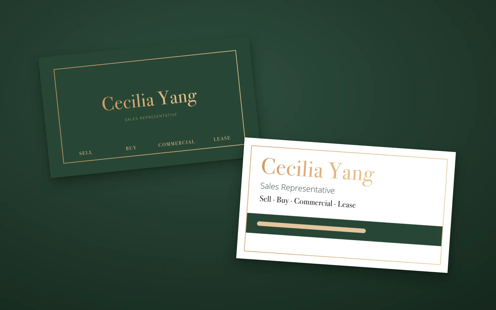
The front carries the name, the role and the services, with the phone number reversed out of a green band — the one line people copy down. The back is all green, framed in gold, with the four services in small capitals along the foot. It comes in two editions: a print file with bleed and crop marks, and a trimmed digital card to send by message.

Card front: the name in gold, role and services, the phone line on a green band (shown as a pale rule)

Card front: the name in gold, role and services, the phone line on a green band (shown as a pale rule)

Front
Card back: forest green framed in gold, with SELL, BUY, COMMERCIAL and LEASE along the foot

Card back: forest green framed in gold, with SELL, BUY, COMMERCIAL and LEASE along the foot

Back · her name in place of the brokerage logo

03Signs

First the news,
then the name.

A lawn sign is read from a passing car, so each one speaks in order: FOR SALE or OPEN HOUSE across a gold banner, then her name, then the number on white. The For Sale sign is 32 inches square. The Open House signs are 24 inches and come as a pair, one arrow left and one right, with a white strip under the banner for the address.

For Sale sign: FOR SALE on a gold banner, her name in champagne on green, a white panel for the number (shown as a pale rule)

For Sale sign: FOR SALE on a gold banner, her name in champagne on green, a white panel for the number (shown as a pale rule)

For Sale · 32 × 32 in

In the final file her portrait stands at the lower left. It is left out here, and the name moves over to take the whole green panel.

The gold Open House arrow, close up
Open House sign, arrow pointing left, with a white strip for the address

Open House sign, arrow pointing left, with a white strip for the address

Open House · left · 24 × 24 in
Open House sign, arrow pointing right

Open House sign, arrow pointing right

Open House · right · 24 × 24 in
The card, back and front, on forest green
The card, back and front
Client
Cecilia Yang
Year
2026
Scope
Name, type and colour · Business card, print and digital · For Sale sign · Open House signs, left and right

The studio designed the business card (print and digital), the For Sale sign and the Open House signs in 2026. This page re-sets them from the final files; they are not photographs of the printed pieces. Cecilia’s portrait, phone number, email, office address and QR code are left out, as are the brokerage and MLS marks supplied with the brief; where the phone number was, a pale rule stands in its place. On the card back her name stands where the brokerage logo was. Type is re-set in Bodoni 72 and Open Sans Light to match the originals. The opening and closing images are the flat artwork laid on a coloured ground, not photographs.