RenovationGreater Toronto · Hamilton · Barrie
A gold roofline,
and a site where the rooms do the talking.

00The project
- Client
- 58HomeServices Inc.
- Part of
- 房东网 (58Home)
- Service area
- GTA · Hamilton · Barrie
- Years
- Logo 2023 · Website 2026
58Home Renovation is the renovation company of 房东网 (58Home), founded in 2023 and working across the GTA, Hamilton and Barrie. That year we drew its logo: three roofs, one gold. In 2026 it needed a website worthy of more than a hundred finished projects. We read the old site and fifteen competitors, rebuilt the structure, and made 58reno.com — Chinese and English each written for its reader, the photographs large, the sentences short.
- Bilingual logo lockup (2023)
- Logo on T-shirts and sweatshirts
- Old-site audit and 15-competitor teardown
- Information architecture and web design system
- 58reno.com, bilingual website
Elsewhere in the 58Home family: 房东网 58Home ↗58甄选 Home Solutions ↗
01The logo · 2023
Three roofs,
one gold.
Three roofs and three windows. The outline is exactly one right-angled gable — 45° each side — and each window hangs under a ridge. The lettering is a heavy sans with 装修 reversed out of a gold block and the English in capitals beneath. One colour throughout: #B89E77, PMS 7562 C in print. On the website it turns white over photographs and stays gold on paper.


PMS 7562 C
Small type on the site
Type and dark grounds
The site’s ground
02Research & structure
First the old site and fifteen competitors,
then what to say.
Before designing anything in 2026 we audited the old website and took apart fifteen competitors’ sites. The findings became the structure: six services, a page each, every page opening on a single sentence; projects sorted by room rather than by job; the process given a page of its own; and every page ending at a free site visit.
- Home
- Services
- Work
- How we work
- About
- Book a visit
- 01Whole-Home RenovationFrom layout to finishes — the whole house, reconsidered.
- 02KitchensThe hardest-working room in the house.
- 03BathroomsWaterproofing you never see. A room you use every morning.
- 04Legal Basement SuitesTurning unused space below into a lease that holds up.
- 05Additions & Structural WorkWhen the house runs out of room, start with how much it can grow.
- 06LandscapingThe first thing anyone sees, and the last place you unwind.
The opening line of each service page, as published on 58reno.com
03The home page
One page:
who, what, and how.
The home page follows the order a homeowner asks in: who you are — part of 房东网, over a hundred projects since 2023; the six services, each beside a finished room; a client’s words; how the work is run; recent projects; and finally a visit. White ground, ink type, and gold kept for links and numbers.
04Service pages
Every page opens
on one sentence.
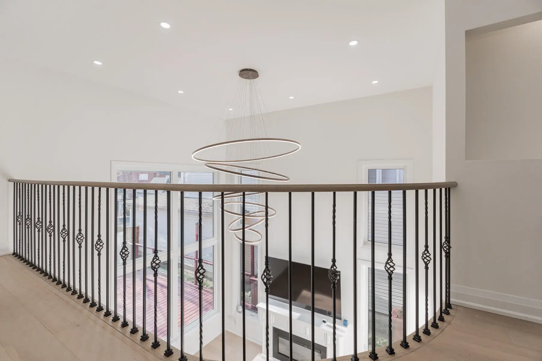
A service page opens on the room, its name and one sentence. Below, it says where the job is actually hard — a kitchen in the movements repeated dozens of times a day, a basement suite in whether it passes code — then three things the company holds itself to, then the booking form and the other services.
05Process & projects
Eight steps.
Over a hundred projects.
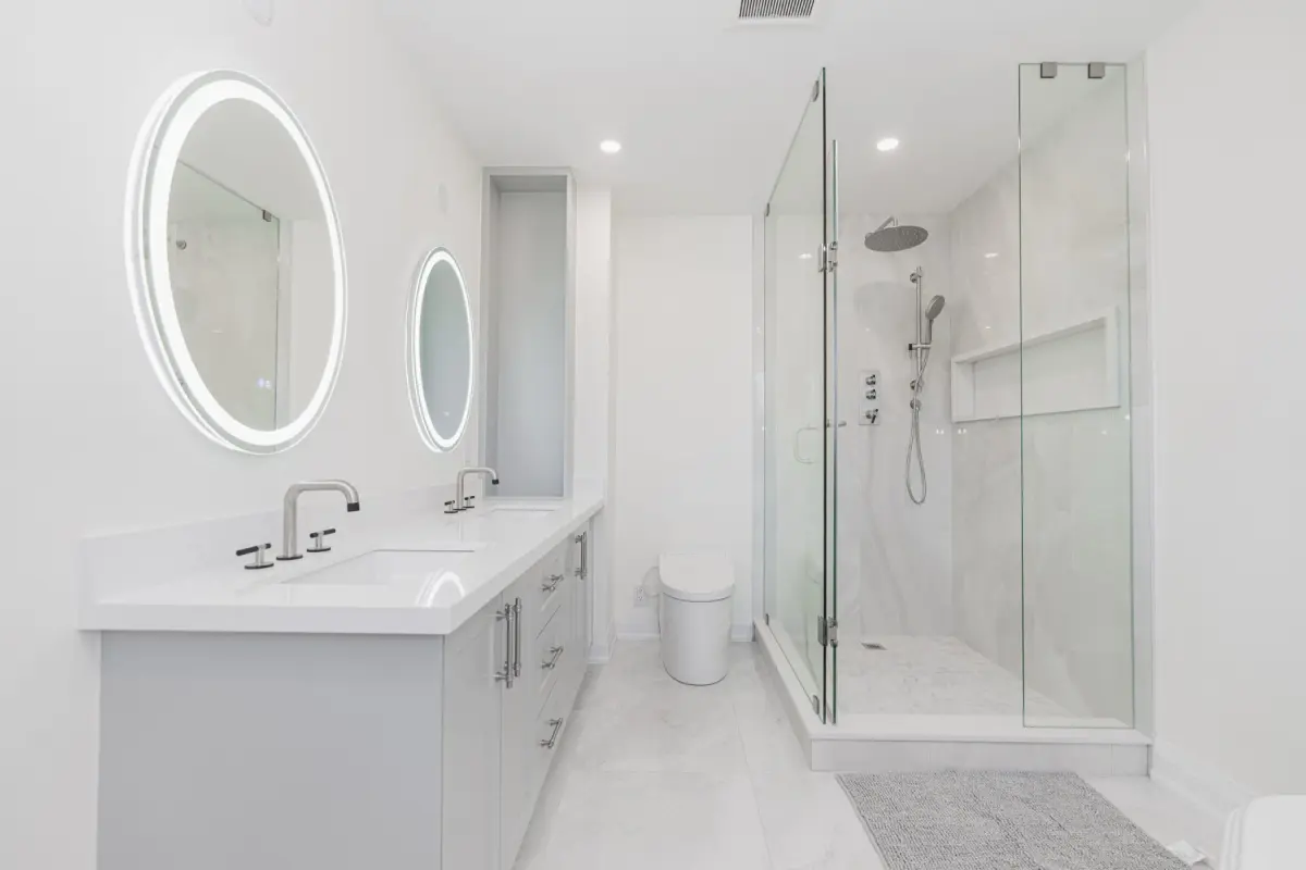
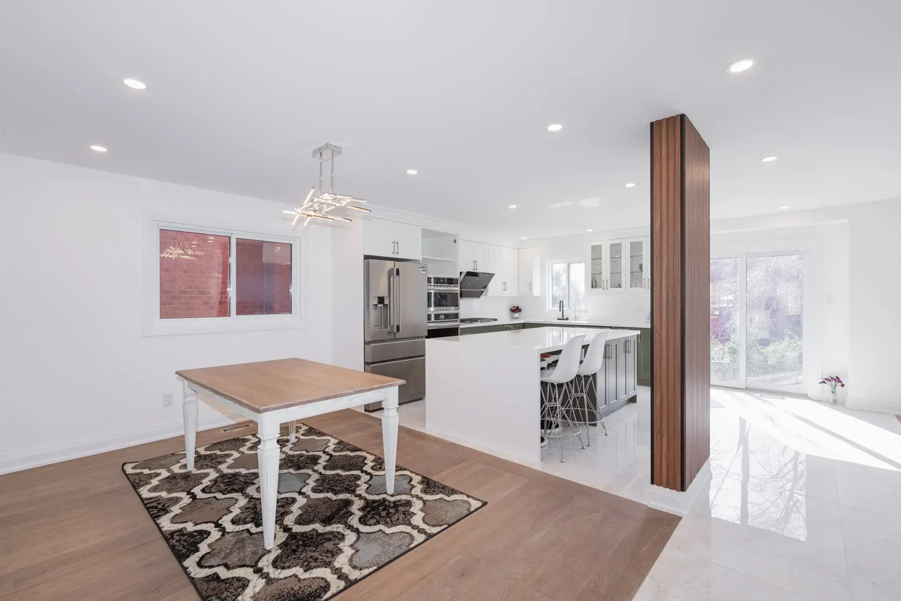
The process page breaks a renovation into eight steps — first call, site visit, design and estimate, contract, drawings and permits, scheduling, inspections, sign-off and aftercare — each with who answers for it. The projects page tells no stories and sorts by room instead: 47 kitchen photographs, 41 of bathrooms. A homeowner is looking for their own room.
06Two languages
Chinese and English,
each written for its reader.
Every page exists in both languages, and neither is a translation. The Chinese home page says 我用心尽心,您放心安心。 — I take the care, you take the ease; the English says “The care goes where you cannot see it.” One idea, put the way each reader hears it. The phone gets all of it.

The care goes
where you cannot see it.