Property managementIdentity
Two strokes
and a roof.


00The project
- Client
- Y. L. HENDLER LTD.
- Sector
- Property management
- Year
- 2026
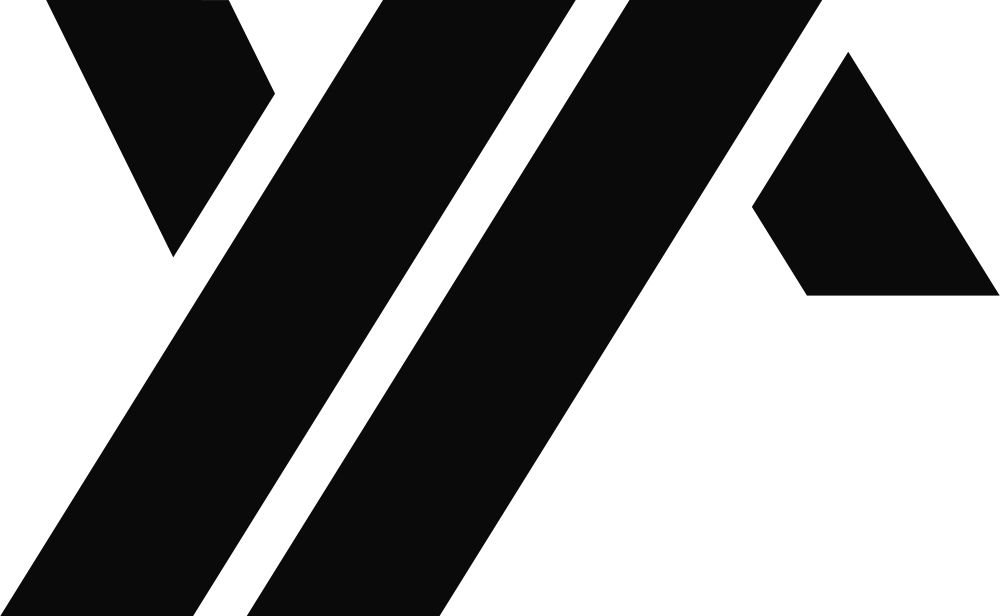
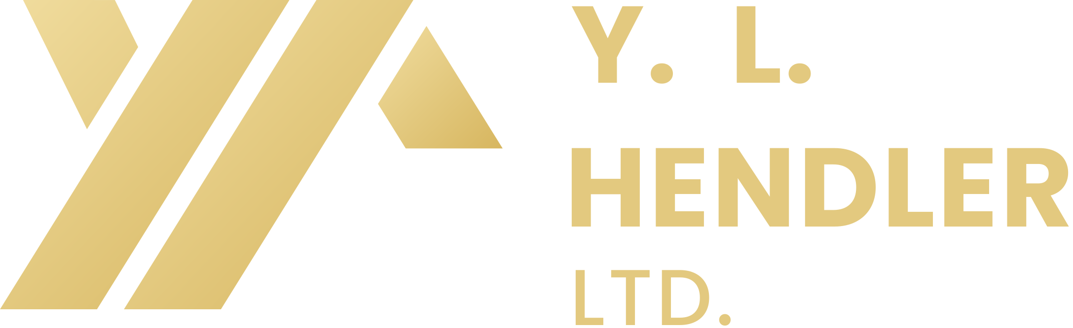
Y. L. HENDLER LTD. manages property — it looks after buildings for the people who own them. The mark doesn’t need to draw another house: the Y and the L from the name lean side by side, a small triangle closes the right-hand stroke, and a roof appears. The deck put two directions to the client and recommended this one, with the name set in three lines beside it and the “Y.” in gold to answer the Y in the mark.
- Two logo directions
- The Y + L roof mark
- Lockup & colourways
- Gold and black palette
- Presentation deck
01The mark
Three shapes,
one angle.
The whole mark is three flat shapes: a gold Y, a parallel black stroke and a small triangle. Every long edge leans at the same angle, both sides of the roof included, and the triangle’s base is exactly one stroke wide. No curves, no outlines — it stays crisp at the corner of a card.
- 58°
- The angle shared by both strokes and both sides of the roof
- 1 : 1
- The roof’s base is one stroke wide
- 3
- Three vector paths, kept from the original file
02Directions
Draw the house,
or keep only the roof?
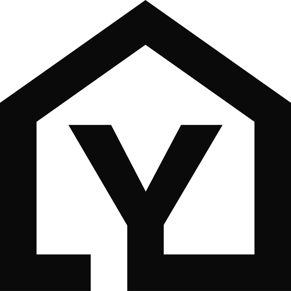
The deck set out two directions. The first puts the Y inside a house whose outline starts, bottom left, as an L — literal, and read at a glance. The second takes the house away and keeps only the pitch of the roof, so the letters carry it. The deck recommended the second: fewer shapes, more a name than a picture.
03Colour
Gold for the Y,
black for the rest.
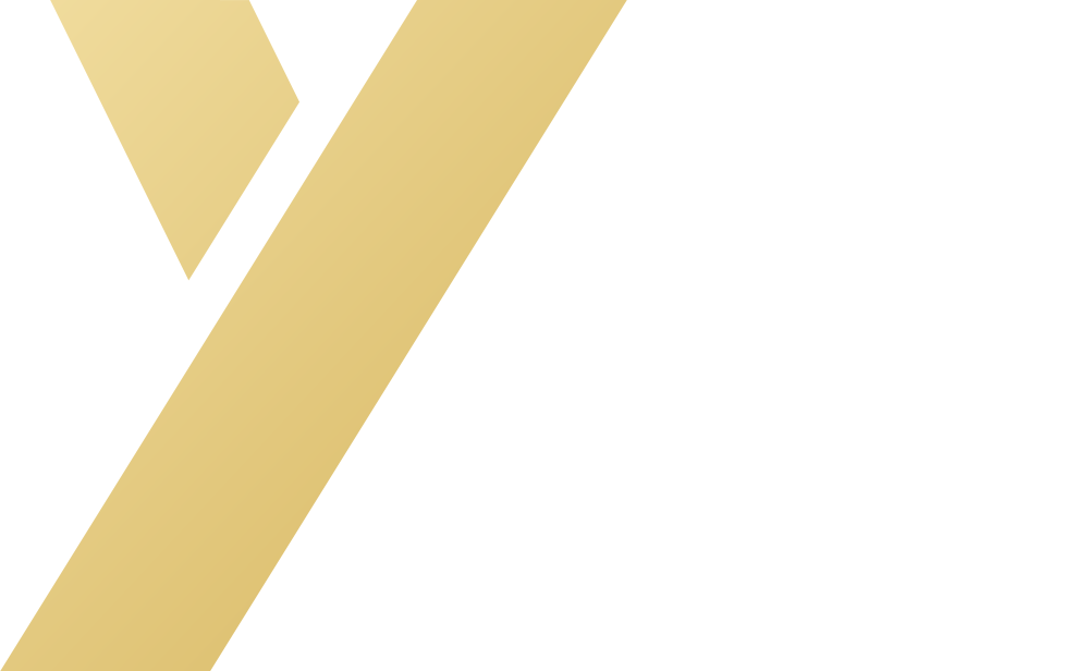
The deck spells it out: gold for value and longevity, black for stability and professionalism. The gold isn’t a flat colour but a run from pale champagne to warm gold — on paper it becomes foil. On black, the stroke and the roof turn white.
- #F1DD9F
- #E3C97F
- #D7B65F
04Lockup
The name in three lines,
the Y. in gold.
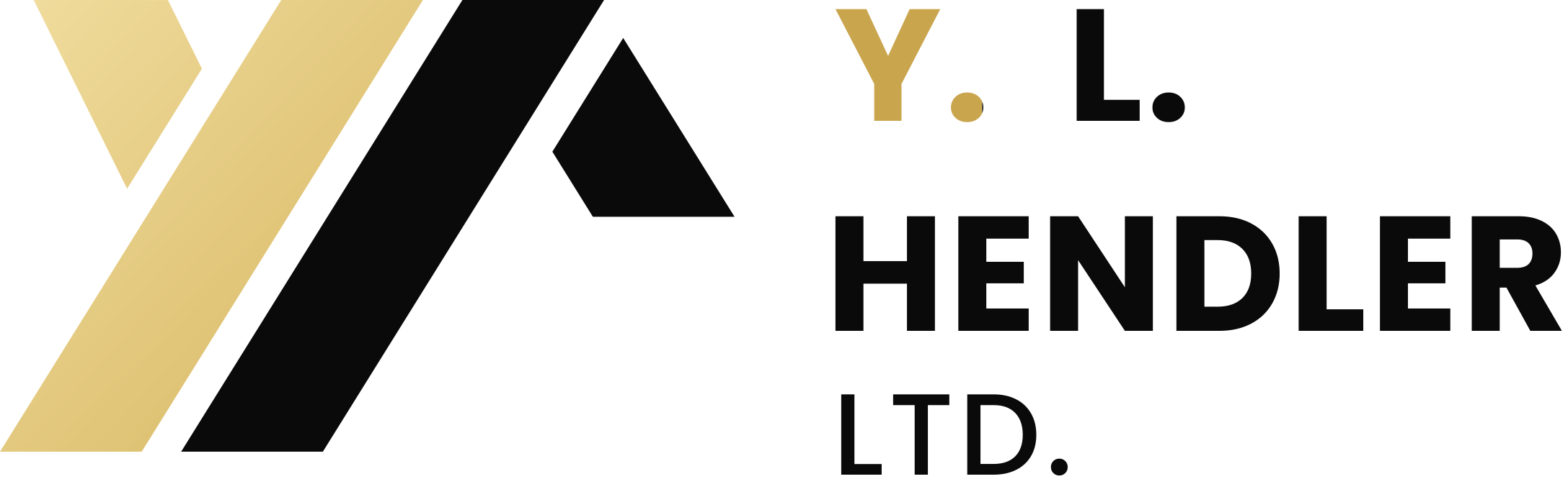
The name is set in Poppins, a geometric sans: Y. L. and HENDLER in bold, LTD. a step down in medium, three lines flush left, about as tall as the mark. The Y. alone is gold, answering the gold Y beside it. We re-set it from the original file and outlined it, so no printer can lose the font.
Two strokes,
and the roof is there.