Design-buildToronto · Event stand
Ask us aboutanything.

00The project
- Client
- Winchester Design Build
- Location
- Toronto
- Field
- Residential design-build
- Year
- 2023
Winchester Design Build is a Toronto firm that designs and builds houses: architecture and interiors, additions, renovations and rebuilds, with the planning approvals and lot severances around them. In 2023 the studio designed two things for its event stand: a 33.5 × 80 in roll-up banner, in a navy and a green edition, and a four-sided throw for an eight-foot table, laid out face by face on the supplier’s template.
- Roll-up banner, navy & green editions
- Eight-foot, four-sided table throw
01The mark
Three strokes,
one W.
The client’s mark folds a W into an inverted triangle: one stroke width, every diagonal on a 3:4 slope. The original came only as a bitmap, which goes soft at eight feet across, so for this page we redrew the symbol as a vector from it. The colours come from the print files: navy first, forest green for the banner’s second edition.

RGB 22 48 107
RGB 0 72 50
RGB 239 239 239
02Roll-up banner
From a page of sketch
to eighty inches tall.
The banner began as a page of sketch: the two partners’ portraits, then “Ask us about anything”, four services, and a closing line in Chinese — how to spend the least and get the most from it. We set it as a 33.5 × 80 in roll-up in a navy and a green edition. In this re-set, the space the portraits held goes to the logo.
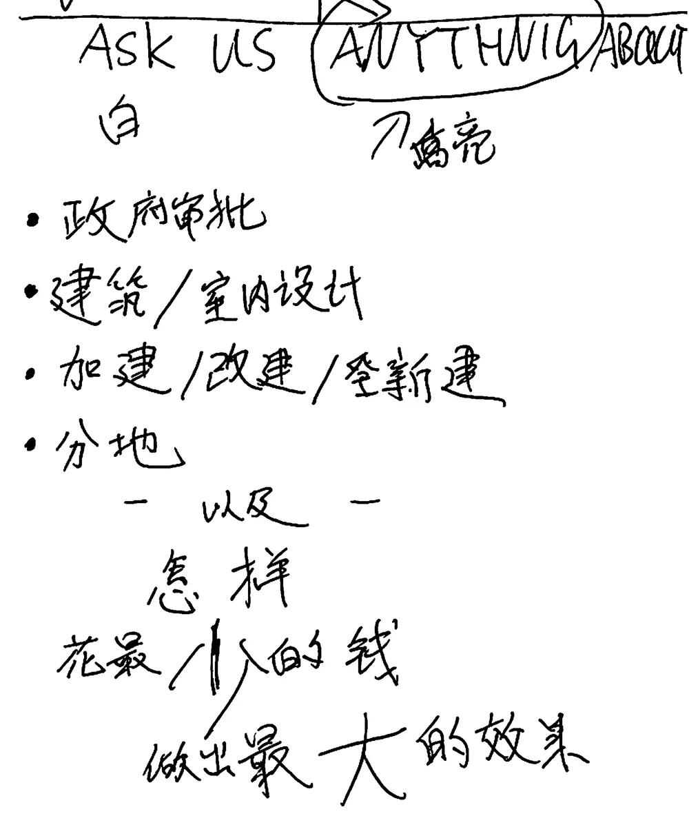
- 政府审批Planning approvals
- 加建/改建/重新建Additions, renovations, rebuilds
- 建筑/室内设计Architecture & interior design
- 分地Lot severance
03Table throw
One cloth,
four faces.
A throw for an eight-foot table is one piece of cloth cut to the supplier’s template: a 96 × 30 in top, a front and back of 96 × 29, two 30 × 29 ends, the corners draped. The front carries the name on navy; the top, three lockups in a row; the ends, the lockup in black on white, turned so it stands upright once the cloth hangs; the back, plain navy.
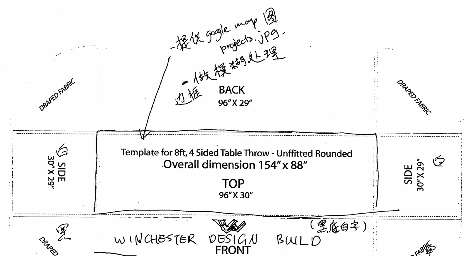
“Black ground, white type” on the front, “white” on the ends: the sketch marked each face’s colour. We set every face on its own, turned it the right way, and put them back on the template for the printer.
- Top
- 96 × 30 inNavy, three reversed lockups
- Front
- 96 × 29 inNavy, the symbol and the name
- Ends
- 30 × 29 inBlack on white, turned
- Back
- 96 × 29 inPlain navy
怎样花最少的钱,
做出最大的效果。