Lifestyle storeToronto · Raffle ticket
From Whee-ski,
to the future.
No.
WHEE – SKI
A Brand
Inspired by Life.
- DateEveryday
- Flight timeNow
- Classwhee_ski
- GateEvery door
- SeatEverywhere
- Gate closesNever
Clothing accessories
Designer toysHome decoration
Whee-ski life
No.
- From
- WHEE – SKI
- To
- Future
- Date
- Everyday
- Flight time
- Now
- Gate
- Every door
- Seat
- Everywhere
00The project
- Client
- Whee-ski
- Location
- Toronto
- Sells
- Clothing accessories · designer toys · home decoration
- Year
- November 2022
Whee-ski sells three things in Toronto: clothing accessories, designer toys and things for the home. Its line is “a brand inspired by life”; its mark is a hand making a W. In November 2022 it held a prize draw and needed a ticket. We made the little slip a boarding pass: whoever wins departs from Whee-ski.
- Raffle ticket, front and back (6 × 2.5 in)
- Two earlier routes
01The mark
Three fingers
make a W.
Whee-ski’s mark is a hand: three fingers up, thumb holding down the little finger — a W. The ticket uses the client’s logo files as they are, with one treatment added: a magenta and a cyan copy, each knocked slightly out of register, like a two-colour print gone a little wrong, or an afterimage under neon. Those two colours became the colours of the whole ticket.
02The idea
A raffle ticket
that reads like a boarding pass.
A raffle ticket only needs a number. We borrowed the boarding pass and filled each field with the store’s attitude: from Whee-ski, to the future; date, every day; flight time, now; gate, every door; seat, everywhere — and the gate never closes. Anyone holding it gets the idea without being told.
03Front and back
The front says where.
The back says from where.
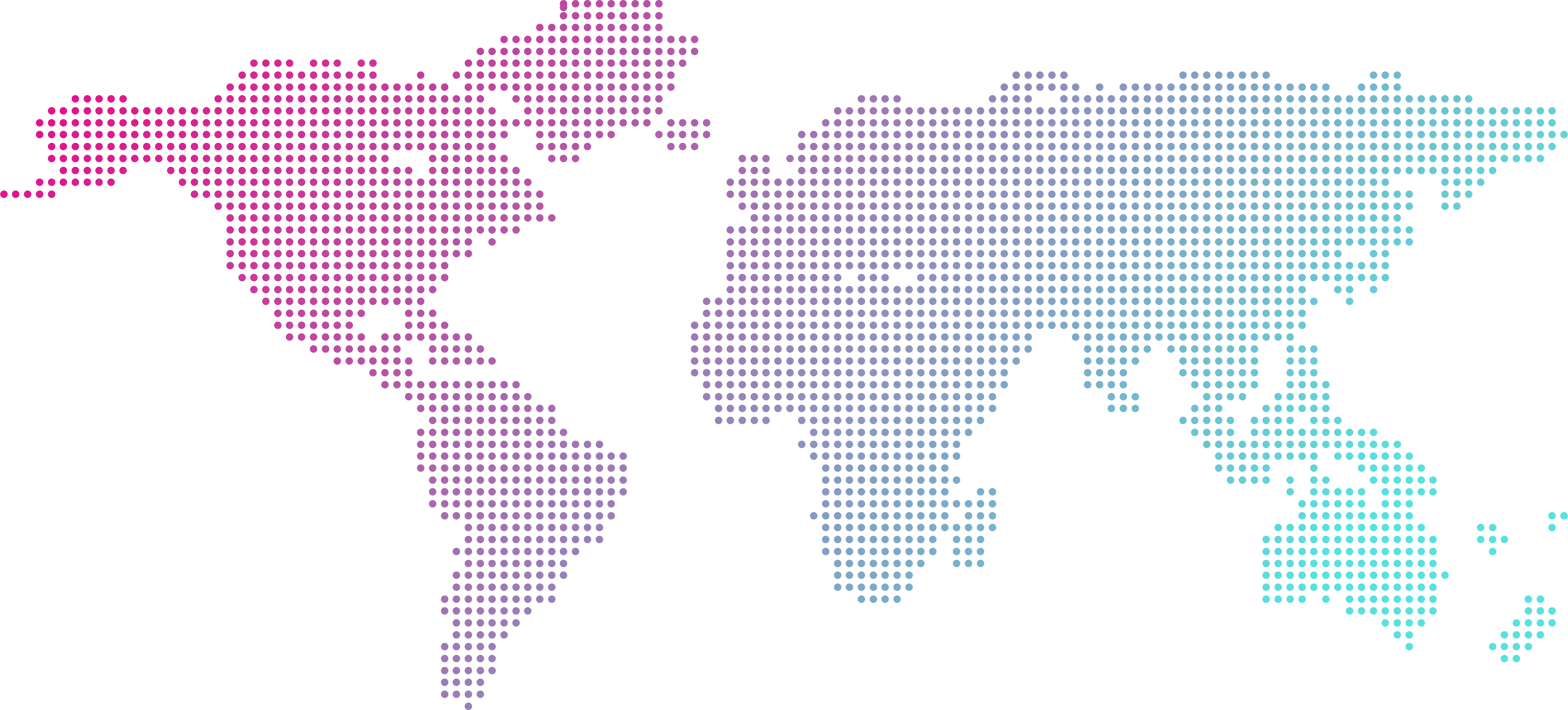
The front is the boarding pass: a dotted world map grading from magenta to cyan, the name set across North America, a row of fields, and a stub to tear off. The back turns the map into a globe, North America forward, one pin in Toronto; the stub side keeps only the hand, the name and the line. The whole ticket is 6 × 2.5 inches — wallet size.
No.
WHEE – SKI
A Brand
Inspired by Life.
- DateEveryday
- Flight timeNow
- Classwhee_ski
- GateEvery door
- SeatEverywhere
- Gate closesNever
Clothing accessories
Designer toysHome decoration
Whee-ski life
No.
- From
- WHEE – SKI
- To
- Future
- Date
- Everyday
- Flight time
- Now
- Gate
- Every door
- Seat
- Everywhere
WHEE – SKI
A Brand Inspired by Life.

Toronto Canada
WHEE – SKI
@whee_ski
04Earlier routes
Before the boarding pass,
a hand.
The design files keep two earlier rounds. The first is blunter: black, a hand filling the ticket, a large No. 001, and Fashion · Toys · Home · Life across the top. The second found the boarding pass and tried it in black first; the white one went to print — the gradient is brighter on paper, and it looks more like a real ticket.
A Brand Inspired by Life.
FashionToysHomeLife
No.001Raffle ticket
No.001
No.
WHEE – SKI
A Brand
Inspired by Life.
- DateEveryday
- Flight timeNow
- Classwhee_ski
- GateEvery door
- SeatEverywhere
- Gate closesNever
Clothing accessories
Designer toysHome decoration
Whee-ski life
No.
- From
- WHEE – SKI
- To
- Future
- Date
- Everyday
- Flight time
- Now
- Gate
- Every door
- Seat
- Everywhere
Gate closes
Never.
Whee-ski · Toronto Canada