Homes微小房 · Ontario
Small homes,
on the way up.


00The project
- Client
- 微小房 V-UP Homes
- Business
- Rebuilds, additions, renovation
- Region
- Ontario
- Year
- 2019–2022
The client’s own copy is unusually warm: it can build big, but loves ordinary people’s small homes best, and wants people on ordinary incomes to live somewhere bright, easy and warm. The 微 in its Chinese name means small, and sounds like 危, the old and unsafe made new. That is what the mark had to carry: small in size, pointed up.
- Logo, horizontal & square
- Logo book
- Business card
- Letterhead
01The name
One character,
six readings.
In the website copy the client wrote, the 微 of its Chinese name is unpacked six ways. The mark had to hold all of them in one small shape: modest, and pointing up.
Small: one small member of a vast online world, adding up.
A homophone of 危, danger: old made new, broken made good, small made bigger.
A small, distilled team with a lot of energy in it.
偎, to nestle: home as the quietest, most comfortable harbour.
微笑, a smile: for life, for work, for clients.
Victory: that everything goes well.
02The mark
The arrow
is the P.
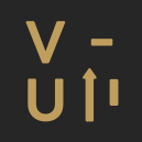
Read it as V-UP. The V, a dash, the U — and then the P, taken apart: its stem became an arrow pointing up, its bowl a single short stroke beside it. The studio’s design file keeps two other versions of the P: one with a cut-away bowl, one solid with a gold triangle set into it. The final mark keeps only the stroke.
- 1VVictory — and 微.
- 2DashThe hyphen, in gold.
- 3USame weight and corners as the V.
- 4ArrowThe P’s stem, pointing up.
- 5StrokeWhat is left of the P’s bowl.


03Forms & colour
Long for the letterhead,
square for the sign.
The horizontal mark runs across letterheads, websites and screens; the square stacks the same five strokes into two rows for signs, avatars and the back of the card. Two colours and white — charcoal and a warm gold — and the gold goes only to the dash and the arrow.




04Logo book
Eleven pages,
one thing on each.
Landscape, black and white, a gold tab in the top corner: the mark, its grid, its colours, its three grounds, then a sign, a card and a letterhead. The book’s colour page had slips in its RGB and CMYK figures; the swatches above are corrected from the HEX values. The card and letterhead pages used placeholder names and are left out.
05Letterhead & card
Two rules at the foot,
the gold one a step up.
The letterhead leaves the page to the letter: the mark at the top, and at the foot a charcoal rule and a gold one, the gold set a step higher, like a stair. The card is charcoal on the front, white on the back with the square mark.
Two letterheads (US Letter) and the card · re-set from the original files, contact details removed