Real-estate brokerage2021–2023
A U that stands
like a building.
- V1Two towers

- V2Arrow roof

- V3One-line house

- V4Stepped tower
- V5Ground line

00The project
- Client
- U Dream Home Realty, Brokerage
優居地產 - Location
- Markham, Ontario
- Years
- 2021–2023
U Dream Home Realty is a brokerage in Markham, Ontario, working in English and Chinese across resale homes, pre-construction, commercial property and business sales. Over three years we made its property flyers and storefront window (2021), a new logo (2022) and the listing template that carried it (2023).
- Logo design, five directions
- Lockups & brand colours
- Property flyers
- Storefront window
- Listing template
01The mark
Five directions,
one building kept.
The 2022 proposal drew the U five ways: two towers in outline, a U with an arrow for a roof, a house folded from a single line, two buildings on a ground line — and V4, where the U is the base of a stepped tower with three short cuts for windows. V4 is the one the brokerage took forward.
- 1The U: two walls and a sloping base
- 2A stepped roofline, high then low
- 3Three short cuts for windows


02Listings
One poster
for every project.
Each pre-construction project got its own flyer: Bayview at the Village in North York, Joy Station in Markham, and in 2023, on a new template carrying the V4 mark, 4800 Yonge Street. The originals packed in the broker’s portrait, phone numbers, a QR code and a page of selling points. Re-set here, each keeps the developer’s rendering, the project’s name and where it is.
Bayview
AT THE VILLAGE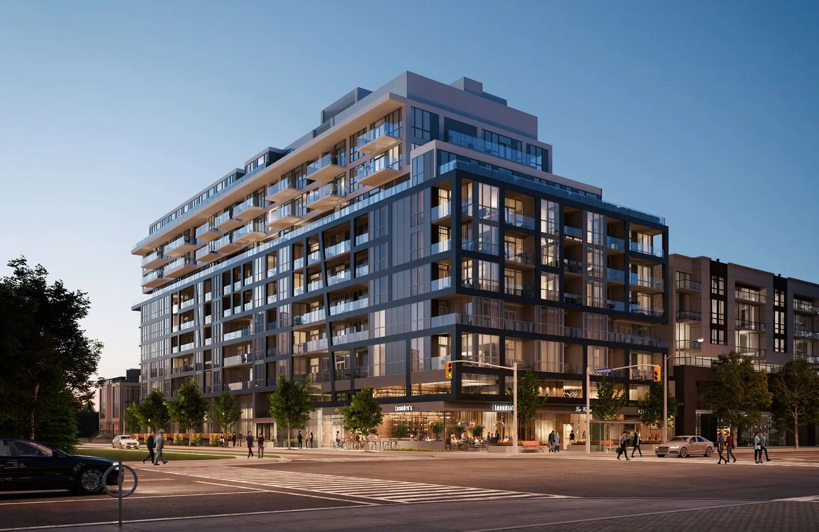
COMING SOON即将推出
North York · 北约克
Bayview at the Village · 2021
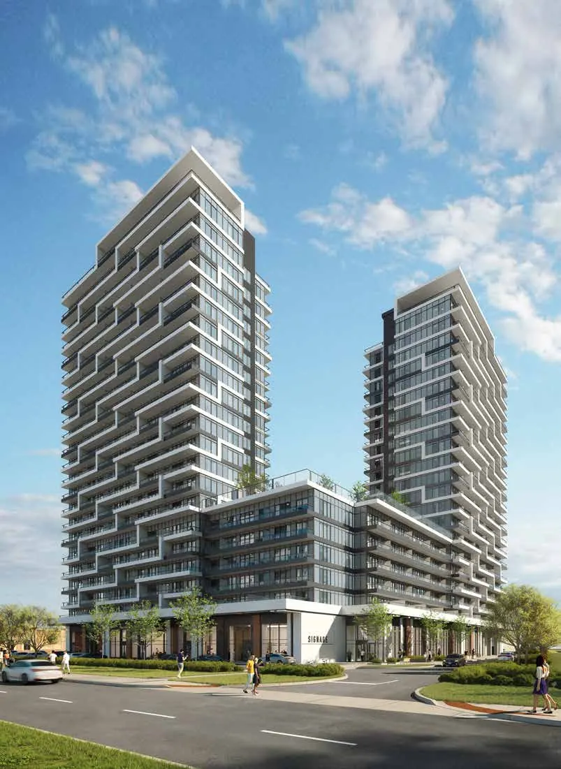
Joy Station
万锦高级公寓
COMING SOON
Bur Oak & Markham Rd
Joy Station · 2021

4800 YONGE STREET
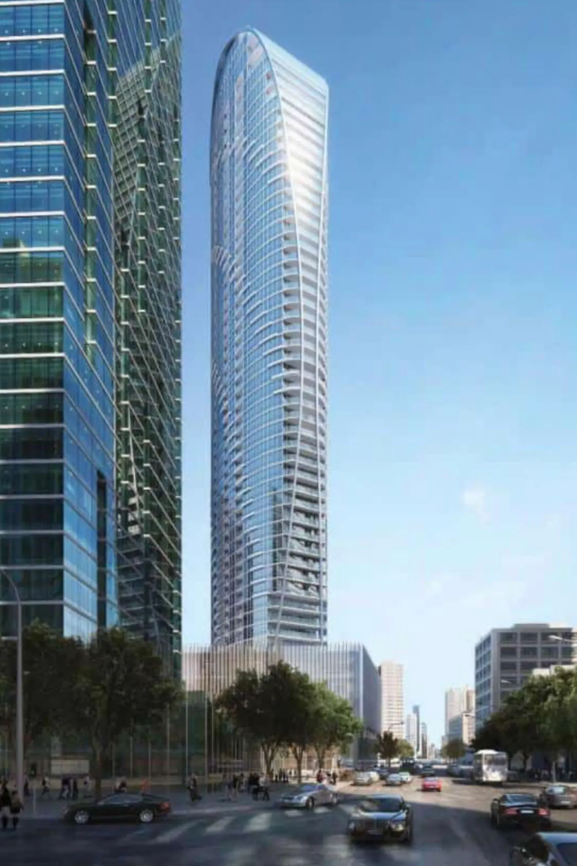
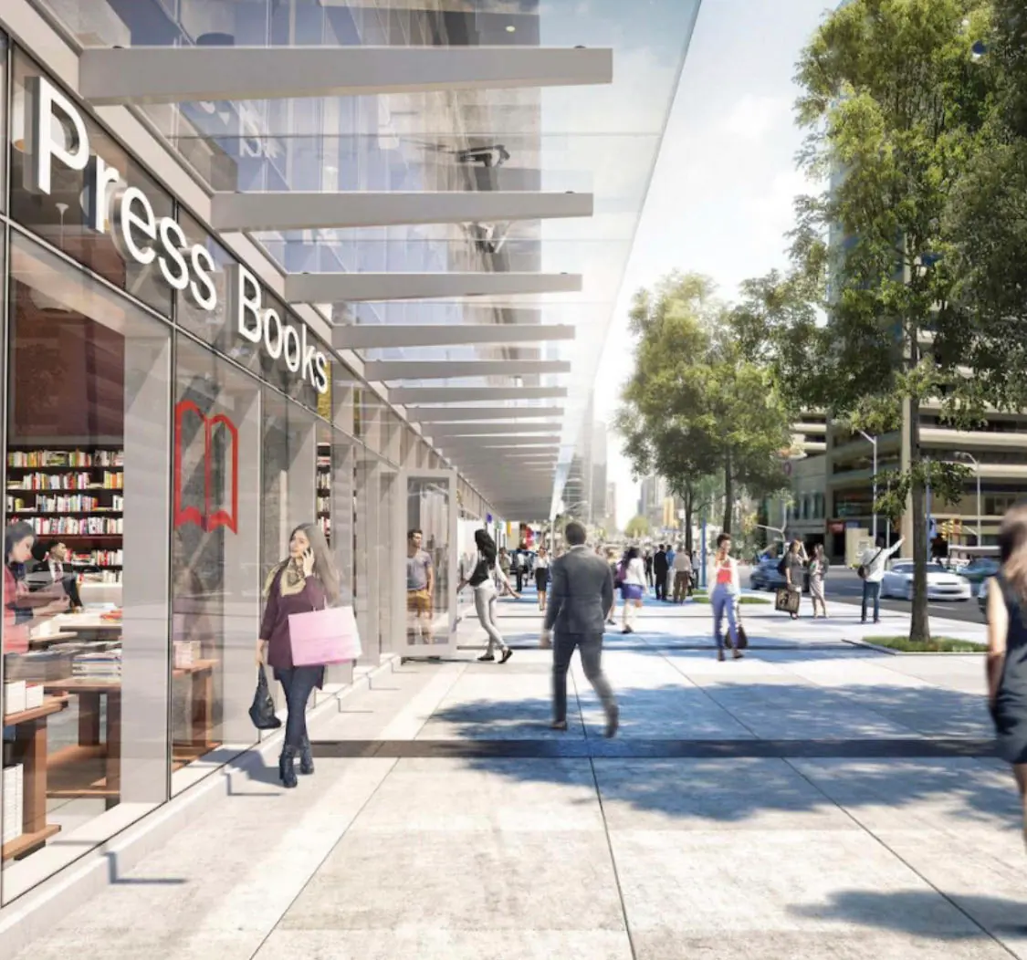
Yonge & Sheppard · North York
4800 Yonge Street · 2023 template
03Storefront
On the glass,
the name stands tall.
For the brokerage’s street-front office, a set of window panels: the Chinese name 優居地產 set tall in a single column, the English name running up the edge, the line “Your dream, my action!” and the four things the office does — resale homes, pre-construction, commercial property and business sales.
U DREAM HOME
優居地產
您的梦想,我的行动!
Your Dream, My Action!
住宅买卖 / 预售楼花 / 商业物业 / 生意买卖
Residential / Pre-construction / Commercial / Business
Your dream,
my action.