Home renovationToronto
A brush, a ruler,
and the letters T R.

00The project
- Client
- TruReno
- Sector
- Home renovation · Toronto
- Year
- 2017–2018
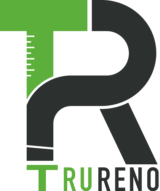
TruReno renovates homes in Toronto. The name has two letters; the trade has two tools — a brush and a ruler. The mark folds all four into one monogram: the stem of the T carries a ruler’s ticks, the R swings down into a brush handle, and the handle’s end is the first T of the name.
- Logo design
- Logo construction
- Colour and one-colour versions
- Horizontal lockup
01The idea
Four parts,
one monogram.
The original board spelled the idea out on a green band: brush plus ruler, plus T, plus R. The brush and the ruler are what a renovator holds every day; T and R are the name. Put together they make the whole mark — nothing else is added.

- 01Brush — the foot of the R’s stem
- 02Ruler — the ticks on the T
- 03T — the first letter of the name
- 04R — for Reno, renovation
02Construction
Every cut
has a reason.
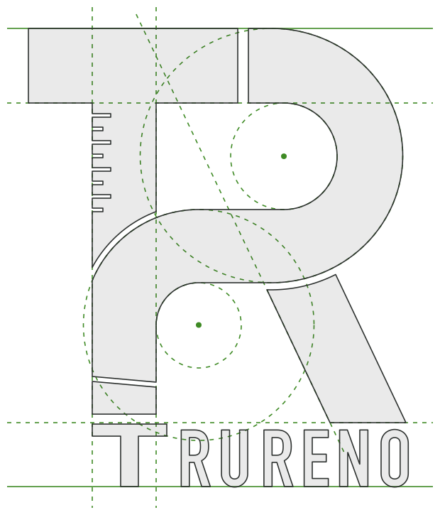
All the archive keeps is a 739-pixel raster, so we drew the mark again over the original: straights on the stems, every curve from a stated centre, ticks at an even pitch, the three cuts at one width. The drawing is the same; it simply has clean vectors for the first time.
- 1The ruler
Eight ticks, long and short, are cut into the left edge of the T’s stem: the T is the ruler.
- 2A curved cut
The R’s bowl swings down and left into a stem. A thin arc keeps it apart from the T, so each letter stays whole.
- 3The brush
A slanted cut near the foot of the stem marks the brush’s ferrule; below it, the handle becomes the first T of the name.
- 4A leg set apart
The R’s leg stands a hair away from the bowl, in the same language as the other cuts.
- 5The wordmark
RURENO is set in condensed DIN-style capitals, ending flush with the foot of the R.
03Versions
Green and graphite,
or one colour alone.
In full colour the T and the TRU of the name are green, the R and RENO graphite, so “Tru” and “Reno” read apart at a glance. The original also came reversed on black and in black on white. Its R was shaded from black to grey; here it is one graphite, so the mark holds at small sizes and in one-colour print.
RGB 93 175 59
RGB 72 148 40
RGB 44 48 46

TruRenoToronto · Home renovation