PilatesLogo design in three rounds
Two O’s,
held together.


00The project
- Client
- The Good Core
- Discipline
- Pilates studio
- Years
- September 2023 – January 2024
The Good Core is a Pilates studio, and its name already holds the idea: two O’s side by side in GOOD, the way a core holds the body together. The studio drew its logo in three rounds, each starting from those two letters — first joined into an infinity sign, finally interlocked as a pair of serif capitals.
- Round oneAutumn 2023 · the infinity wordmark
- Round twoJanuary 2024 · a board of directions
- Round threeJanuary 2024 · the interlocked serif
01Round one · 2023
Two o’s,
drawn as one infinity.
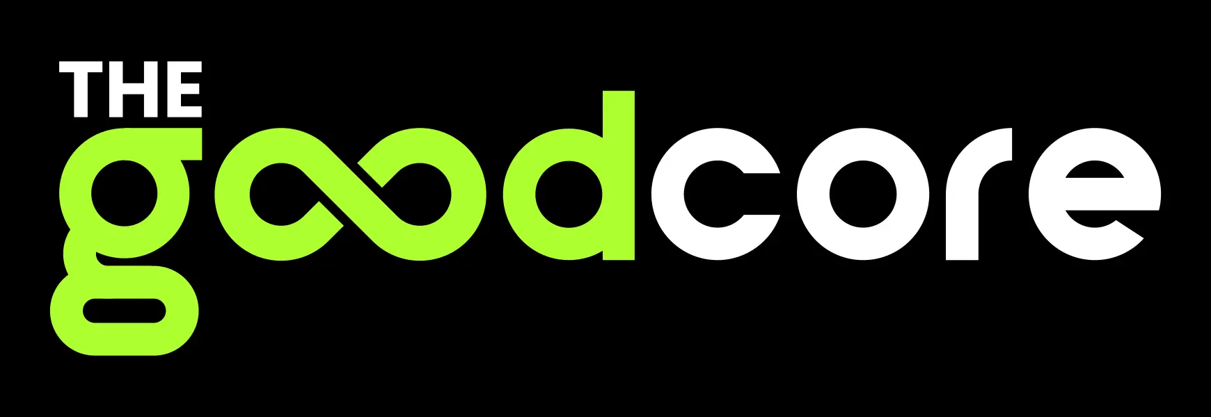
The first round set goodcore as one word in a rounded lowercase sans, its oo drawn as a single lime infinity sign and core left in white. The same stroke made a g monogram, and the infinity sign repeated into a pattern. The boards carried the line “Linking Power to Your Core.”
Linking Power
to Your Core.
02Round two · 2024
Every direction
on one board.
Before the last round the studio laid the directions out on one board so they could be compared at a glance: a g broken in two with a square, a g with a dot, the infinity in capitals, a serif good with a star, a blocky 1GC, and round one’s goodcore.

03Round three · 2024
A serif,
the O’s still linked.
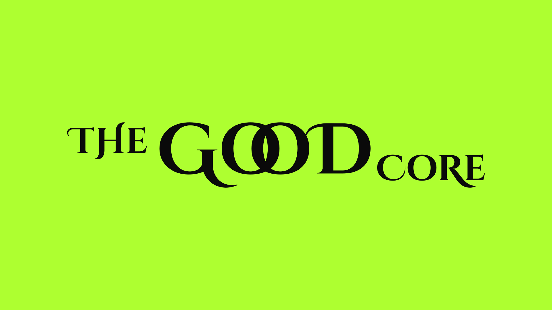
The last file sets THE GOOD CORE in sharp serif capitals. The two O’s of GOOD overlap like two links of a chain; THE and CORE sit small on either side and the weight falls in the middle. On black, GOOD turns lime, beside a band of the same colour.