IdentityCapital · Student housing · Beauty & medical tourism
One T,
three colours.

00The project
- Client
- TERRA
- Divisions
- Capital · Student Housing · Beauty & Medical Tourism
- Year
- 2025
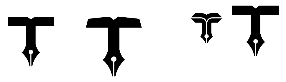
TERRA does three very different things: capital, student housing, and beauty and medical tourism. It needed one mark that could stand for the whole company and still come apart, one piece for each business. The sketches began with a book and a pen; the final mark is a T built from three pieces — a yellow page, and a blue and an orange stem.
- Mark & wordmark
- Three-colour system
- Division lockups
- Business cards, two-sided, print-ready
- App icon
01The mark
A page of a book, two stems of a pen.
The sketches started from the nib of a fountain pen: the T’s bar an open book, its stem split by the nib’s slit. The final mark takes that apart into three pieces — the yellow page on top, the blue and orange stems curving down either side of the slit to a point. The white lines between the pieces are all one width, so the three colours stay distinct at any size.
01Yellow · the page
#FFC621 · RGB 255 198 33
Division: Capital
02Blue · left stem
#0150C6 · RGB 1 80 198
Division: Student Housing; the wordmark
03Orange · right stem
#E4562E · RGB 228 86 46
Division: Beauty & Medical Tourism
02Three divisions
Each division whites out its own piece.
There is one rule: whichever colour a division stands on, that piece of the mark turns white. Capital sits on yellow and its page goes white; Student Housing on blue, the left stem; Beauty & Medical Tourism on orange, the right stem. The ground tells you which business, the mark tells you it is TERRA. The division names, originally squeezed above the wordmark, are re-set beneath it, aligned to its left edge.
Parent brand
Capital
Student Housing
Beauty & Medical Tourism
03The card
On white card, a light in the three colours.
The card is the piece that went to print. The front is almost all white, with only the logo; blue and orange rise from the lower corner as if the two stems had dissolved into light. The back enlarges the T into a translucent watermark and keeps names and contacts in the white at the left. Four colleagues’ cards went to press from the one file.
04Small sizes
Down to an icon, still the T.
The app icon keeps only the T, in white on a black rounded square. At small sizes the lines between the pieces become negative space, and the T still holds.

One TERRA.