Studio design studyA gym identity
Get
stronger.


00The project
- Project
- T1 Fitness (study)
- Designer
- Andy Li
- Year
- 2023
- Formats
- 16:9 · 1:1 · 3:4
T1 Fitness is a gym identity Andy Li drew in 2023 as a studio design study: a T1 cut from two strokes, one safety yellow, and a strip of caution tape that says what the place is for. He carried it through social posts in three sizes, a set of posters and a landing page. The originals were built on stock photographs of athletes; here each piece is re-set from the source file without them.
- Mark & wordmark
- Caution-tape graphic
- Social posts in three sizes
- Campaign posters
- Website landing page
01The mark
Two strokes,
cut at forty-five degrees.
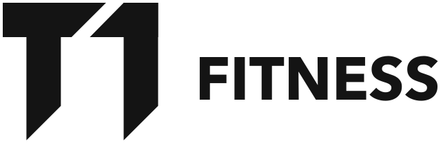
The T and the 1 share one stroke width and every end is cut at 45°, so the pair reads as a single block leaning forward. The mark is exactly four strokes tall. Beside it, FITNESS is set in Avenir Next Bold at about a third of the mark’s height, sitting just below its centre.
RGB 249 173 1
RGB 20 20 20
RGB 244 242 236
02The tape
One strip of yellow
does the shouting.
The best idea in the set is a strip of caution tape printed GET STRONGER. It runs flat along the foot of a frame or cuts across it on a diagonal, and it carries the yellow wherever the mark is too small to. Every visual went out in three sizes: 16:9 for the web (the frame at the top of this page), 1:1 for Instagram and WeChat, 3:4 for Xiaohongshu.
03Posters
Three posters,
on type alone.
The original posters set their headlines over photographs of athletes. Re-set without them, the words hold the poster: yellow on black, black on yellow, and one saying broken into three short lines, with the tape and the lockup tying the set together. One headline from the series is left out; its wording was unclear.
04Website
A landing page
that leads with the tape.
A black sidebar holds the lockup and four links — gym, classes, about, contact. The page makes one offer with one button, and the tape cuts the corner to frame NEW. Where the original had a photograph, the mark itself stands in.