Logo designWindow coverings
A name with
the blind drawn.

00The project
- Client
- SKYLIGHT Windows Covering
- Sector
- Blinds and curtains
- Year
- 2022
- Files delivered
- AI · PDF · PNG · JPG
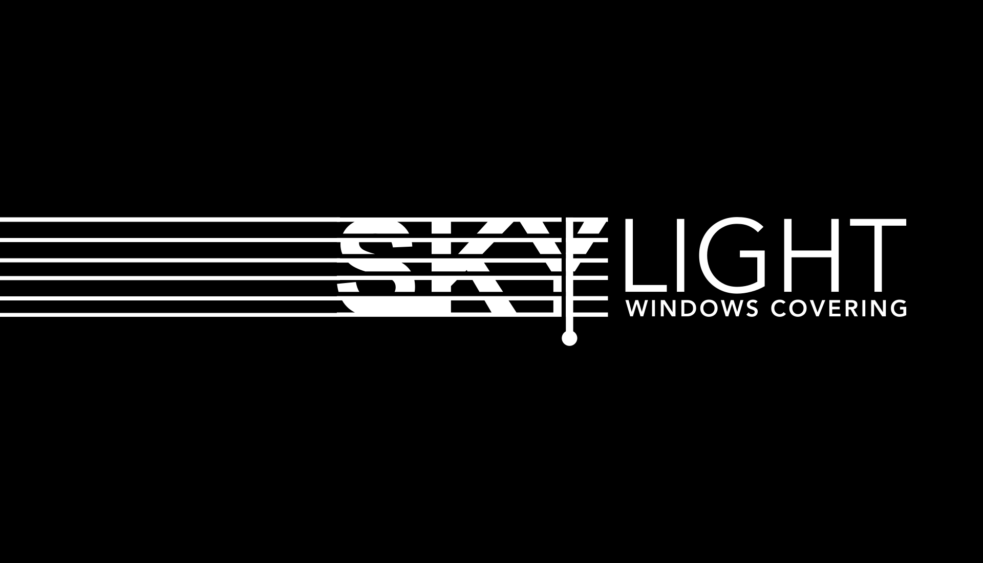
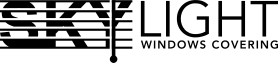
SKYLIGHT Windows Covering makes blinds and curtains. In 2022 the studio designed its logo. Early studies set a blind beside the name; the final one put the blind inside it, cutting SKY with slats and letting the stem of the Y fall as the pull cord. LIGHT beside it is drawn in a single thin line — shade on one side, light on the other.
- Logo design
- Sky blue, black & reversed versions
- AI · PDF · PNG · JPG files
01The idea
Three letters
behind the slats.
SKY is set in a heavy sans and cut by six slats of equal weight, so the letters show only between the slats — a word read through a blind. The stem of the Y keeps falling below the last slat to become the pull cord, finished with a round bead you could reach for.
- 1Six slats cut through S, K and Y
- 2The stem of the Y, dropped as the cord
- 3The bead at the end of the cord
02Earlier routes
The blind moved
from beside the name into it.
The working file keeps a few earlier routes: a blind half open, slats inside a rounded window, slats in perspective — each an icon set beside the name. All of them have a cord and a bead. The final logo kept those two and handed everything else to the letters.
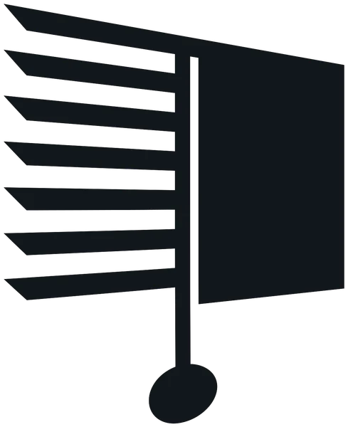
01A blind half open
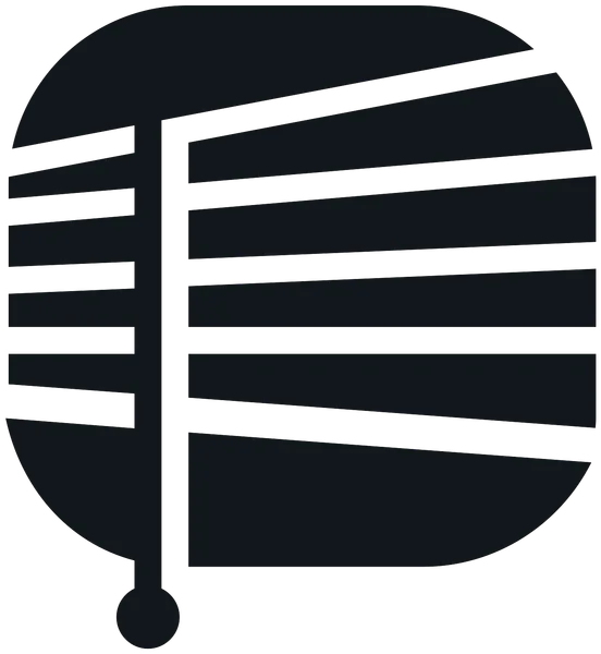
02A rounded window
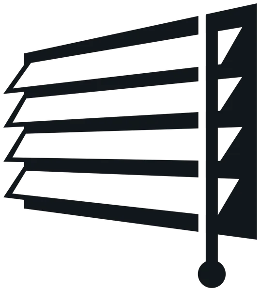
03Slats in perspective
03The lockup
Shade on one side,
light on the other.
SKY is solid and heavy; LIGHT is written in a single thin line — one word dark, the other bright. The descriptor, WINDOWS COVERING, is set in tracked medium capitals that run exactly the width of LIGHT and sit level with the last slat of SKY.
04Versions
Four versions,
one blind.
The delivered files cover four uses: white with a black descriptor on sky blue; sky blue or black on white; and fully reversed on dark grounds. The blue is the one in the original file, RGB 72 185 245.

RGB 72 185 245