Student residenceLondon, Ontario · Coming 2028
A residence
drawn into the trees.


00The project
- Client
- Sarnia Real Estate Development Inc.
- Location
- London, Ontario
- Architecture
- SRM Architects + Urban Designers
- Year
- 2026
Sarnia Residence is a student residence in London, Ontario: 650 bedrooms, under ten minutes on foot from Western University and Ivey Business School, due in 2028. Before the building exists, people have to be able to see it. For Sarnia Real Estate Development Inc. we put the logo in order and made the project’s teaser book and a guide to the neighbourhood around it.
- Logo package & usage guide
- Teaser book, 28-page print edition
- Digital edition
- Neighbourhood guide
- Retouching & AI scenes
01Identity
Two strokes of an S,
and a star.
We turned the developer’s mark into a package anyone can be handed: full colour, navy, reversed and black; the monogram on its own for avatars and icons; screen and press values for both colours; and a one-page guide to using them.


RGB 27 49 99 · PMS 534 C
RGB 213 181 132 · PMS 7502 C
02The book
A book that shows the place
before it exists.
Twenty-eight pages at A4, set in Cormorant Garamond and Inter on warm ivory: navy carries the voice, champagne the detail. Each spread does one job — where it is, what it looks like, how a day there goes. A landscape digital edition takes the same pages to email and screens.
“A field guide to arrival” — the cover carries only the building and the name; the subtitle says what kind of book this is.
03Location
Ten minutes
to Western.
The book maps the walk. A separate seven-page guide does the rest — groceries, food, buses, clinics and shops, each with its minutes on foot or by car — in English with Chinese notes for international students’ families.
04Architecture
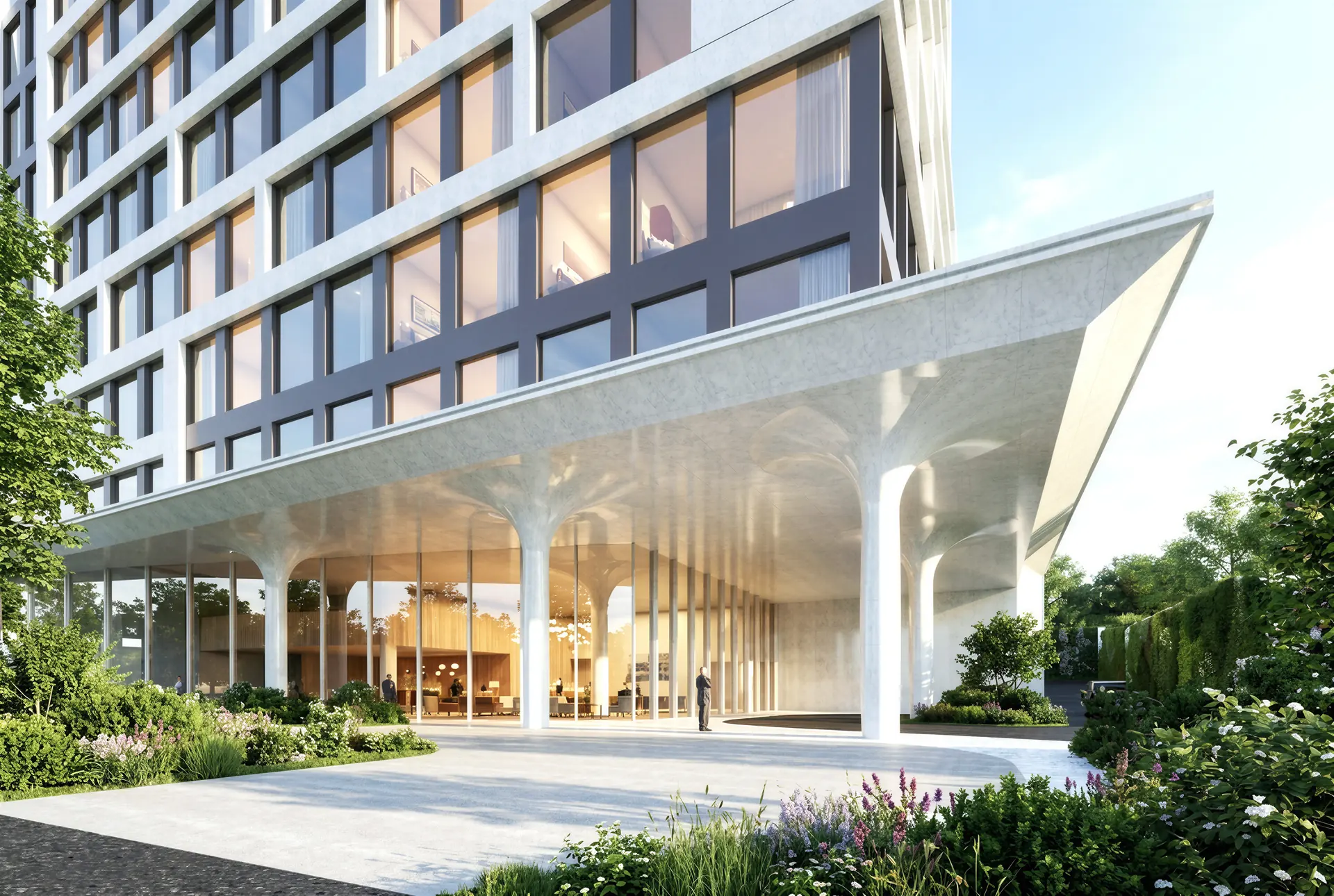
Sculpted in white,
softened by green.
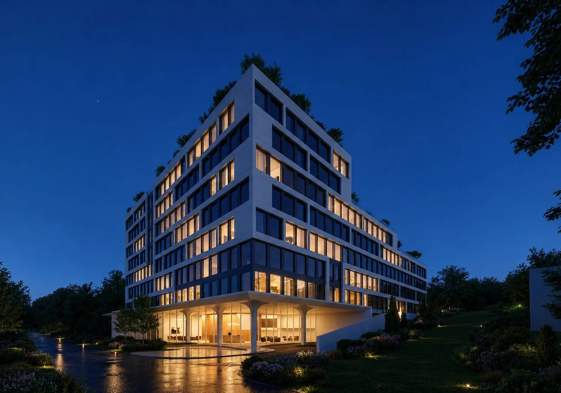
SRM’s building steps back into planted terraces. The book lets it hold a page on its own, without a word, and only on the facing page starts to explain.
05Shared spaces
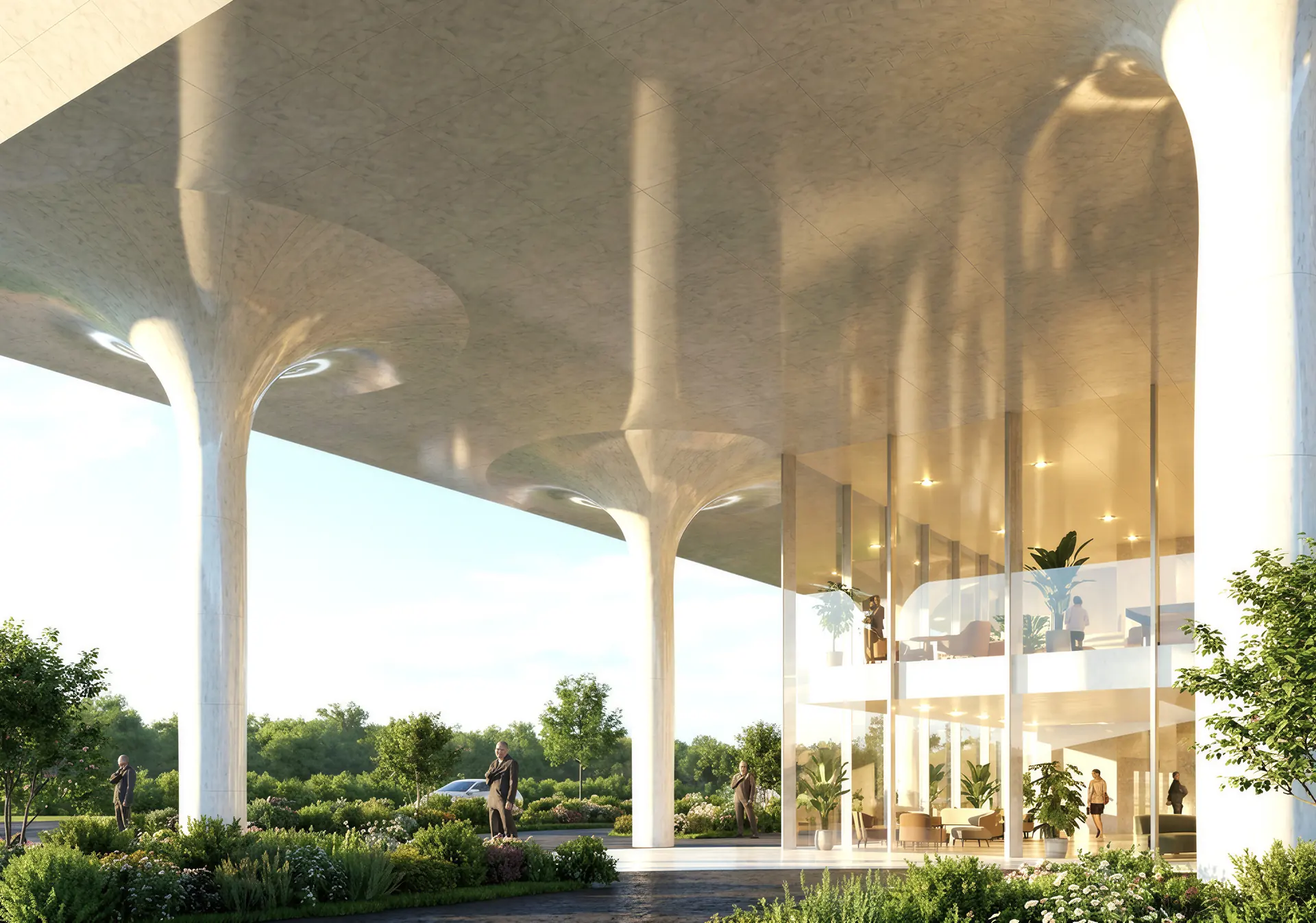
The lobby is
a second living room.
Lobby, library, refectory, roof garden: four spreads in one rhythm — a page for a single line, a page for the room.
06Suites
A bedroom that closes.
A home that opens.
Suites of two, three and four bedrooms, each bedroom with its own ensuite around a shared kitchen and living room — told in three lines and two pictures.

Coming 2028.