ModelingThe 7th IMA Supermodel Competition · poster series
A burst of light,
a turn of tulle.


00The project
- Client
- RE/TUNE Modeling
- Project
- 7th IMA Supermodel Competition
- Year
- 2023
In 2023 the modeling studio RE/TUNE Modeling announced the 7th IMA Supermodel Competition with a series of posters: a Toronto division in September, an international final in October. We set the grid: a fashion-magazine Didot headline, a quiet Chinese title, and a white band at the foot that sets out entry and dates in both languages. The same grid takes a different model for each version.
- Competition poster series
- Bilingual type system
- Casting-call layouts
01The poster
One grid,
every version.
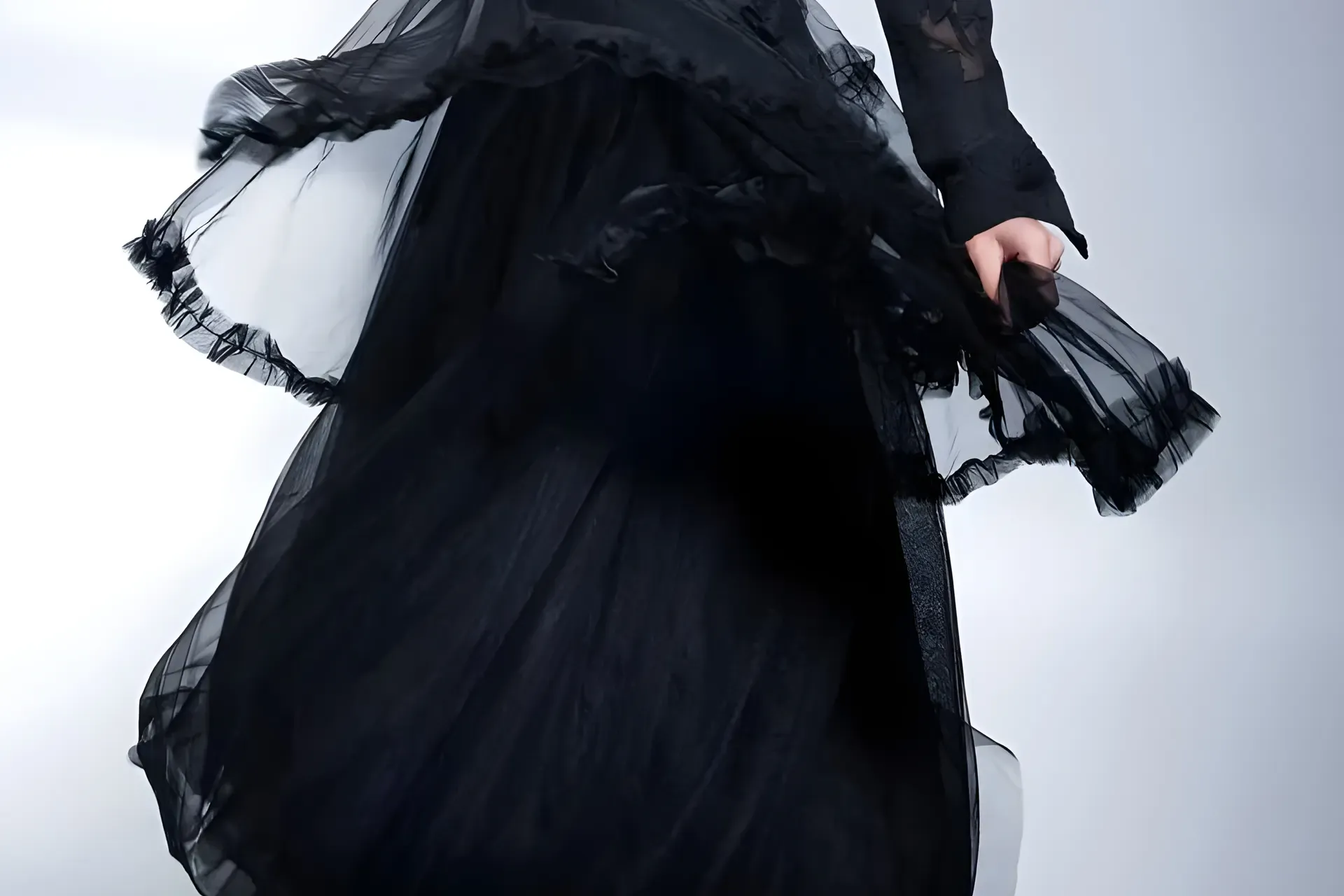
The series ran in several versions — one model, two, a group with the youngest entrants — and the grid never moved: Didot across the top, the Chinese title at the waist, entry details either side of the figure, the dates at the foot. The version on this page takes the model out and keeps the organza from the original photograph, behind the re-set type.
- 01
Headline
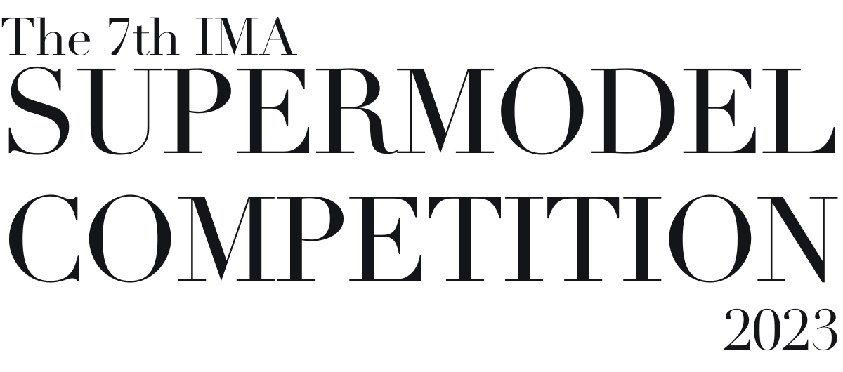
Didot, set to the full width of the sheet, the way a fashion magazine sets its masthead.
- 02
Chinese title
第七届 IMA 国际超模大赛 in a plain sans: no second display face to compete with the Didot.
- 03
Date band
Deadline, Toronto division, other divisions, the final: four dates, Chinese over English, the same on every version.
02The type
A fashion serif up top,
plain type for the facts.
Didot’s hairlines need room, so the headline runs the full width and nothing else on the sheet tries to be decorative. Everything a parent needs — the age groups, heels or not, no height or size limits, the deadline — is set small and plain, Chinese first and English under it.
第七届 IMA
国际超模大赛
- 儿童组
- Kids Model · age 4–16
- 青年组
- Female Model · age 14–25, in heels
- 无身高或体重限制
- No height or body size restrictions
03The mark
Eleven rays
from one point.
RE/TUNE’s mark sits in the corner of every poster, beside the competition’s. Redrawn here as vector from the archive file, the burst is eleven tapered rays of different lengths meeting at one point, over a wordmark spaced wide enough to hold up at a very small size.