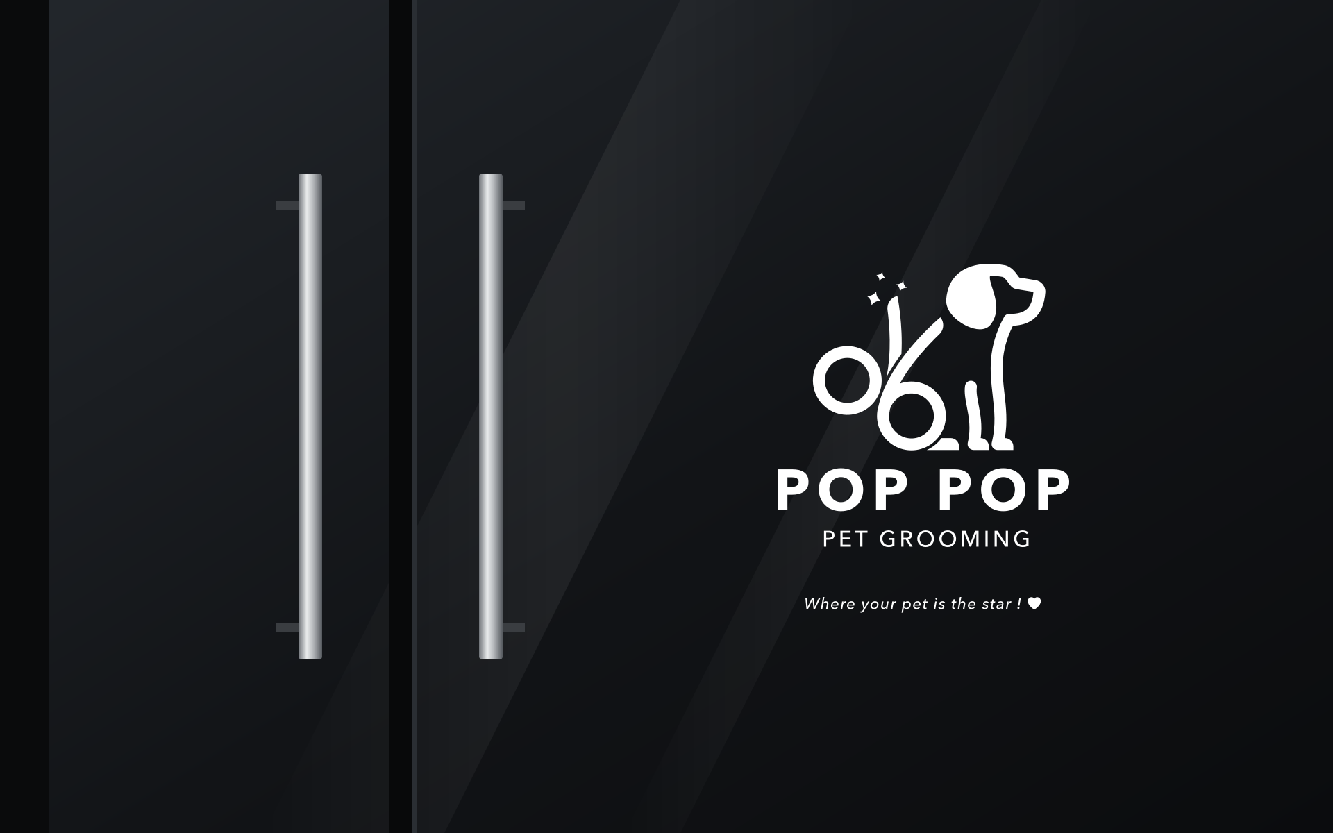
Pet groomingLogo study
Where your pet
is the star.

00The project
- Brand
- POP POP Pet Grooming
- Type
- Studio design study
- Year
- 2023
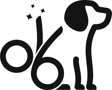
A logo for a pet-grooming shop built on one idea: the groomer’s scissors, drawn as the dog that has just been trimmed and is sitting up nicely for it. Everything else is black, white and the shop’s line, “Where your pet is the star!”
- Logo
- Horizontal and stacked lockups
- Type and colour
- Business card
- Apron and shopfront applications
01The mark
A pair of scissors,
sitting up.
Open grooming scissors, drawn in one even line. The two rings sit low: one stays a finger ring, the other becomes a haunch with a paw. The blades lift into a tail, and the head, ear and chest close the line on the right. Three small sparkles say what just happened: a fresh trim.
- A finger ring
- The other ring: haunch and paw
- The blades, raised as a tail
- Three sparkles: freshly groomed
02Lockups
Two ways
to sign the name.
A horizontal version for signs, letterheads and the website header; a stacked one for squares — the shop door, an avatar, a sticker. Both come in black and in white, and the mark on its own still reads at icon size.


03Type and colour
Avenir Next,
given room.
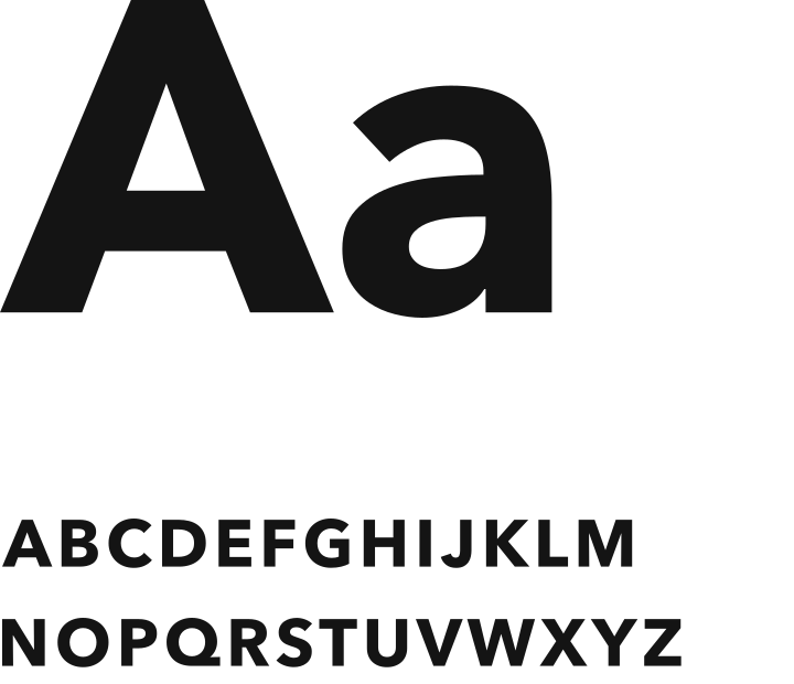
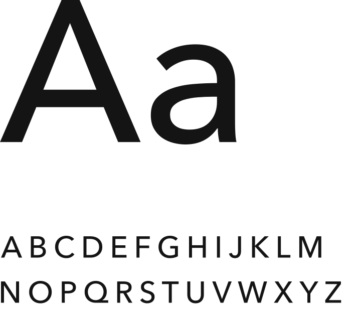
The name is set in Avenir Next Bold with open spacing; PET GROOMING underneath is Medium, spaced wider still, so the two lines end flush. The colours are black and white, with a pale grey for grounds and a night blue for dark ones.
04Business card
One card,
black and white.
White on the front, with the horizontal logo and the line; black on the back, with the stacked logo. The file’s front also carried a name, title and contact details — template placeholders, left off here.
05Aprons
Worn at
the grooming table.
Black aprons with white ties carry the logo at the chest — horizontal on one, stacked on the other. The file showed them as a stock mockup on hangers; here they are redrawn flat.