Music & skewer barMarkham, Ontario
Skewers with music.
Drinks with stories.
00The project
- Client
- Play House (酒局)
- Location
- Markham, Ontario
- Sector
- Food · music bar
- Year
- 2023
Play House (酒局, roughly “a night of drinks”) is a music bar in Markham, Ontario that serves skewers off the grill: food, music and drinks in one round. We designed its logo and, in September 2023, four social posters for its half-price “BBQ memories” promotion.
- Logo design
- Gold, mono and neon versions
- Half-price grill posters (four)
01The mark
One bottle,
threaded through the name.
The L of PLAY rises into a bottle’s neck and the U of HOUSE drops into its base: one line, one bottle. A long rule runs through both words like a skewer. 音乐串吧 (“music skewer bar”) stacks on the left, 酒局 (“a night of drinks”) stands on the right, and every letter is cut on the slant so the name reads with a beat. The original files carry it in gold, black and white, and a neon cyan for screens.
02The posters
BBQ memories,
half price.
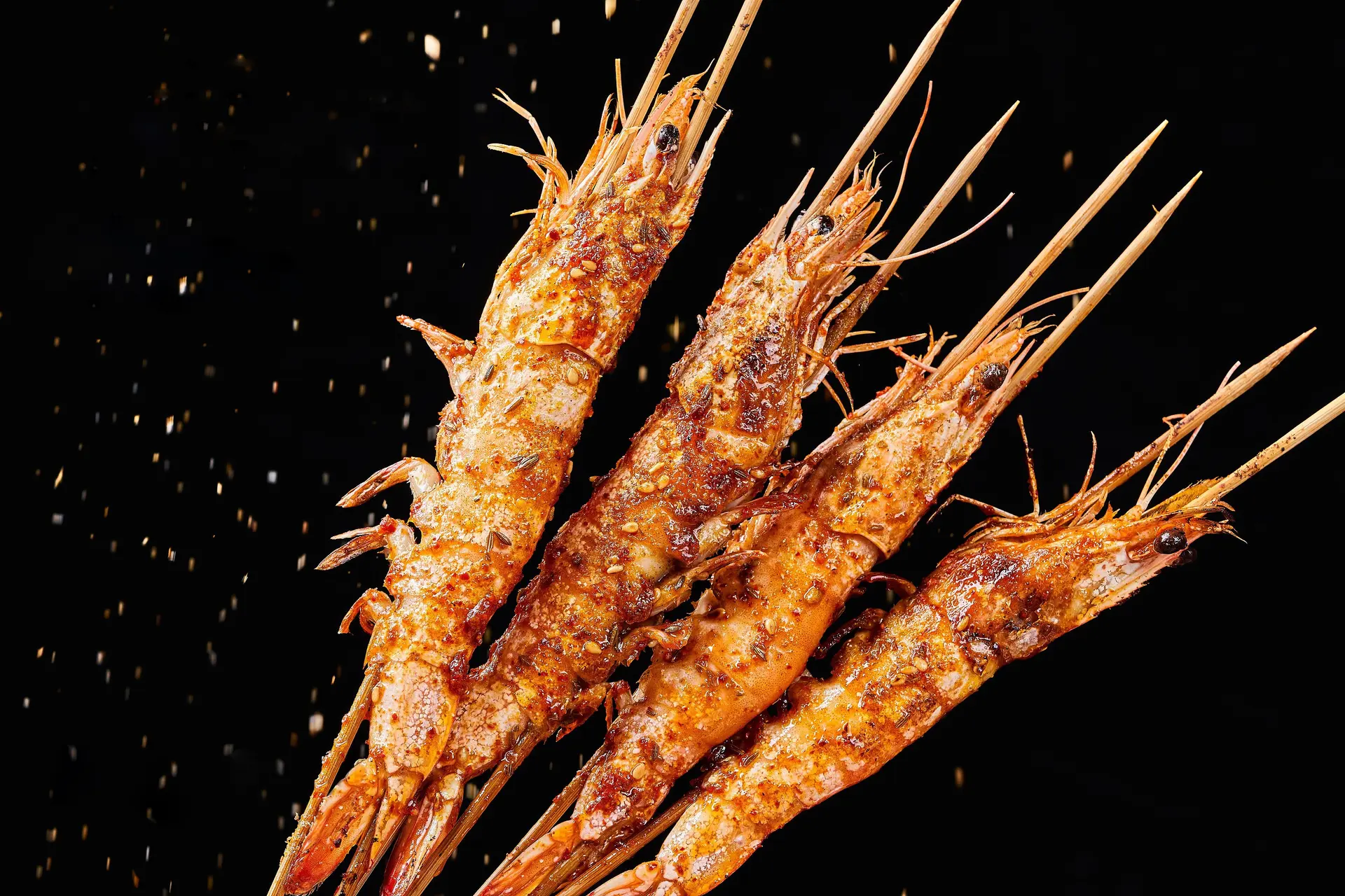
In September 2023 the bar ran half-price grill nights, Sunday to Thursday, and we made four portrait posters for social media. The originals crowded slogan, dates, address and QR code into gold box after gold box. Here they are re-set from the same copy and the same menu photographs: one line per poster, the photograph full bleed, the dates and the branch tucked into a single line at the foot.
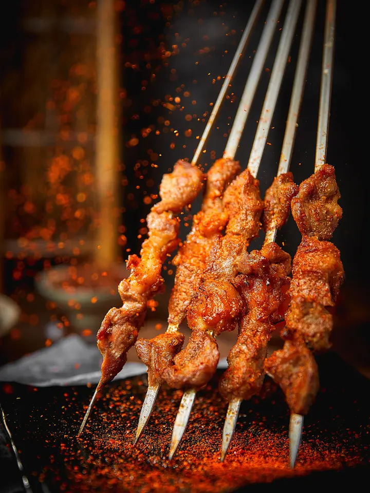 音乐串吧烧烤记忆烧烤全场限时五折9.18 – 9.29
周日至周四 · 现金结算Markham 店
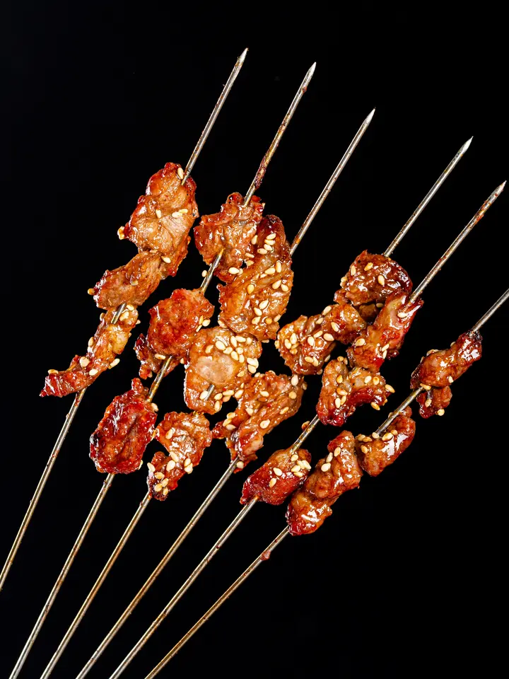 音乐串吧音乐串吧烤串配音乐,
有酒有故事。9.18 – 9.29
周日至周四 · 现金结算Markham 店
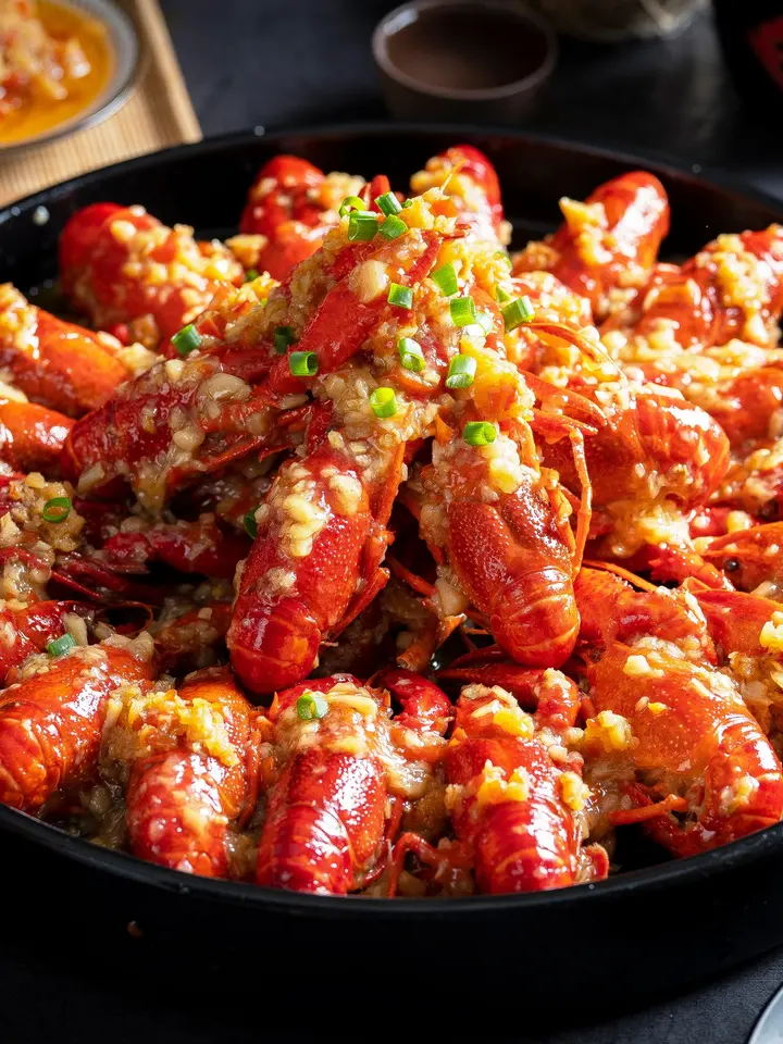 音乐串吧烧烤全场限时5折9.18 – 9.29
周日至周四 · 现金结算Markham 店
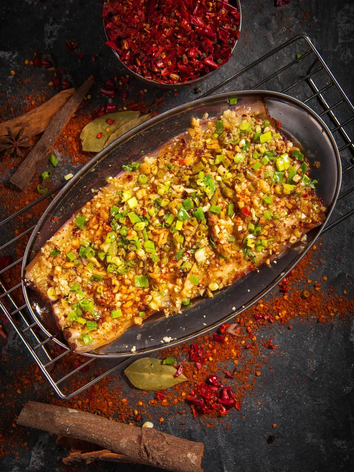 音乐串吧烧烤记忆有酒,
有故事。9.18 – 9.29
周日至周四 · 现金结算Markham 店
Four social posters, 1080 × 1440 · re-set in 2026 from the 2023 originals
03The table
Slate, chilli and smoke:
a ground gold can stand on.
The posters draw on the bar’s own menu photography — black slate, scattered chilli, a lift of sparks. The ground is dark enough for the gold of the logo and the type to hold, so the system adds no other colour.
Music & skewer bar · Markham, Ontario
