Freeze-dried pet treatsIdentity and packaging
Six shapes.
Three colours.
One family.
00The project
- Client
- Pi
- Product
- Freeze-dried treats for dogs and cats
- Mark and first packaging
- 2023
- Refinement
- 2026
Pi makes freeze-dried treats for dogs and cats. In 2023 we drew its mark — three bars, two quarter-circles and a dot on one grid — and a first round of pouches built on photographs of pets. Coming back to it in 2026, we kept the mark and its orange, cobalt and pink exactly, replaced the photographs with a dog and a cat drawn from the mark’s own shapes, and gave the three recipes one shared layout.
- Logo design (2023)
- Packaging proposal (2023)
- Packaging refinement (2026)
- Dog-and-cat graphics
- Sticker and card concepts
01The mark
Three bars, two arcs
and a dot.
The P’s stem breaks in two, its bowl splits into two quarter-circles, and the i is a bar and a dot. Every stroke sits on one grid — 208 wide, 88 apart, five bands each way. Simple enough to hold at icon size; solid enough to stand in any of the three colours.
02Colour
One recipe,
one colour.
Orange is chicken, cobalt is fish, pink is rabbit. From a few steps down the aisle the colour reads first and the name second. All three come from the 2023 identity; none of them changed.
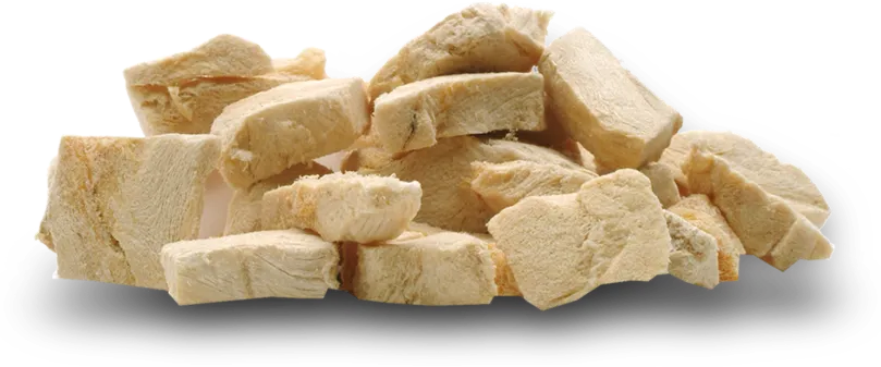
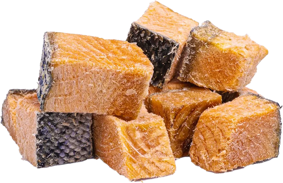
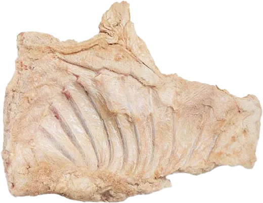
Product photographs supplied by the client
03The dog and the cat
Drawn with the mark’s
own shapes.
The first pouches used photographs of pets, a different one on each, and side by side they didn’t look related. This time the dog and the cat are built from the mark’s bars, quarter-circles and dots. On the pack they change colour with the recipe; off it, they work as stickers.
GOOD COMPANY.
Dog-and-cat graphics and stickers · 2026 concept
04The pack
One layout,
three recipes.
Five things, in the same place on every pouch: the mark, the descriptor, the recipe, the dog and cat, and the footer band. The recipe name is the biggest and boldest thing on the pack, legible from three steps away; the pets take each recipe’s second colour; a cream band lines the three up as one row.
- 1Mark, fixed top left
- 2Descriptor
- 3Recipe, biggest and boldest
- 4Dog and cat, in the second colour
- 5Cream footer band
Pouch fronts, typeset · 2026 refinement concept, proportioned to a 150 × 240 mm stand-up pouch
05Cards
Off the shelf,
still Pi.
The 2023 files include a business-card draft. We turned it into a pair of brand cards: a cobalt face with only the mark, a pink face given to the dog and the cat. Tucked into an order or handed over at a trade show, it’s the same family.
Brand card, front and back · 2026 concept, no contact details
Good company
looks like family.