Indoor golfMark and logo guide
A swing,
held in a P.

00The project
- Client
- Partee Golf Club
- Sector
- Indoor golf club
- Year
- 2022
- Type
- DIN Alternate · Avenir
Partee Golf Club is an indoor golf club. In 2022 we drew its mark: a golfer stands in as the stem of the letter P, a white half-round makes its bowl, and the club crosses the top at the height of the swing, with PGC in DIN at his feet. A logo guide followed, setting out the horizontal and vertical signatures, the avatars and the one-colour versions. The same file holds two further directions.
- The badge and PGC lettering
- Horizontal and vertical signatures
- Avatars and one-colour versions
- Logo guide
- Two further directions and icon studies
01The badge
A golfer
standing in for a stem.
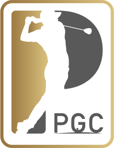
A golfer at the finish of his swing makes the stem of the P; a white half-round makes the bowl, and the club sweeps across its top from behind his shoulder. The figure is cut out of the ground, a field of gold running dark to light behind it, all held in a rounded gold frame. PGC sits at the foot in DIN, a tee tucked into the bar of the G and a thin line of turf beneath.
02The signature
Name and badge,
side by side.
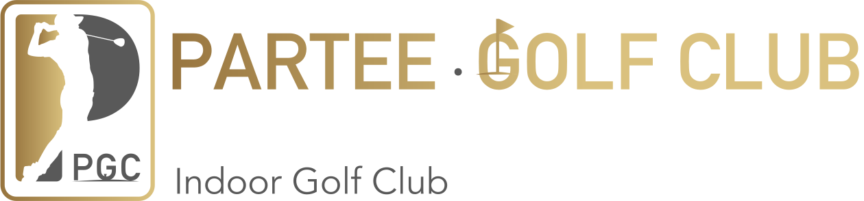
The name is set in DIN Alternate Bold capitals, the gold brightening from PARTEE into GOLF CLUB; a small flag is planted on the G of GOLF, a dot between the two words. Indoor Golf Club sits beneath in Avenir, in graphite. The guide gives two arrangements, horizontal and vertical; the vertical drops the flag and centres three lines.
03Small and single-colour
Down to an avatar,
down to one ink.
On its own the badge goes into a round or a square avatar, its gold frame on charcoal. Where colour is not available it falls back to black or white: the gold and the white become one ink and the figure stays a cut-out, so it still reads in one-colour print or an engraving.
Round and square avatars



04Three directions
Three directions;
the guide follows the first.
The same file holds two more proposals: V2, a gold ball on a tee that becomes a P with its club, and V3, a club driven through the letters PGC in gold and silver. A second file, five days later, tries four icons on the theme “PAR TEE”: a flag, a green, a hole, and a P and T stacked into one letter.


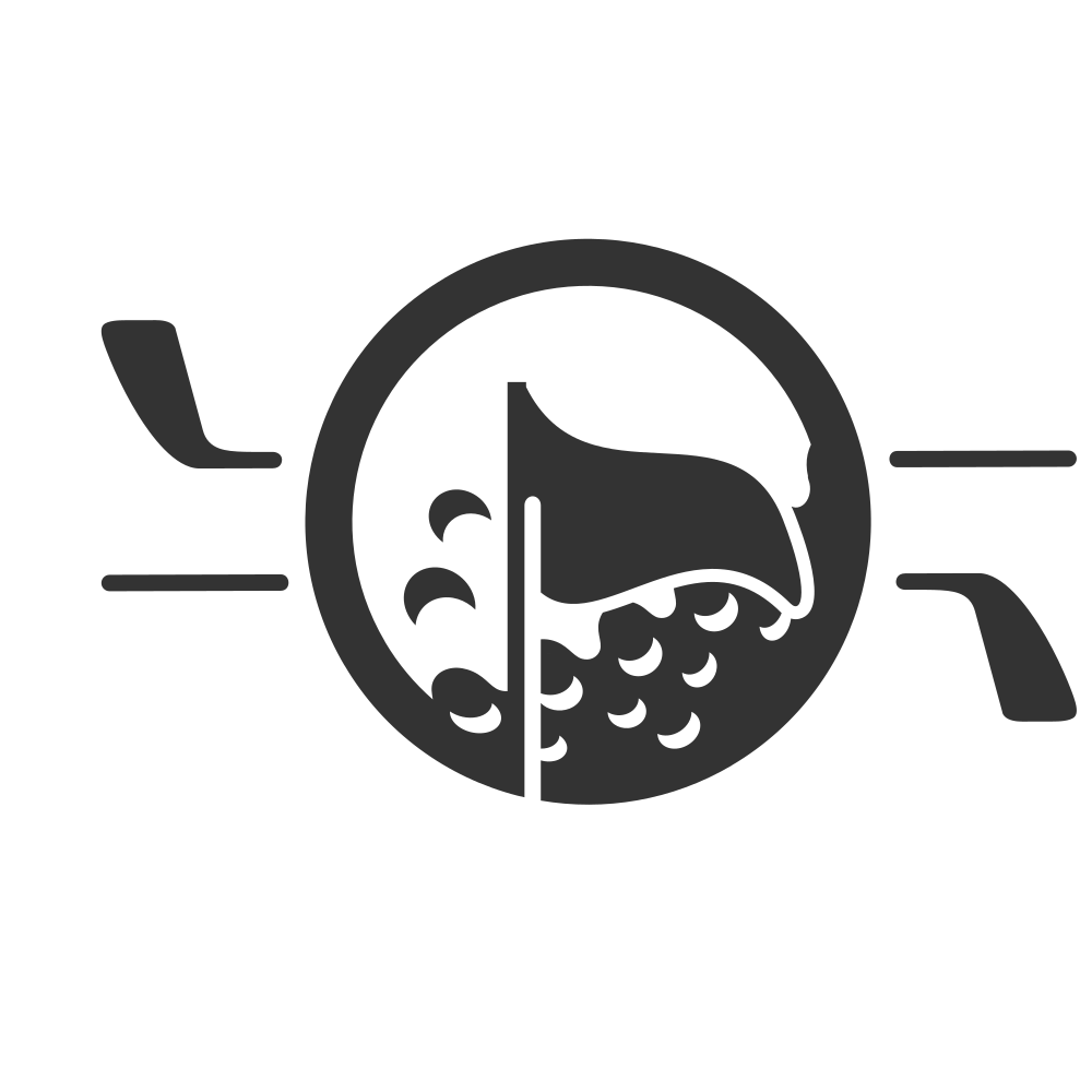
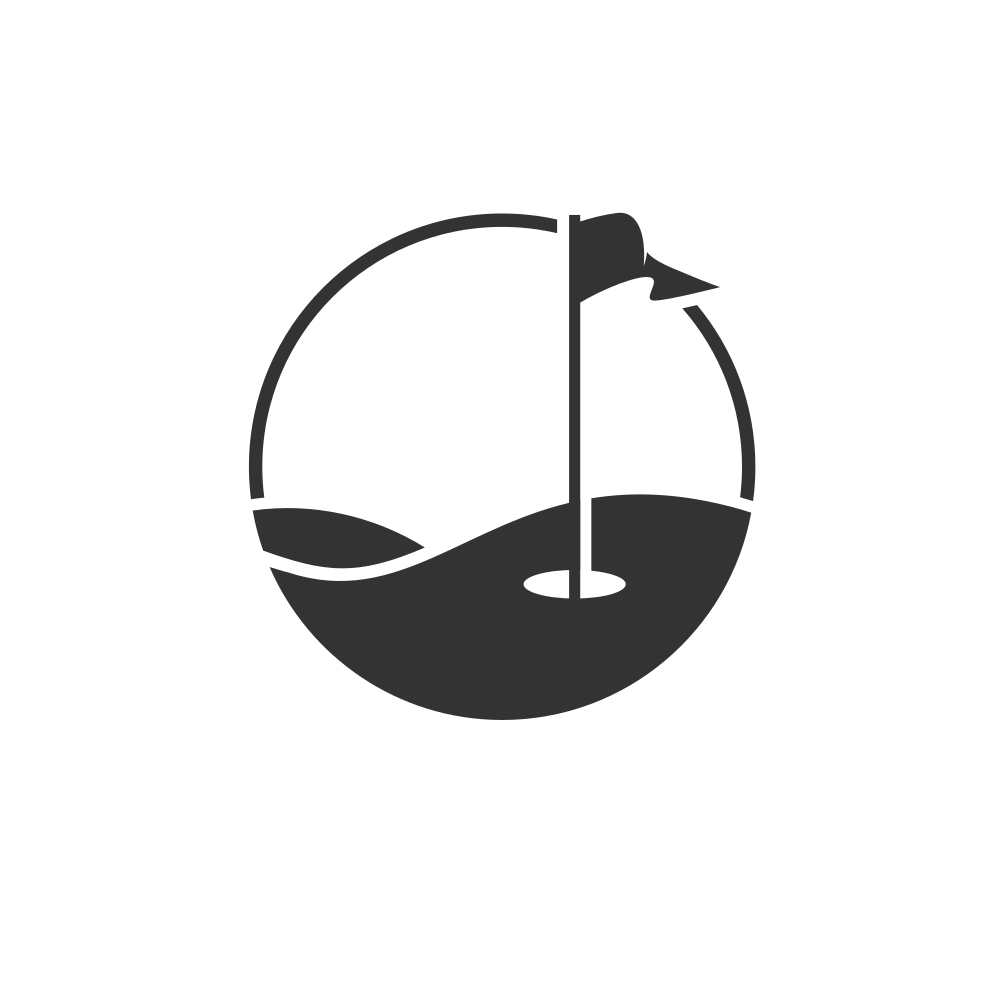


“PAR TEE” icon studies, the second file