Nutrition brandCanada · Logo design
Two marks,
one name.

00The project
- Client
- NutraSential Lab
- Sector
- Nutrition
- Based in
- Canada
- Rounds
- April · May 2024
NutraSential Lab is a Canadian nutrition brand whose name runs two words into one. We drew its logo over two rounds in spring 2024: in April, an S assembled from leaf shapes; in May, a new wordmark that splits the name into three by weight, the S redrawn to sit beside it, and a second mark — a pair of linked rings.
- Wordmark
- S mark proposal
- Rings mark proposal
- Type tests
01The wordmark
Light, bold,
light again.
The name is two words run into one. The wordmark separates them by weight instead of a space — Nutra light, Sential bold, Lab light again — so it reads in three beats at a glance. An olive leaf takes the place of the dot on the i, and Canada sits small beneath.

02First route · April 2024
An S,
cut from leaves.
The first route takes the S from the middle of the name and rebuilds it from four quarter-round pieces, each the shape of a leaf — the same leaf that later sits over the i. In April two of the pieces were green; redrawn in May beside the new wordmark, one piece, top right, stays olive.


03Second route · May 2024
Two rings,
an S where they cross.
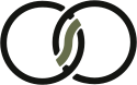
The second route links two open rings. Where they overlap, an olive S-curve, drawn like a leaf, closes the gap — the initial again, hidden in the join. It was presented in black on white and reversed out of olive.


- BlackRings and wordmark
#141512 - OliveThe leaf; reversed ground
#666D4B - PaperGround
#F3F2EC
 The SThe rings