Dairy brandLogo · Seal · Yogurt labels
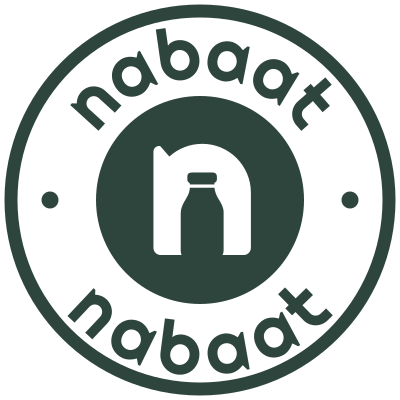
An n with a bottle
standing inside it.

00The project
- Client
- Nabaat
- Sector
- Dairy · Yogurt
- Logo
- November 2024
- Labels
- 2025
Nabaat is a dairy brand making yogurt. We drew it a mark in which the inside of a lowercase n is the outline of a milk bottle — you read the letter first, then see the product. Around it we set a rounded lowercase wordmark, horizontal and stacked lockups, a seal for every round place and four colours led by almond green, and later carried the seal onto the labels of three 2-litre yogurts.
- Mark and wordmark
- Horizontal and stacked lockups
- Round seal
- Colour palette
- Yogurt labels, three flavours
01The mark
Read it as a letter.
Look again: a bottle.
The mark starts from the n in the wordmark. Its counter is cut to the shape of a milk bottle — cap, shoulders, flat base — so the letter and the product are one drawing. Set in a circle it shrinks to a lid or a profile picture; out of it, it is still an n.


02Lockups and colour
Two ways to sign,
four colours to sign in.
The horizontal logo runs along a header or the long side of a label; the stacked one sits in a square. Almond green is the brand’s own colour, forest green takes over where contrast is needed, and milk and oat are the grounds they sit on.


- AlmondThe brand colour
#C0C8A0 - ForestType and dark grounds
#2E453D - OatWarm ground
#EAE4D8 - MilkPaper
#F4F3EF
03The seal
Say the name twice,
and round it off.
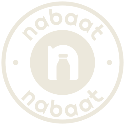
The wordmark runs over the top and reads back along the bottom, a dot either side, the mark at the centre. Anything round — a lid, a sticker, a profile picture — gets the seal.
As a profile picture
 128 px
- 80 px
- 48 px
- 32 px
04Yogurt labels
Three flavours,
one seal.
Wrap-around labels for 2-litre tubs. The seal takes the flavour’s colour — almond for Natural, orange-red for Strawberry, yellow for Vanilla — above the flavour name in the same round letters, with a band of colour for the size. Side by side, each is easy to tell apart and plainly one family.