Nail salonLogo study
An m with
painted tips.
00The project
- Brand
- Mudita Nails
- Sector
- Nail salon
- Year
- 2023
- Status
- Studio logo study
- Typeface
- Cannu
Mudita is a Pali word for the joy you feel in someone else’s happiness, and the set’s tagline says as much. The mark is a lower-case m drawn in a single even stroke — two round arches, three legs — and the end of each leg is dipped in a gradient from peach through pink and lilac to sky blue, like three freshly painted nails.
- Mark
- Wordmark
- Gradient palette
- Round badge
- Membership card
01The mark
Two arches, three legs,
one even stroke.
The m is drawn from two pairs of concentric circles: the band between outer and inner circle is exactly the width of each leg, the three legs sit at equal spacing, and both the arches and the leg ends are true semicircles. The lower part of each leg carries a separate gradient whose upper edge curves down like the base of a fingernail, fading from peach at the top to sky blue at the tip.
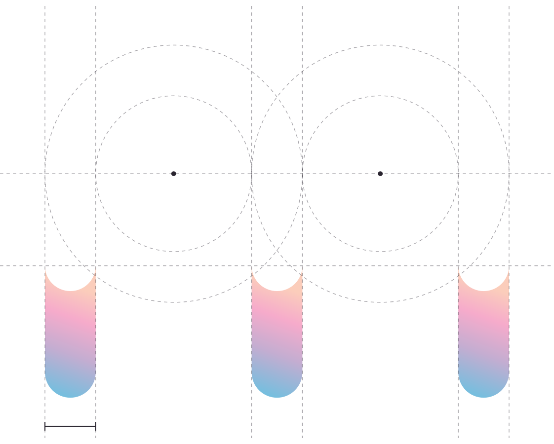

Left: the construction lines are drawn for this page over the original outline. Right: the tip of the middle leg, enlarged.
02Colour
Peach to sky,
in seven stops.
The whole identity runs on one gradient, built in the file from seven stops: peach, coral and pink into lilac, then mist and sky blue. It dips the m’s three tips, covers the membership card and fills the round badge, over a ground of very pale pink. The wordmark and the body of the m stay white.
- Peach#FBCDBB · 0%
- Coral#F8BCC3 · 14%
- Pink#F6ABCB · 29%
- Orchid#DDACCE · 45%
- Lilac#C4ADD1 · 62%
- Mist#9DB5D7 · 81%
- Sky#77BEDE · 100%
Ground · #FFE0E6 — the pale pink behind the set’s posts
03Wordmark and badge
A light serif,
spaced wide.
The wordmark sets Mudita Nails in Cannu, a light serif, with generous letter-spacing — crisp against the round m. The main lock-up centres the m above the name; where that won’t fit, the round badge takes over: a gradient disc, a white ring and the m inside.
04Membership card
A membership card,
almost all gradient.
The front is gradient edge to edge: badge and wordmark at top left, the member’s name in the middle, and an enlarged white m running off the right edge. The back centres the badge lock-up over a white strip for the phone number and address. It is re-set here from the original, with the original’s misspelling of MEMBER corrected and the studio’s contact details and web address left out.
