Ride-hailingBrand identity
The monk’s white horse,
folded into a mark.


00The project
- Client
- Monk Cab
- Sector
- Ride-hailing
- Year
- 2019
- Delivered
- A sixteen-page identity guide
A ride-hailing brand named after a monk. We started from the monk’s White Dragon Horse and folded a horse out of triangles and one circle, leaping forward: simple enough to shrink to an app icon, bold enough to cover a wall.
- Logo and bilingual lockups
- Colour and type standards
- Triangle pattern
- App icons
- Folder and business cards
- Merchandise and wayfinding
01The idea
A triangle and a circle,
folded into a horse.
The name comes from Journey to the West, where the monk Tang Sanzang makes the whole pilgrimage on the White Dragon Horse. The guide opens with two references — the horse-drawn carriage, the first ride for hire, and the monk’s horse — then reduces them to the two simplest shapes, a triangle and a circle. They are drawn into a horse in line, then cut into solid planes with a paper-thin gap between each, like folded paper.


02The mark
Charcoal planes,
an orange mane.
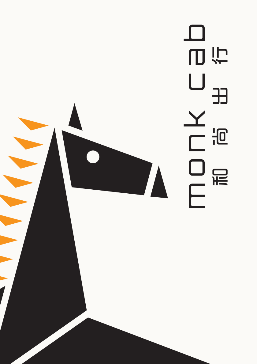
The body is a set of triangles and quadrilaterals; the mane is nine small triangles, the only orange in the mark. Beneath sit monk cab in a rounded geometric face and 和尚出行 spaced out to the same width. Stacked and horizontal lockups are drawn on a construction grid, with clear space and versions for charcoal and orange grounds.


App icons


03Colour and type
One orange,
one charcoal.
Just two colours, each stepped in five tints from 100 to 20 per cent. Orange goes to the mane and anything that should be seen from the kerb; charcoal to the horse and the words. English is set in Orbitron, bold and light; Chinese in 时尚中黑.
Orange
RGB 247 148 29 · #F7941D · CMYK 0 50 100 0
Charcoal
RGB 35 31 32 · #231F20 · CMYK 0 0 0 95
04In use
Scaled up to a sheet,
cropped to the head.
The horse gets better the larger it goes. The folder cover crops it to the head and neck, the mane’s triangles running up the sheet and the name set vertically beside it; the business card carries the horizontal logo on white, and a white horse on orange.

05Pattern
The mane’s triangle,
set in traffic.
Lift one triangle from the mane and repeat it, one row pointing up and the next pointing down, like traffic going both ways. The pattern leaves a clearing open in the middle for the horse to run through.
