Painting & paint retailGreater Toronto · Markham
They paint the walls.
They sell the paint.
- MOMO Painting & DecoratingPainting company
- MOMO Paints Inc.Benjamin Moore paint store

00The project
- Client
- MOMO Painting & Decorating · MOMO Paints Inc.
- Location
- Markham, Ontario
- Formats
- Roll-ups 33.5 × 80 in × 3; posters 24 × 36 and 18 × 24 in
- Year
- 2023
MOMO does two things under one name. MOMO Painting & Decorating sends painters out across the Greater Toronto Area; MOMO Paints Inc. runs a Benjamin Moore paint store in Markham. In April 2023 we designed the print for both: a roll-up banner for the painting company, two for the store, and the store’s posters in two sizes.
- Painting-service banner
- Two paint-store banners
- Store posters, two sizes
- Print-ready files
01The painting company
Strokes of a roller,
in MOMO’s purple.
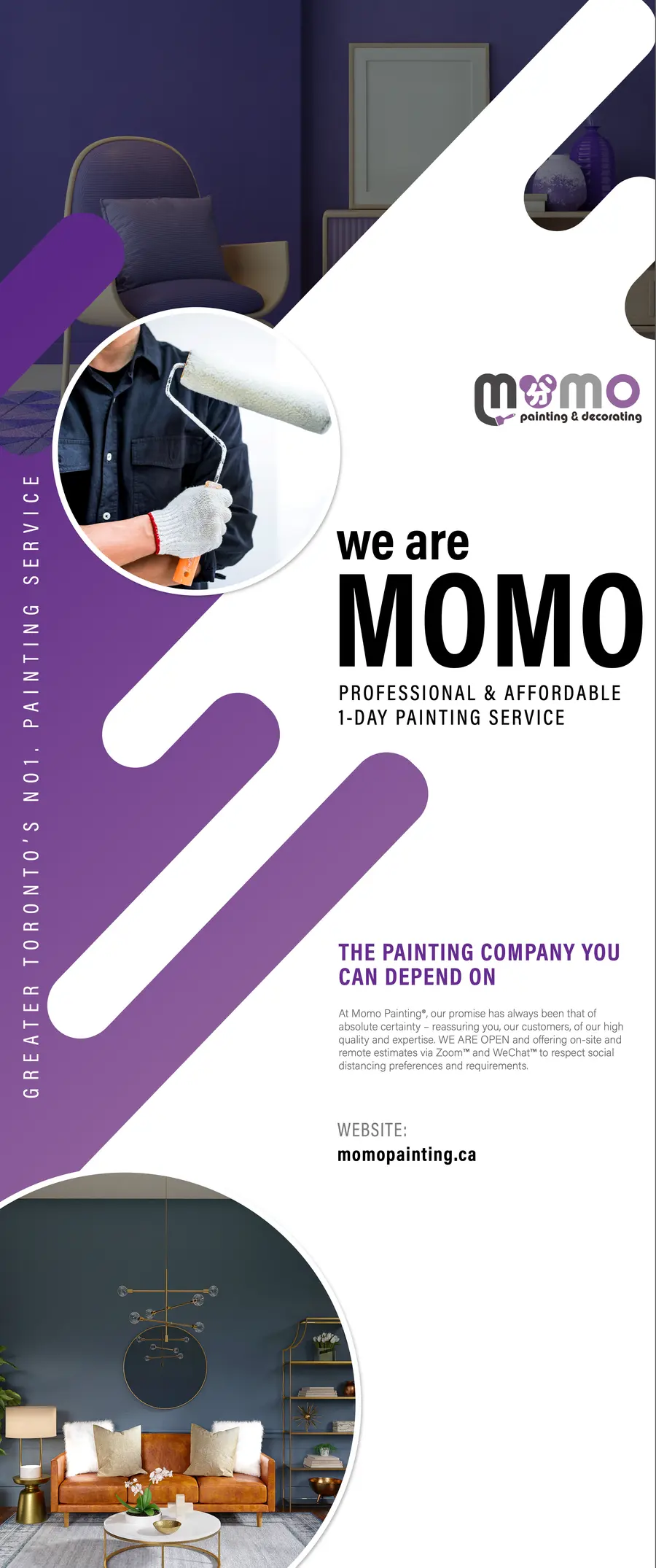
The service banner rests on one gesture: rounded bars climbing the panel at forty-five degrees, the marks a roller leaves, in two purples a shade deeper than the logo’s own. Two round windows open between them — a painter at work, a finished room — and the right-hand column carries the name in tall condensed capitals, then the service in a line.
02Colour · sampled from the print files
02The paint store
A paint store
that also sends painters.
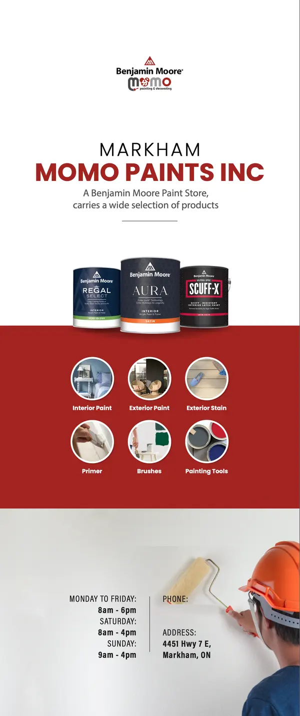
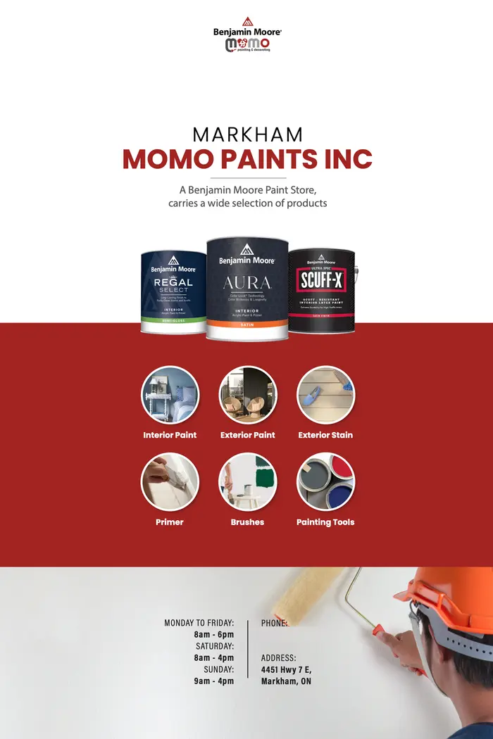
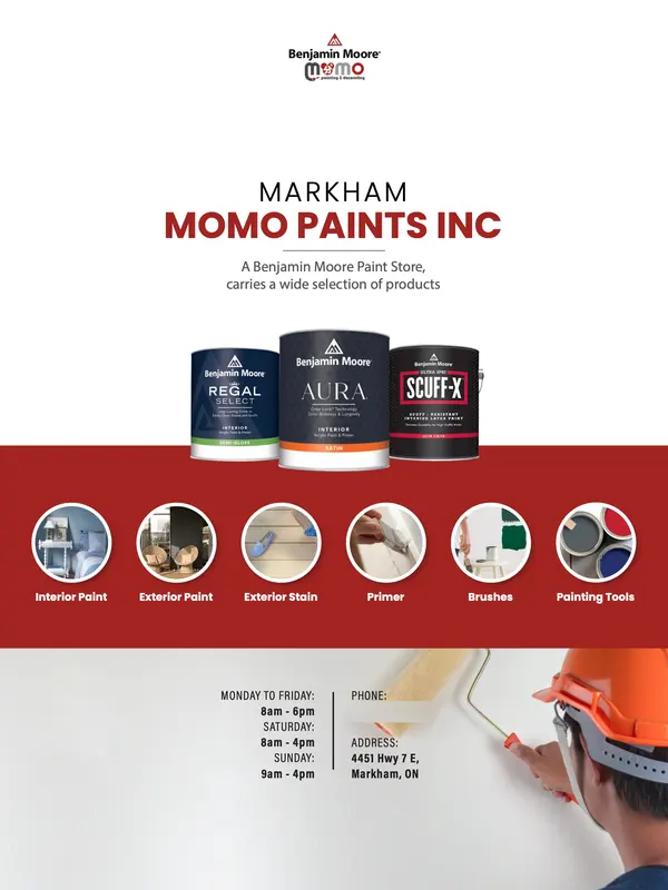
The store banner says three things in order: where (Markham), who (MOMO Paints Inc., a Benjamin Moore store) and what’s on the shelf — the three paints it leads with, standing on a band of red, and inside the band six round icons for the range: interior and exterior paint, stain, primer, brushes and tools. The same page was refitted as posters for the shop in two sizes.
01Six product categories on the red band
- 01Interior paint
- 02Exterior paint
- 03Exterior stain
- 04Primer
- 05Brushes
- 06Painting tools
03The full set
Four pieces of print,
at true scale.
Both banners stand 33.5 × 80 inches; the posters are 24 × 36 and 18 × 24. Below, the four stand side by side at their true relative sizes. A further store banner listed five painting services; it is built mostly on stock photographs and is not shown.