Nail salonLogo study
A hairline, six sprigs
and a name.

00The project
- Brand
- by MIA NAILS
- Sector
- Nail salon
- Year
- 2023
- Status
- Studio logo study
- Typeface
- Marcellus
The name carries a small lower-case “by” in front, like the signature at the end of a note. The capitals are inscriptional, and there are only two colours, warm taupe and near-black. The other half of the identity is a hairline that drops from the top of the layout to the bottom, with six slender sprigs growing along it. The card back, the price list and the social posts all keep that line.
- Wordmark
- Botanical stem
- Business card
- Price list layout
- Social posts
01Wordmark
Inscribed capitals,
and a small “by”.
The wordmark is set in Marcellus, a serif modelled on classical inscriptions, whose strokes flare slightly at the ends instead of finishing in bracketed serifs. MIA and NAILS stack right-aligned, and the lower-case “by”, half the height of the capitals, sits on MIA’s baseline, so the name reads as a signature: made by Mia.
The set uses two colourways only: near-black on taupe, and taupe on black. Right: “by” and the M enlarged, to show the flare at each stroke end.
02The stem
One line down the page,
six sprigs along it.
The stem is a single hairline that falls from the top of the layout to the bottom, with six sprigs of slender leaves set alternately along it. Each leaf is a pen outline left open, its vein a single stroke. It isn’t a corner flourish but a divider: on the card back it runs close to the right edge, and on the price list it splits the page into two columns.

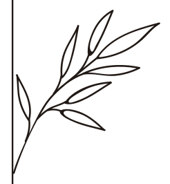



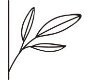
The six sprigs at their relative drawn sizes, from the original vector file. The fifth is the only one that grows to the left of the line.
03Business card
The name on the front,
the stem on the back.
A portrait card, taupe on both sides. The front carries only the wordmark, low in the left corner; on the back the stem runs top to bottom near the right edge, and a short dash at the lower left leads into the contact lines. The contacts themselves are not shown; three hairline rules hold their place, so only the layout reads.
04Price list
The same line
divides the menu.
On the price list the stem moves just left of centre: service headings in spaced capitals on the left, items, descriptions and prices on the right, with the sprigs reaching across between them. The item names, prices and descriptions in the original were placeholders; they are shown here as grey rules, so only the layout reads.