Glass doorsMarkham, Ontario
A frame,
and the sea inside it.


00The project
- Client
- Metal Sea
- Business
- Premium aluminum frame glass doors
- Location
- Markham, Ontario
- Year
- 2023–2024
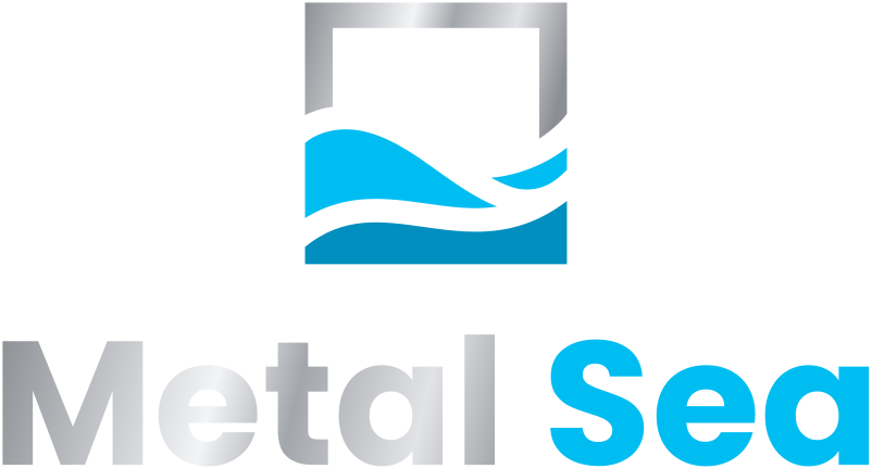
Metal Sea makes aluminum-framed glass doors in Markham, Ontario, and its name already holds two things: metal, and the sea. We drew both into one mark — a square frame for the door, and a sea that rises inside it and runs out through a break on the right — then set it down in a brand manual and on the company’s business card.
- Logo design
- Horizontal & stacked lockups
- Colour, one-colour & reversed versions
- Brand manual
- Business card (print)
01The mark
The frame is metal.
The sea is inside it.
The square is a door seen head-on. Neither of its sides reaches the ground: the water rises on the left, crosses the frame and runs out through a break on the right, so the sea is never quite held. Silver for the metal, two blues for the water — the name, drawn.
- 1The frameOne even stroke about a tenth of the square, like the profile of a door frame.
- 2The breakThe right side stops lower than the left; this is where the water spills out.
- 3Two watersA light swell above a deeper band, with a line of white between.
02The system
Across or stacked,
in colour, black or white.
The brand manual sets the mark and name in two lockups, horizontal and stacked, each in full colour, one-colour black and reversed. For this page the silver in the colour version is tuned once for light grounds and once for dark, so the metal reads on both.


- Metal silverGradient #5A5D62 → #B4B7BC
- Sea#00BDF1 · RGB 0 189 241
- Deep sea#008FBE · RGB 0 143 190
- Ink#0B0D10 · RGB 11 13 16

03Business card
A black card,
edged in gold.
For the printed card the mark turns to another metal. The front carries only the stacked logo in gold; the back has the name in white, one line on the trade, and three gold chevrons climbing from the corner like frames set one inside another.

Premium aluminum frame glass doors

Metal and glass,
and the sea between.