Food packagingCanada
A maple leaf,
a taste of Harbin.

00The project
- Client
- 哈爾濱印象 Memory Harbin
- Product
- Harbin red sausage · smoked
- Market
- Canada · English, French, Chinese
- Year
- 2025
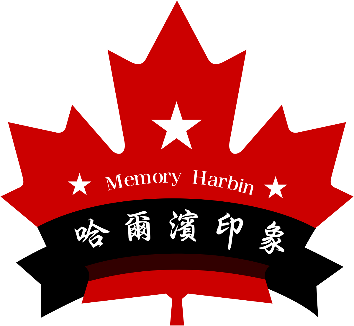
Memory Harbin makes Harbin-style red sausage in Canada. Its badge puts the two places together: a red maple leaf and a black ribbon with the name brush-written across it. In 2025 we designed the sausage’s package around that badge. Canadian rules ask for English and French on the label; the Chinese is a single name, for the people who grew up with the taste.
- Sausage packaging, three panels
- Badge artwork
- Trilingual label layout
01The badge
A maple leaf, three stars,
and a black ribbon.
The badge holds both places at once. The leaf is Canada’s; the ribbon across it carries 哈爾濱印象 in a brush hand, with Memory Harbin arched above between two small stars. On the package it holds at every size: whole on the front, and the leaf alone in a gold roundel on the band.
- 01Maple leafThe red leaf gives the outline
- 02Three starsOne at the heart, two flanking the name
- 03Arched nameMemory Harbin, in a serif
- 04Black ribbonAcross the leaf, folded at both ends
- 05Brush-written name哈爾濱印象, five characters

02The package
Three panels,
saying the same thing.
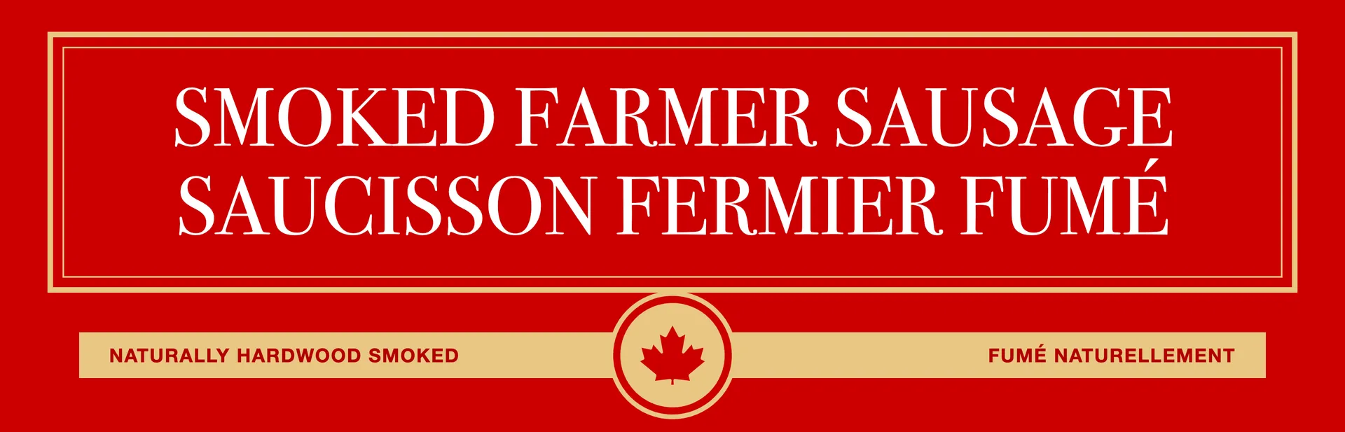
The file holds three panels: a red front inside a gold frame, a white front with the badge beside the product, and a top panel cut like the flag — red, white, red, the badge in the middle and 紅腸 beneath it. Each says the same things in the same order: the name in English and French, how it’s smoked, fully cooked, keep refrigerated, and 百年傳承 along the base.
03Three languages
English, French,
and one Chinese name.
Canadian food labels carry English and French with equal weight, so the two names stand as a pair in the same serif capitals, one above the other. The Chinese doesn’t translate them; it names the thing the way someone from the north-east would ask for it: 紅腸, red sausage. Below is the copy all three panels share, in the label’s order.
| Line | English | Français | 中文 |
|---|---|---|---|
| Name | Smoked Farmer Sausage | Saucisson fermier fumé | 哈爾濱紅腸 |
| Process | Naturally hardwood smoked | Fumé naturellement | — |
| Serving | Fully cooked · Heat n’ serve | Entièrement cuit · Chauffer et servir | — |
| Ingredients | No artificial flavours or colours | Sans arômes ni colorants artificiels | — |
| Storage | Keep refrigerated | Garder réfrigéré | — |
| Base band | — | — | 百 / 年 / 傳 / 承 |
