Logo proposalSeven badges
One green name,
seven badges.
00The project
- Client
- Maple Ocean International
- Brand
- HIGREENS
- Year
- 2017–2018
- Scope
- Logo proposal, seven directions
HIGREENS is a name under Maple Ocean International. In 2018 the studio answered with one presentation board of seven round badges: MAPLE OCEAN over the top and INTERNATIONAL beneath, a red maple leaf in the middle, fields or water below, and the name on a ribbon. All seven share one skeleton; what changes is the ribbon and the landscape.
- Logo proposal
- Seven badge directions
01The board
The same board,
set again.
The board delivered in 2018 survives only as a low-resolution image, and the skies, grass and fields inside its badges were photographs and illustration of unrecorded origin, most likely stock, so the original is not shown. Here it is set again in the same order, bands and type styles: all seven badges redrawn as flat vector, the photographs turned to flat colour, at consistent sizes and lettered A to G so they can be discussed.
02Seven directions
One skeleton,
seven ribbons.
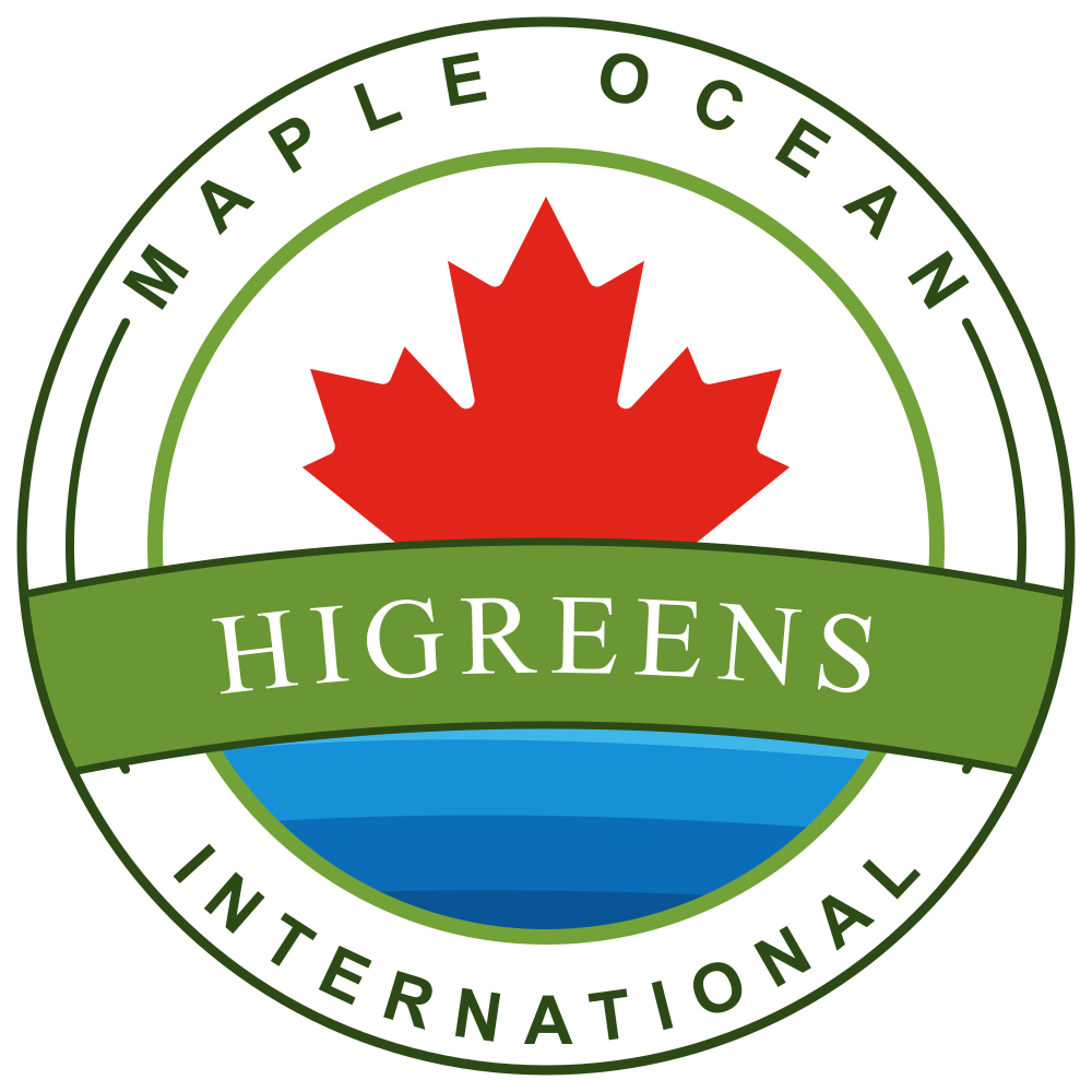
Direction A led the board: a large leaf over water, HIGREENS in a serif on a green ribbon, no date. The other six move to sky and grass or painted fields, split the name into HI and GREENS, and try the ribbon’s curve, the weight of the type and where HI sits, one change at a time.
A large leaf over water, HIGREENS on a green ribbon
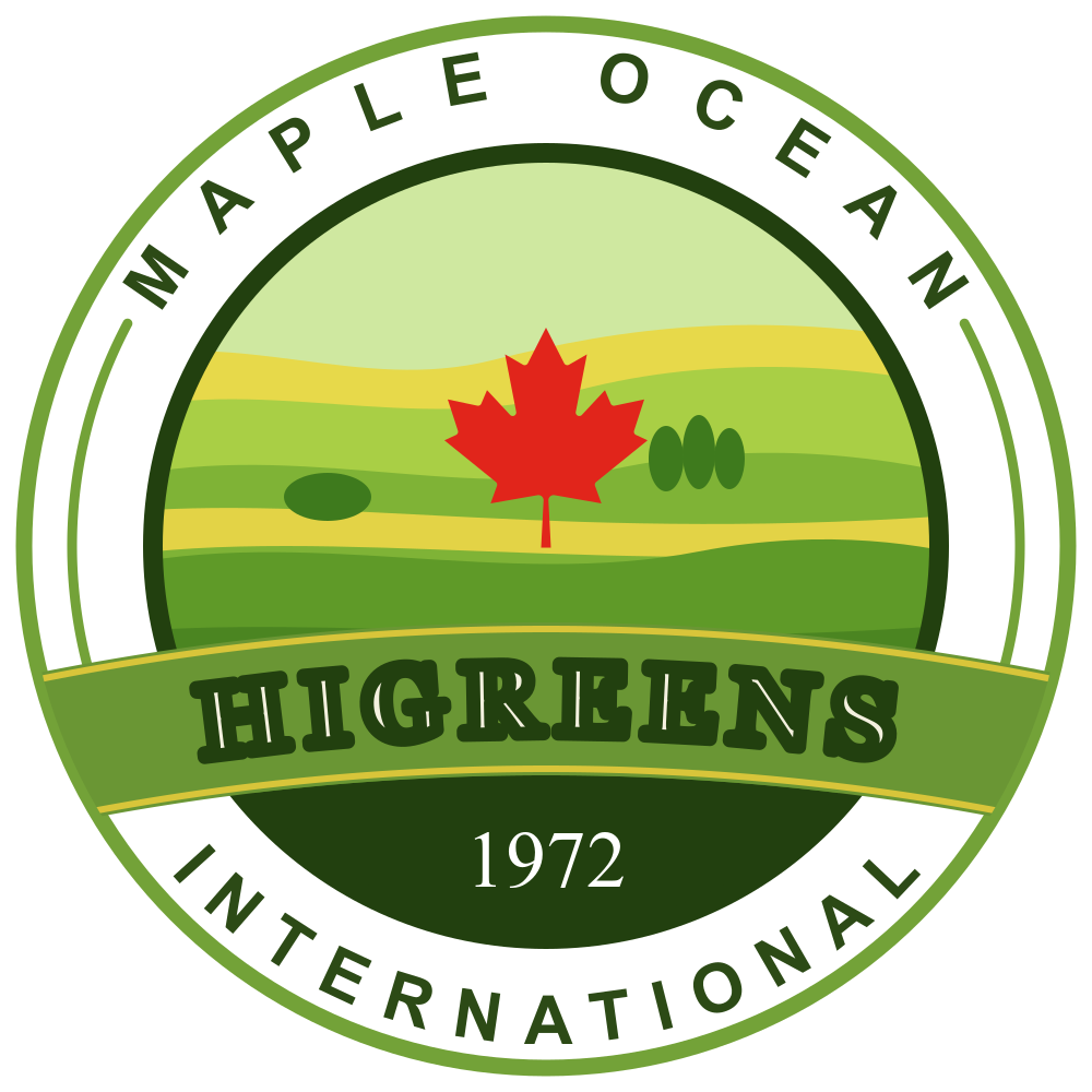
BPainted fields, HIGREENS with a dark outline
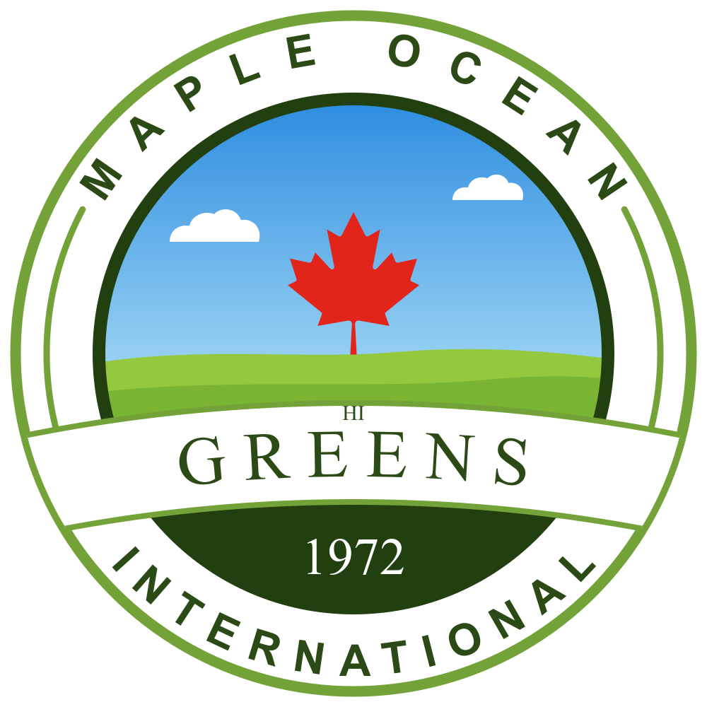
CSky and grass, a fine serif GREENS, HI set above
DA heavy lowercase greens, the most casual
EA bold serif GREENS, HI moved to the left
FA straight banner that breaks the ring
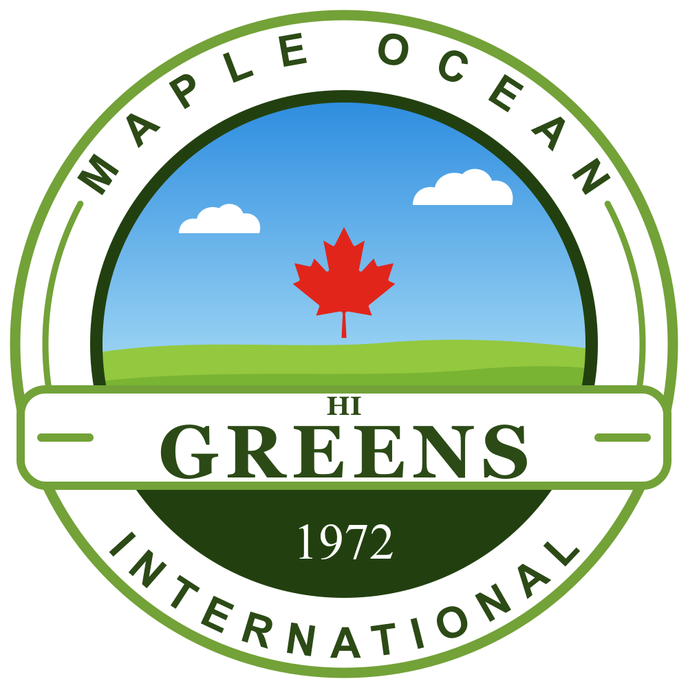
GA rounded banner with side rules, HI stacked over GREENS
03Anatomy
Five parts,
one seal.
All seven share one skeleton: two rings holding the company name, a round window for the landscape, and a ribbon across the window for the brand name. The redraw keeps that skeleton and only evens out line weights and spacing, so the lettering runs evenly around each arc.
- 1
Outer ring
MAPLE OCEAN runs along the top arc, with a short inner arc closing each side.
- 2
The leaf
One red maple leaf, at the centre in all seven.
- 3
The ribbon
Where the name sits, and where the seven differ most.
- 4
The lower field
Water in direction A; a deep green field carrying 1972 in the rest.
- 5
Bottom arc
INTERNATIONAL along the bottom arc, completing the company name.