Tea barGreater Toronto · three stores
Wheat in the M,
tea in the cup.

00The project
- Client
- M Chá Bar
- Sector
- Fruit and milk teas
- Where
- Greater Toronto Area
- Year
- 2022
M Chá Bar is a tea bar with three stores across the Greater Toronto Area: fruit teas made from fresh fruit with nothing artificial, milk teas made with local organic milk. In 2022 we set out its mark — a serif M whose middle stroke grows into a stalk of wheat, held in a circle — fixed its navy, copper and stone, and designed the website’s home page.
- The mark, solid and line versions
- Palette: navy, copper, stone
- Website home page
01The mark
A letter
that grows wheat.
The M is a serif capital whose middle stroke grows into a stalk of wheat. It comes in two versions: a solid navy seal with the M reversed out, for the small places that must stay clear — cups, signs, avatars — and a single copper line on navy, for the website and the quieter moments. CHÁ BAR sits underneath in wide-set capitals, accent kept.
RGB 0 36 94
RGB 141 96 65
RGB 220 220 208
02On the cup
Printed on the cup,
coloured by the drink.
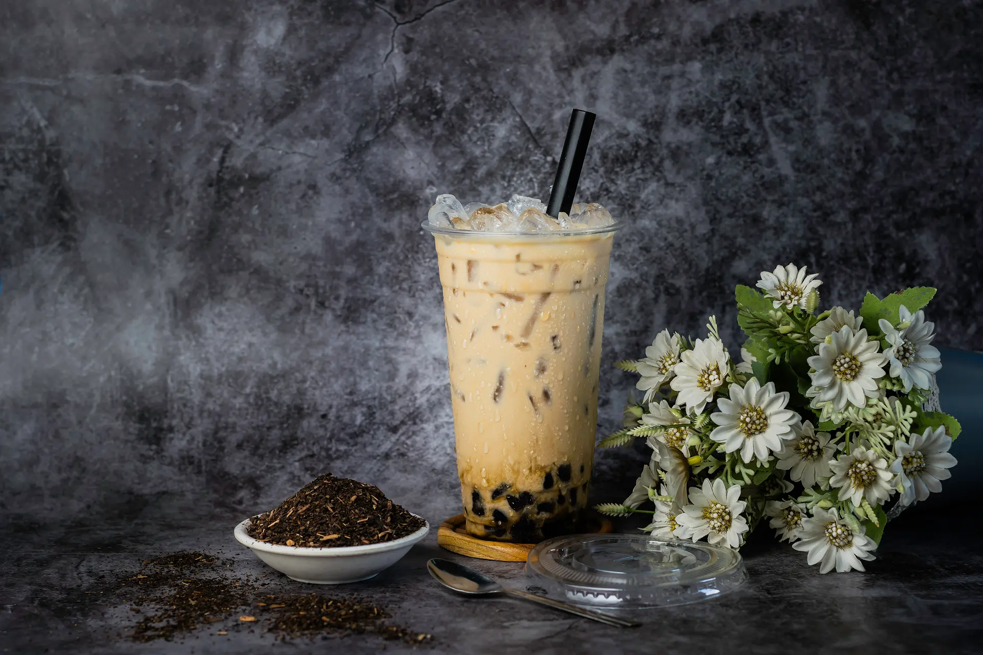
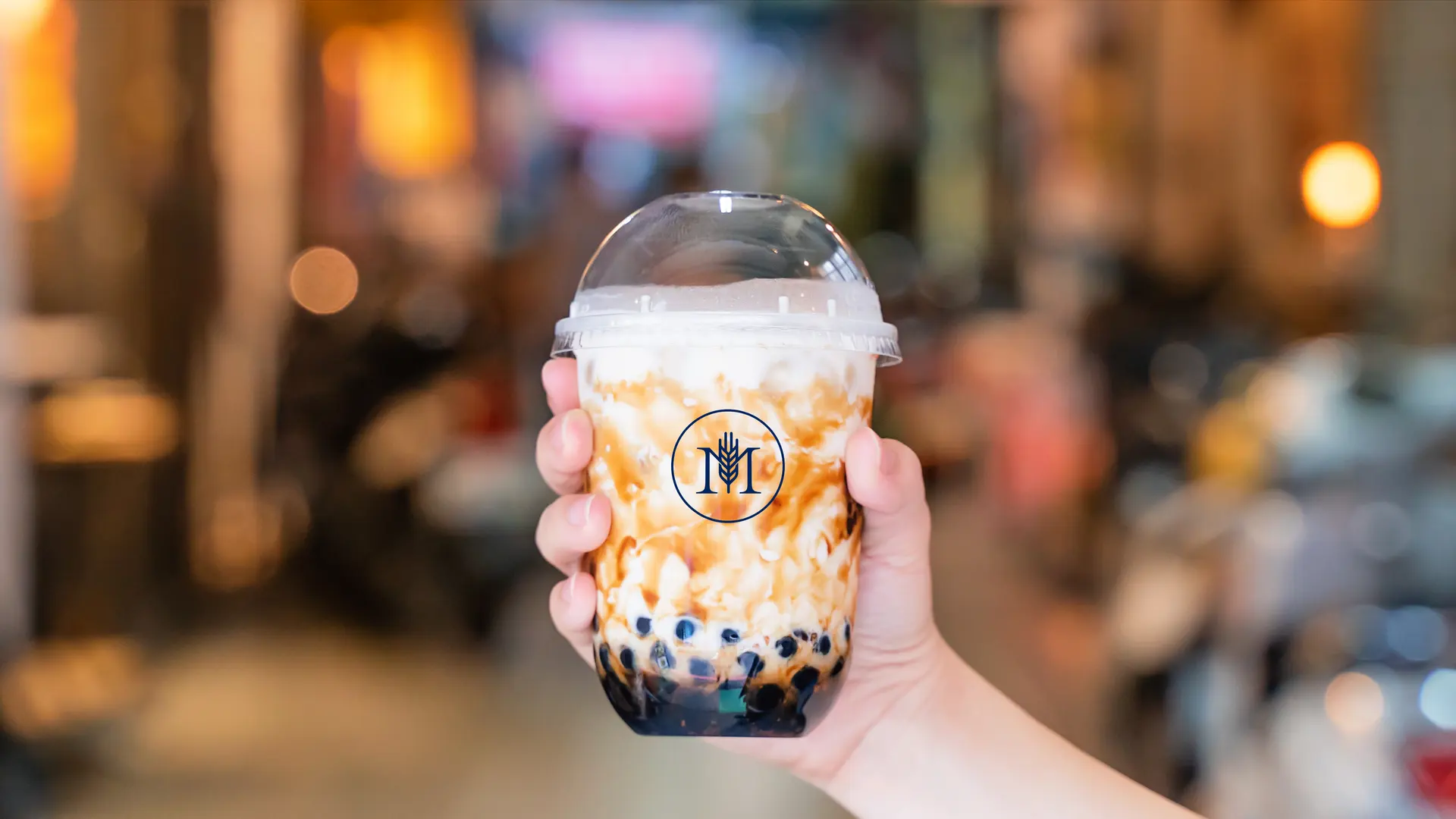
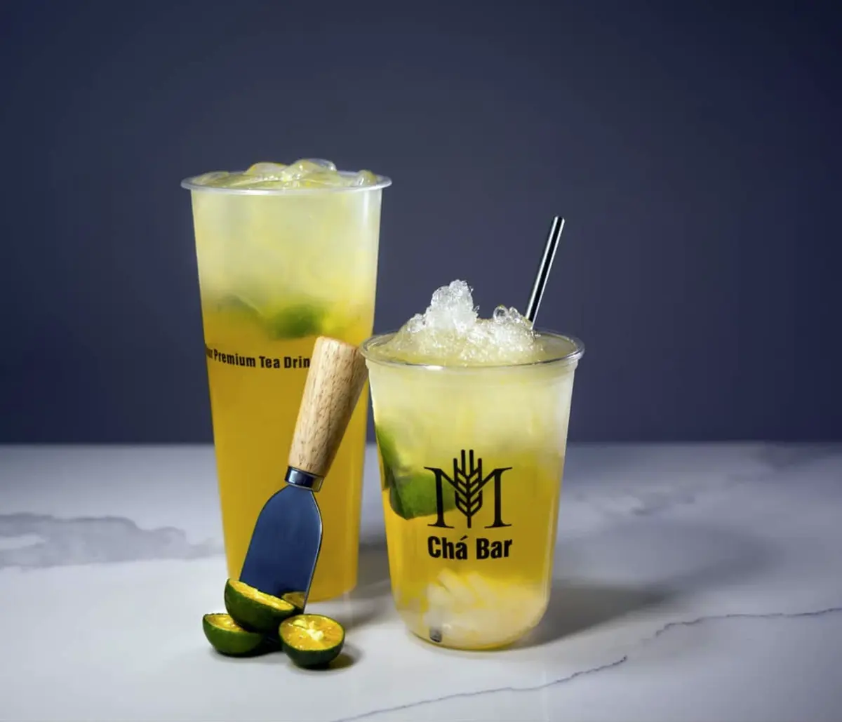
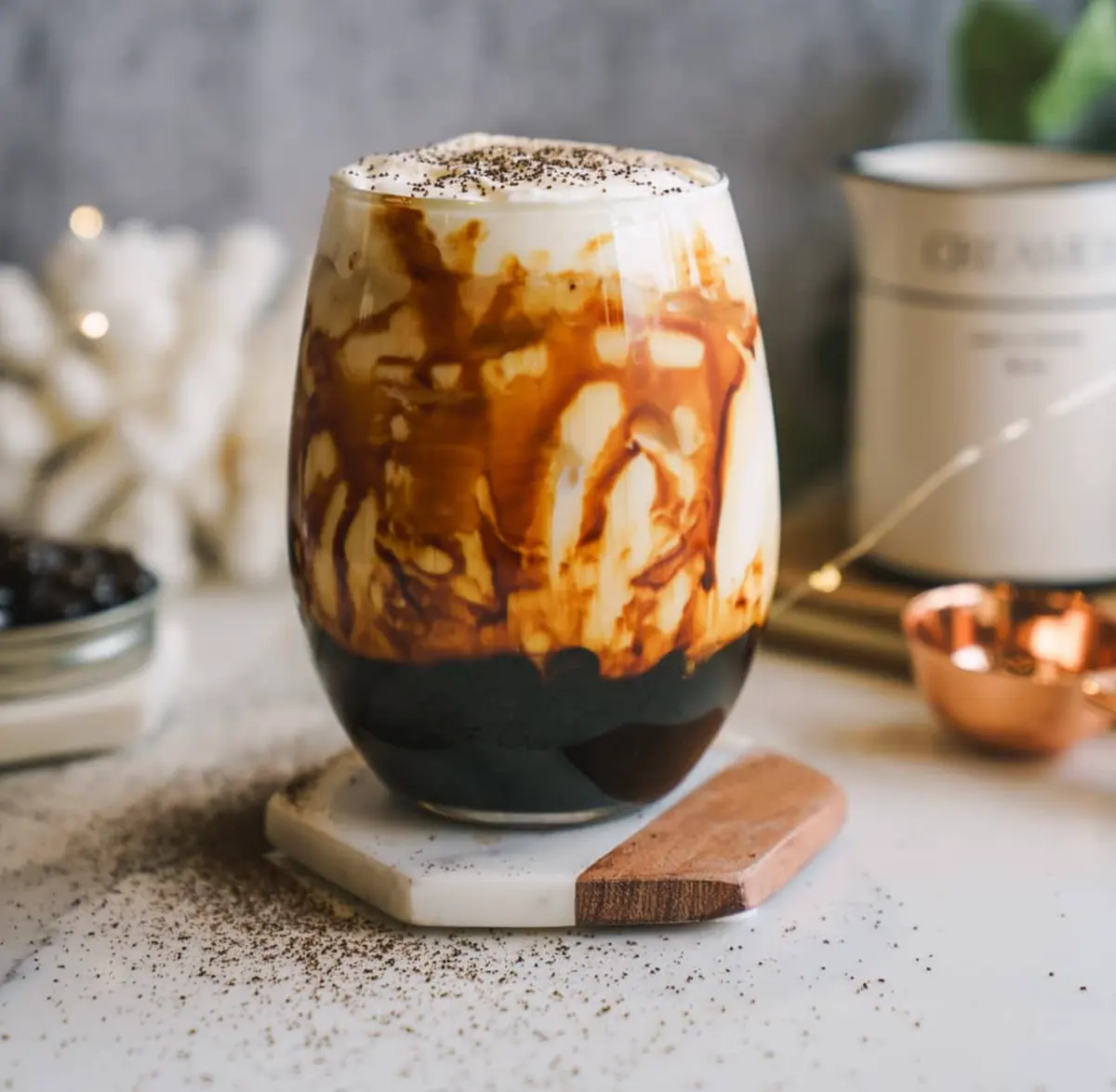
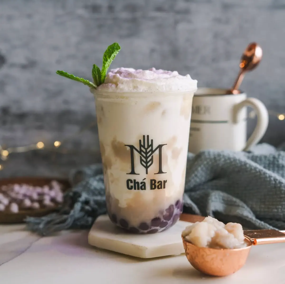
In the shop the mark is printed in one colour on clear cups, and the drink becomes the ground: citrus yellow, taro lilac, brown sugar. These product photographs come from the 2022 design file and lead the site’s “Popular this year”.
03The website
A website
steeped in navy.
The home page opens on a navy field that deepens from left to right, as on every page of the identity. Baskerville gives the titles a café-menu warmth; copper draws the hairlines, card frames and buttons. Below come the year’s popular drinks, the story and the three stores. Re-set here in HTML from the 2022 layout, with the shop’s own copy in place of the placeholder text.


Home page · re-set from the 2022 layout