Sheng jian baoToronto
In Toronto,
as if in Shanghai.
00The project
- Client
- Kissing Bun 双城记生煎馆
- Location
- Bayview Avenue, Toronto
- Year
- 2022
- Sector
- Restaurant · Shanghai buns
Kissing Bun is a sheng jian bao shop on Bayview Avenue in Toronto. The name comes from how the bun is eaten: bite a small opening in the top, sip out the soup, then eat — which looks a lot like a kiss. In 2022 we made the shop four things: the sign over the street, a brush-written lockup that reads 双城记, a tri-fold menu and an opening poster.
- Storefront sign
- 双城记 brush lockup
- Tri-fold menu
- Opening poster
01The brush
Two cities,
one brush.
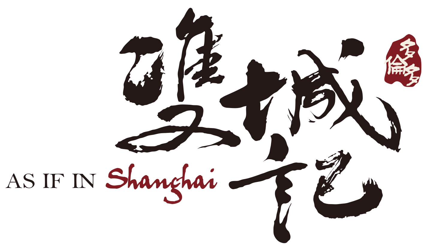
双城记 — “a tale of two cities” — is written with a brush, dry strokes and all: that is the Shanghai side. A red seal in the corner reads 多伦多, Toronto: this side. Beneath runs one line of English, As if in Shanghai. Brush, seal and line together say what the name means at a glance.
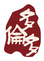
Seal · 多伦多, Toronto
- Ink#231815
- Seal red#811D22
- Sign red#D72229
- Rice paper#F4EEE3
02The sign
A sign that carries
across Bayview.
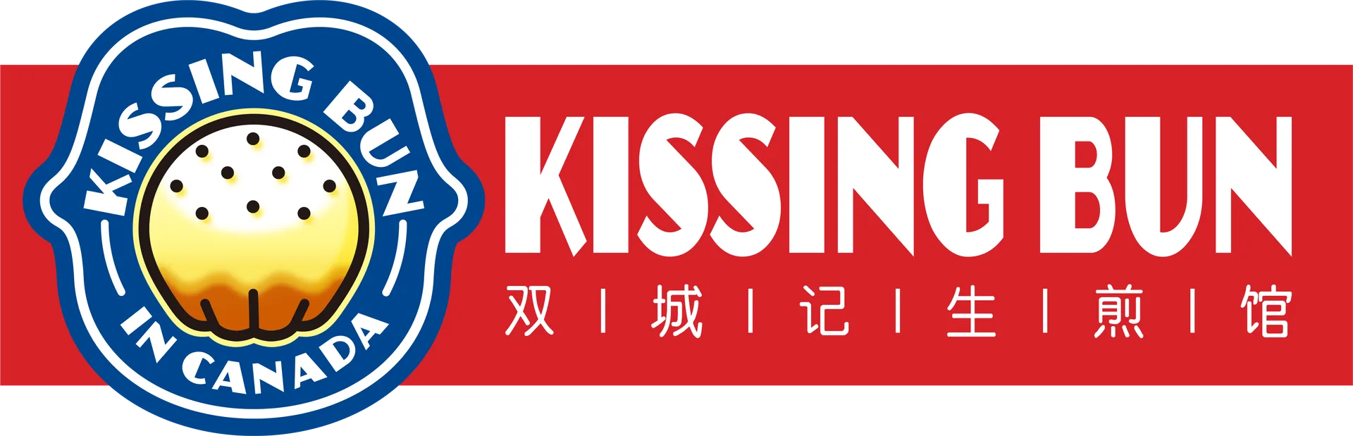
The sign speaks in the other voice: white on red, tall narrow capitals with angled cuts so KISSING BUN holds up from across the road, and beneath it 双|城|记|生|煎|馆 spaced with bars for customers who read Chinese. The file went to the sign maker with one instruction — scale to fit — so the whole board grows with the shop front.

双城记生煎馆
The Chinese line of the sign, re-set at the original spacing03Signed
The brush,
signing every photo.
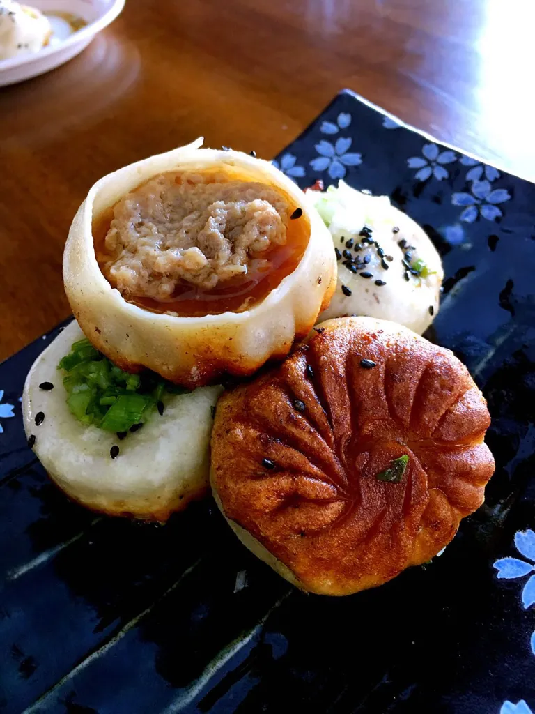
By the end of March 2022 the lockup was already printed in white in the corner of the restaurant’s own food photographs, the way a painter signs a scroll. They are shown here as they were taken: pot stickers, buns, Chinkiang vinegar, and one bun bitten open.
04The menu
A tri-fold menu
you can read across a counter.
A tri-fold, printed both sides. Inside: buns in five fillings, three noodles with thirteen toppings, six dim sum. Outside: the story of the name, seven milk teas and the cover. The original sat on a dark wood-grain photo, small and crowded; here it is re-set on rice paper from the original dishes and numbering, without the prices.
What is a Kissing Bun什么是亲嘴包
生煎包是江浙沪一带的民间小吃,至今已有一百多年。鲜面团包上肉馅,直接下平底锅煎,皮薄汁多,底部酥脆。
肉冻遇热化成汤汁,所以要先在顶上轻轻咬开一个小口,把汤吸干,再大口吃。看上去就像在亲吻生煎包,亲嘴包的名字由此而来。
A popular snack across Jiangsu, Zhejiang and Shanghai for more than a hundred years. Bite a small opening in the top, sip the soup, then eat. Done in that order it looks like a kiss — hence the name.
Please let us know if you have any food allergies
Bubble tea珍珠奶茶
- B1Milk tea原味奶茶
- B2Coconut milk tea椰香奶茶
- B3Peach milk tea蜜桃奶茶
- B4Mango milk tea芒果奶茶
- B5Taro milk tea芋头奶茶
- B6Brown sugar milk tea黑糖奶茶
- B7Aurora极光杯
Black or green tea · 红茶或绿茶
Tapioca / jelly · 珍珠 / 椰果
双城记生煎馆
Classic Kissing Buns弄堂生煎包
4 pc · 四只
- K1Pork猪肉
- K2Beef牛肉
- K3Chicken鸡肉
- K4Shrimp虾仁
- K5Vegetarian全素
Noodles面
- N1Soup noodle汤面
- N2Dried noodle凉拌面Green onion oil / sesame · 葱油 / 麻酱
- N3Fried noodle炒面
Meat toppings · 荤浇头
红烧狮子头 · 糖醋排骨 · 葱烤大排 · 五香牛肉 · 酱爆猪肝 · 酱鸭 · 辣子鸡丁
Vegetarian toppings · 素浇头
素三丝 · 罗汉上素 · 雪菜冬笋毛豆 · 四喜烤麸 · 五香素鸡 · 油焖笋
Dim sum点心
- D1Pork fillet with sticky rice cake上海排骨年糕
- D2Pot sticker锅贴Pork / beef / vegan · 猪肉 / 牛肉 / 全素
- D3Small steamed bun小笼包
- D4Small wontons小馄饨
- D5Dumpling饺子Pork & cabbage / vegan · 猪肉白菜 / 全素
- D6Pork pastry鲜肉酥饼
05The poster
The opening poster
says one thing.
The opening poster stacks three things: the brush, the sign lettering and a pan of buns straight off the heat, with one line at the foot — 到店有惊喜,每周三半价, a surprise in store and half price every Wednesday. It is re-set here from the original layout with the restaurant’s own photograph, without the phone number and address.
 生煎馆
生煎馆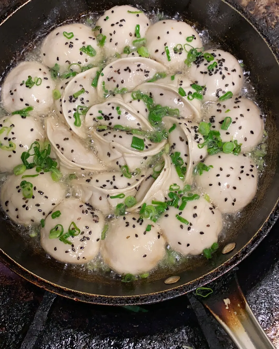
到店有惊喜每周三半价