Studio design study · Wine
Gold on black,
a bird in flight.

00The project
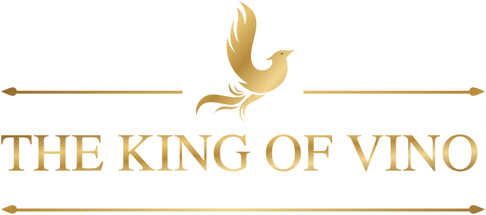
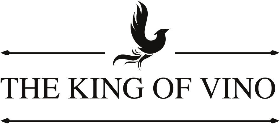
The King of Vino is a wine identity Angel drew in 2023 as a studio design study. It rests on one emblem — a bird rising, its tail trailing into flourishes — set between two arrow-tipped rules above a serif wordmark, in gold foil on black. She took it onto a bottle, business cards and shopping bags. Here the parts she designed are re-drawn as vectors from her source file; the stock mock-ups they sat in are not reused.
- Project
- The King of Vino (study)
- Designer
- Angel
- Year
- 2023
- Scope
- Emblem & wordmark · Four colourways · Label & capsule · Business card · Shopping bags
01The emblem
A bird rising
between two arrows.
Three parts, all from the source file: the bird, the serif capitals of THE KING OF VINO, and two rules ending in arrowheads that point outward. The original lockup carried a founding year on the lower rule; no such date is on record, so the rule is drawn through. The study used the mark four ways — gold on black, black on white, black on gold, and wine on paper.

02The label
A gold label,
a bird on the capsule.
The label is one band of gold carrying the lockup in black and, beneath it, the grape: Sauvignon Blanc. The capsule repeats the bird inside a thin ring. The bottle is re-drawn here as a vector after the designer’s mock-up; two other bottles in the set wore stock label templates and are left out.
03Cards and bags
Gold on black,
held in the hand.
The business card carries the lockup alone on its front; the back sets the bird beside a gold rule, with the contact lines shown here as blank bars. The shopping bags come in white and in black, the lockup centred on each.
