Day of Design
← All work2021 / 2026 REFINEMENT

JOYMOON MEDIA / EVERYDAY CONNECTIONS

JoyMoon Media — A place in the everyday.

A familiar object. A new expression.IDENTITY / PACKAGING / COMMUNICATION
JoyMoon cutlery-wrap application concepts
Cutlery-wrap concepts · AI-assisted mockup
Where brands meet everyday life.

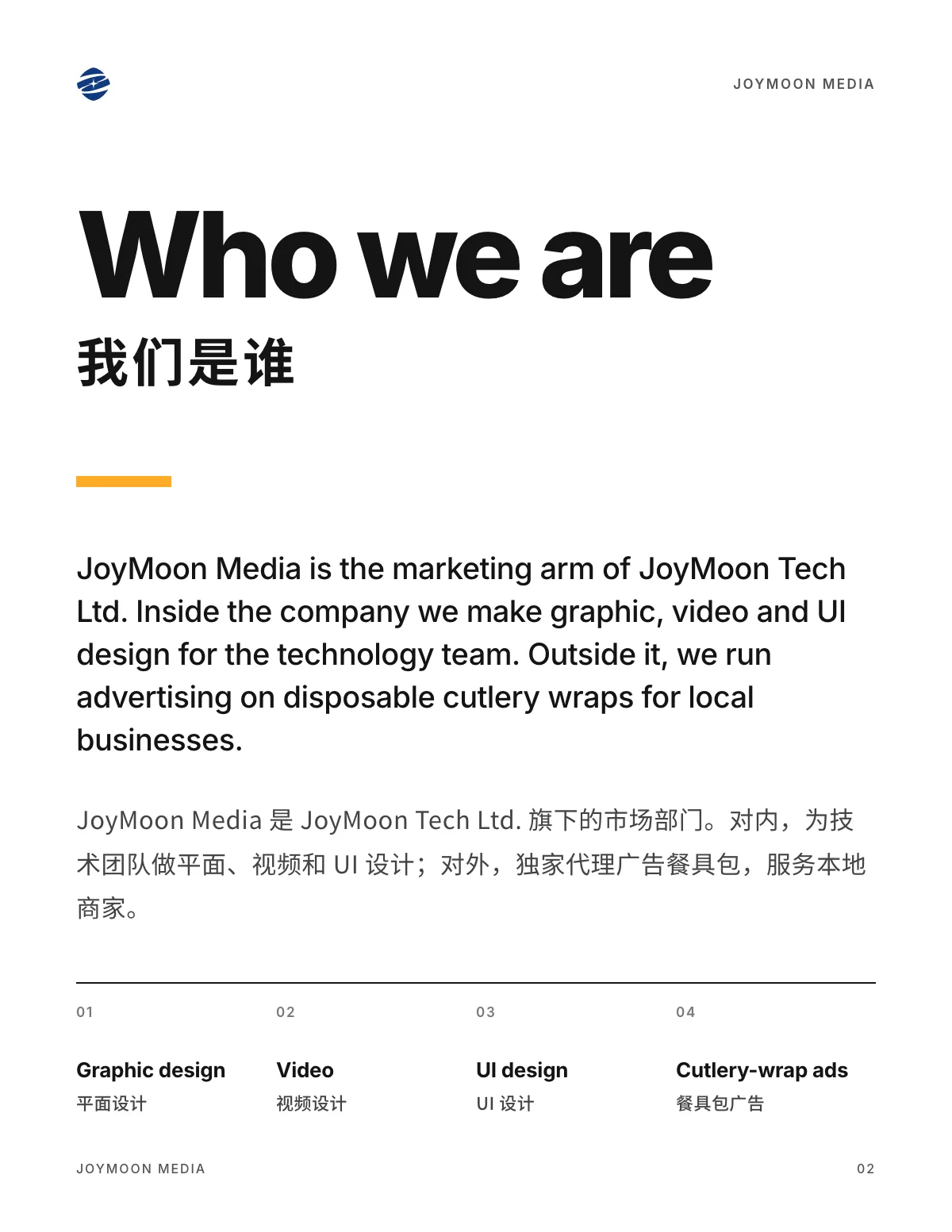
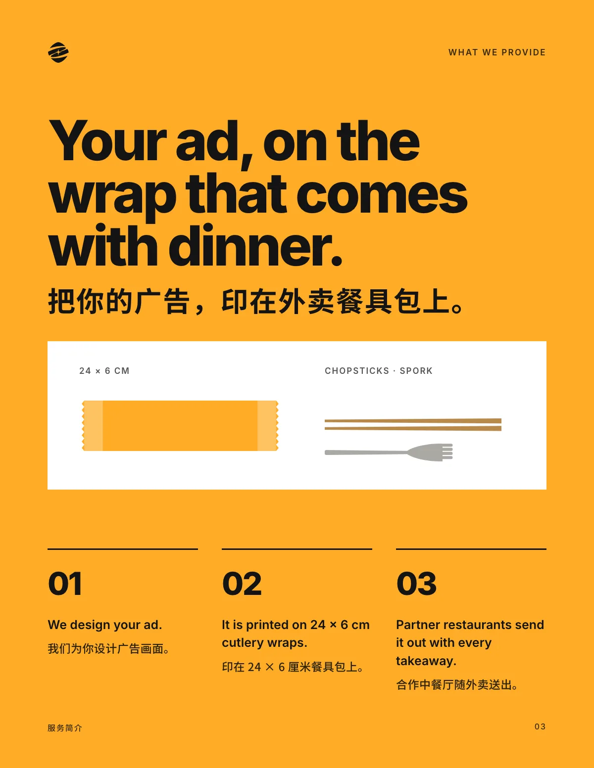
JoyMoon places advertising on cutlery wraps distributed with restaurant takeaway. Starting with this familiar object, we made the service easier to understand and gave its narrow format a distinctive, confident visual language.

  • Identity refinement
  • Cutlery-wrap concepts
  • Bilingual brand posters
  • Service communication
  • Brand card
  • Four-page service edition
The complete original JoyMoon emblem and wordmark
The original JoyMoon orbit-and-star emblem on warm yellow
01 / Recognition, with a clearer rhythm

A familiar mark. A clearer voice.

The original orbit, star and slanted wordmark remain intact. Deep blue continues the identity, warm yellow adds an approachable tone, and paper-white gives the message room to breathe.

BLUE
YELLOW
PAPER
02 / EVERYDAY CONNECTIONS

A small format. A clear statement.

One identity, three voices. A clear headline, a stable brand position and generous space give English, Chinese and each colour variation the same easy reading rhythm.

Complete blue Hello, neighbour. cutlery-wrap artwork

Complete blue Hello, neighbour. cutlery-wrap artwork

Blue / EnglishComplete flat artwork ↗
Brand, format and everyday moments in a three-part visual sequence

Brand, format and everyday moments in a three-part visual sequence

From brand to format to everyday life
03 / ORIGINAL PRODUCT PHOTOGRAPHY / 2021

An everyday object. A place for a message.

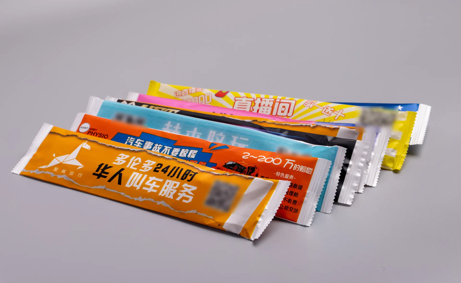
The original product photographs show the service in tangible form: narrow cutlery pouches, advertising samples and the utensils inside. Complete frames preserve their material, proportions and purpose. The advertisements shown are historical samples.

Original 2021 archive photograph: a selection of advertising cutlery wraps, complete frame

Original 2021 archive photograph: a selection of advertising cutlery wraps, complete frame

Original archive photograph / Advertising cutlery-wrap samples
Original 2021 archive photograph: a fan of cutlery-wrap samples, complete frame

Original 2021 archive photograph: a fan of cutlery-wrap samples, complete frame

Original archive photograph / Packaging samples
Original 2021 archive photograph: a cutlery pouch, bamboo chopsticks and a spork, complete frame

Original 2021 archive photograph: a cutlery pouch, bamboo chopsticks and a spork, complete frame

Original archive photograph / Cutlery set
04 / ONE IDEA, TWO LANGUAGES

A place in the everyday.

The clarity of the packaging carries into a larger canvas. Bilingual posters share a consistent identity position and four sloping bands, keeping the visual language recognisable across scales.

Complete A place in the everyday. English poster artwork

Complete A place in the everyday. English poster artwork

English brand poster
Complete Chinese poster artwork: a place for brands in the everyday

Complete Chinese poster artwork: a place for brands in the everyday

Chinese brand poster
Four warm-yellow sloping bands on deep blue
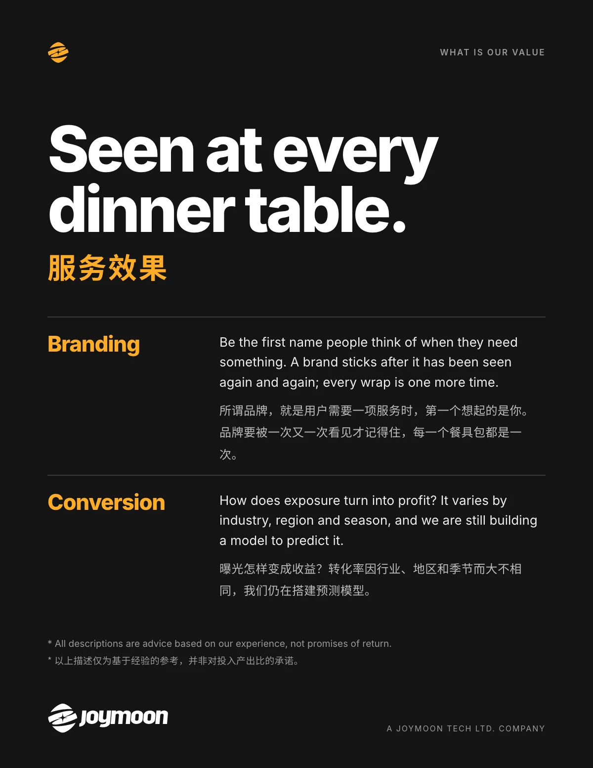
A four-page folded JoyMoon service leaflet shown as a print concept
Four-page folded service leaflet · AI-assisted print mockup
05 / SERVICE EDITION

Make the service easy to understand.

Four pages move from the brand statement to the service, the packaging and the design approach. A concise hierarchy gives every piece of information its place.

Download service editionPDF / 4 pages ↓
JoyMoon service edition page 1: Brand statement

JoyMoon service edition page 1: Brand statement

01 / Brand statementRead larger ↗
HELLO, NEIGHBOUR.

A connection starts with a little hello.

Complete warm-yellow Hello, neighbour. brand card artwork

Complete warm-yellow Hello, neighbour. brand card artwork

Warm-yellow brand card
A place in the everyday. landscape brand artwork

A place in the everyday. landscape brand artwork

Landscape brand artwork
CLIENT
JoyMoon Media
DESIGN PERIOD
2021
2026 refinement
SCOPE
Identity, cutlery-wrap concepts, bilingual posters, service edition and brand card

Developed from the original 2021 designs, copy and product photographs. All eleven original JoyMoon vector paths are retained. Typography, supporting graphics, packaging, posters and the service edition are 2026 portfolio refinements with adoption and production specifications unconfirmed. Historical photographs retain complete frames; their advertising content belongs to the samples of that period, not current services or offers, and does not establish authorship of third-party ads. AI-assisted packaging and leaflet scenes are application concepts.