Farm standLavender · honey · vegetables
Everything the farm sells,
on one banner.

00The project
- Client
- Honey Lavender Farm
- Year
- 2023
- Sells
- Lavender goods, hydrosols, honey, vegetables
- Size
- Roll-up, 85 × 200 cm
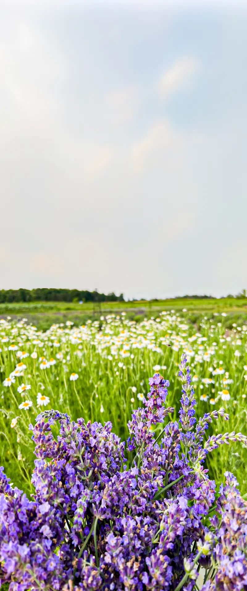
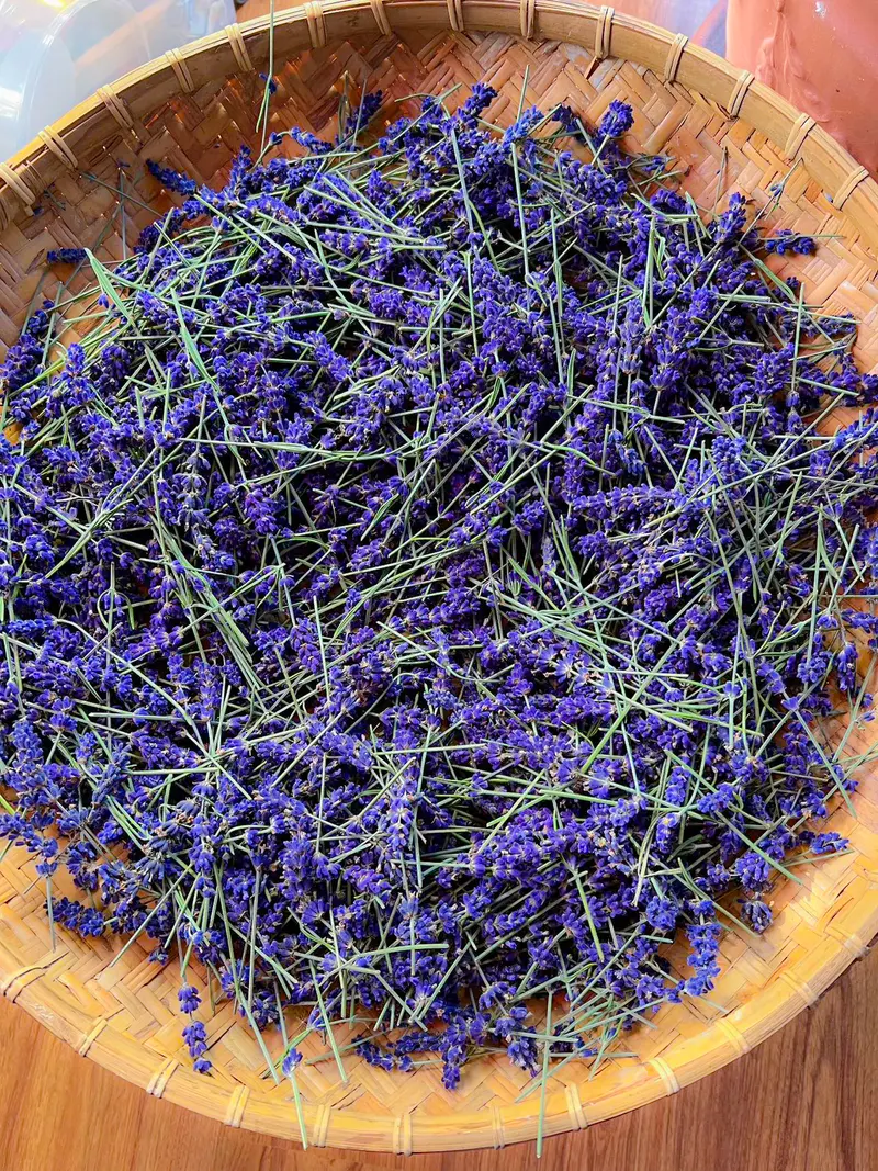
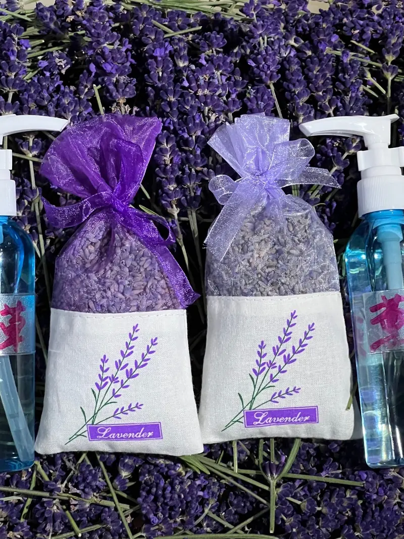
Honey Lavender Farm grows lavender and vegetables, and sells what the lavender becomes — essential oil, sachets, hydrosols — alongside Canadian honey. In 2023 it needed one thing to stand behind its market table: a banner that says, from across the market, what’s for sale and how to stay in touch. We made it from the farm’s own photographs.
- Market roll-up banner, 85 × 200 cm
- Two title versions
- Photo selection & background composite
- Print files
01The banner
Read from across
the market.
Two metres tall, and it has to read from ten metres away. The farm’s name goes at the top, in the sky; the four things to buy sit in the middle, at eye level; the lavender itself fills the bottom, the part a table hides anyway. The 2023 files came in two versions — the name in spaced capitals, and in a script — with the products in tilted photo frames. Re-set here, the capitals stay and the four products line up on one card.
02What’s for sale
Four things,
four colours.
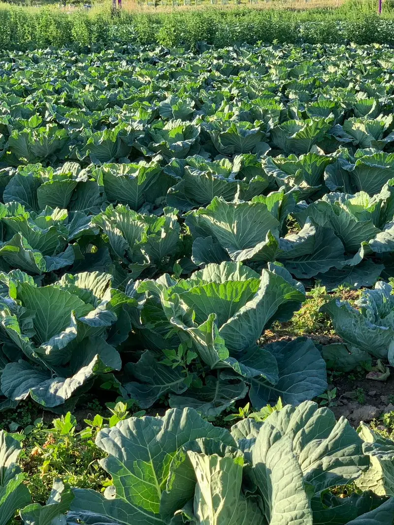
The banner gave each product a colour of its own: deep violet for lavender, leaf green for vegetables, honey orange, orchid for the hydrosols. The page keeps the four with the farm’s own photographs; the farm had no picture of its honey, so a honeycomb drawn in honey orange stands in.
- 01
Lavender
薰衣草
Essential oil · sachets - 02
Seasonal vegetables
当季蔬菜
Cabbage · bitter melon · tomatoes - 03
Canadian honey
加拿大蜂蜜
- 04
Hydrosols
花水纯露
Lavender · mint · Roman chamomile

Lavender, honey, and whatever’s in season.