Indoor golf & bar · Markham, Ontario
Golf and beer,
all summer long.


The project
- Client
- GolfWing
- Sector
- Simulator golf & bar
- Place
- Markham, Ontario
- Year
- 2024 · redesigned 2026
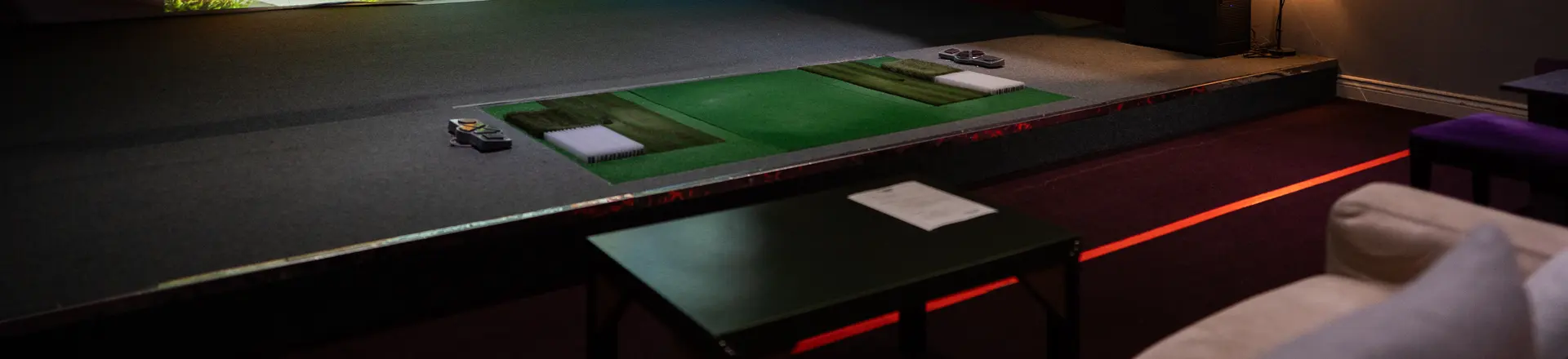
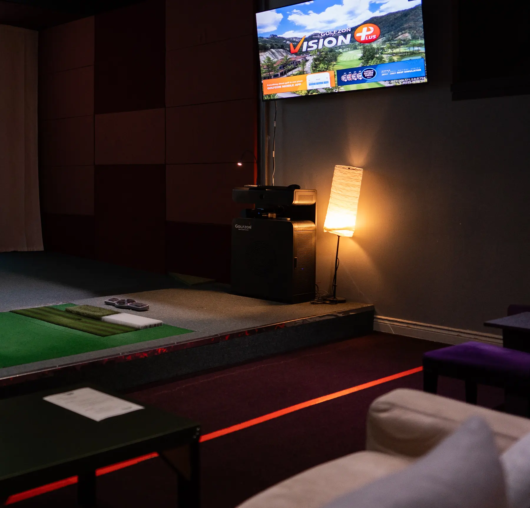
GolfWing runs Golfzon simulator bays with a bar in Markham, Ontario. In summer 2024 it ran one offer — a round and a beer, summer hourly rates — across three phone stories and a screen in the venue. Each 2024 frame crowded a stock model, two cut-out beer glasses, the address, the phone number and a paragraph of rates. This redesign answers the same brief again: the venue’s own photograph as the only picture, one idea per frame, and the rates set as a scorecard.
- Summer promotion · three 9:16 stories
- In-venue 16:9 screen
- Summer rate card
- Wordmark for dark grounds
The mark
Green for the golf,
lime for the wing.
The wordmark is the client’s own and arrived as one small two-colour file. We cleaned it up and added a reversed version — GOLF in bone, WING kept lime — for the dark rooms and screens the brand actually lives on. Both greens are sampled from the mark itself.
Reversed · dark grounds Colour · light grounds
RGB 0 119 54
RGB 140 198 63
RGB 11 18 14
RGB 241 240 230
Stories
One offer,
three frames.
The summer offer is split into three frames, one sentence per swipe. The first is the bay itself and two words, “Golf & beer.” The second sets the rates as a scorecard, with only the starting price shouting. The third says the bar is open every day. The address and phone number go back to the profile, out of the picture.
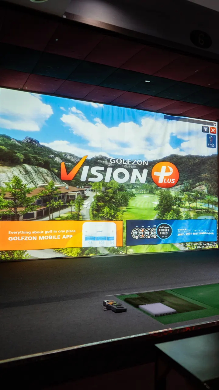 Summer
2024
Golf
& beer.
All summer5.18 — 10.31
Summer rates2024
From
$33
an hour, all summer
| Play | Rate |
|---|---|
| 1 hour | $33 |
| 10-hour pass | $280 |
| 60-hour pass | $1,500 |
Plus tax · May 18 – Oct 31 · Walk in or book online
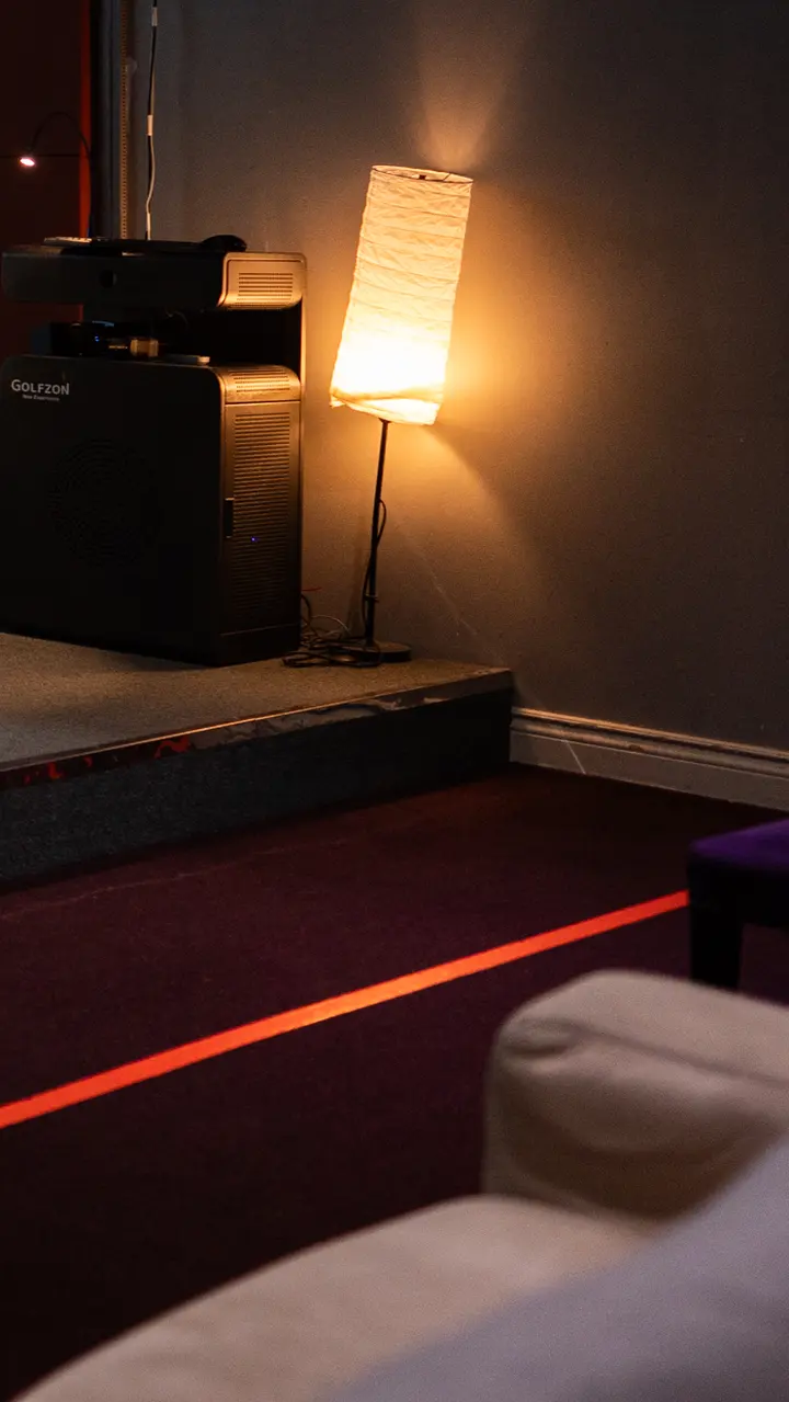 Bar
Baropen
The bar
is open.
Monday to Sunday. Golfzon Vision bays, walk in or book online.
golfwing.caMarkham
The screen
The same line,
above the bar.
The 16:9 version is for the wall screens in the venue and the website banner. The bay on the left, the line and three rates on the right, the dates in a lime bar along the bottom — legible from across the room.
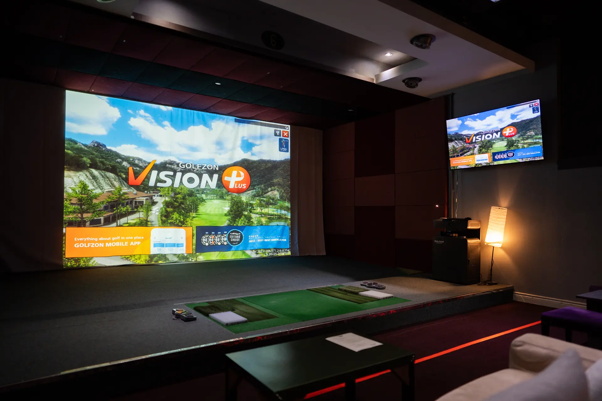
Golf & beer,
all summer.
- 1 hour$33
- 10-hour pass$280
- 60-hour pass$1,500
Summer rates 2024 · May 18 – October 31Plus tax · golfwing.ca
What changed
Less in the frame,
more in the room.
The brief did not change: the same offer, the same rates, the same three frames and a screen. What changed is what each frame is asked to carry.
| Item | 2024 | 2026 |
|---|---|---|
| Picture | A stock model, cut-out beer glasses and the venue, layered | The venue’s own photograph, nothing else |
| Rates | A paragraph | A scorecard, the starting price largest |
| Each frame | Logo, address, phone, dates, rates | One line, one job |
| Type | Several faces, outlines and drop shadows | One sans, ranked by weight |
Golf & beer.
Summer, after hours.