Brochure环景留学移民 · Study & immigration consulting
A block of yellow
wrapped round the book.

CANADA
环景留学移民
GLOBAL
PROSPECTS
IMMIGRATION
专注加拿大留学教育、访问签证、留学签证、团聚移民、技术移民与省提名移民。
CANADA
环景留学移民
GLOBAL
PROSPECTS
IMMIGRATION
专注加拿大留学教育、访问签证、留学签证、团聚移民、技术移民与省提名移民。
00The project
- Client
- Global Prospects Immigration
- Sector
- Study-abroad & immigration consulting
- Year
- 2021
- Format
- A4 · Chinese, English headings
Global Prospects Immigration advises on studying in Canada, visitor and study visas, family sponsorship, skilled and provincial-nominee immigration. Its 2021 brochure is a working document — services, school systems, nominee programs — so the design makes one loud gesture, a block of yellow round the outside, and keeps a quiet, numbered order within.
- Brochure, A4
- Cover & back cover
- Contents & six chapters
01The cover
Yellow first,
then the name.
On the front, yellow takes the left three-quarters and leaves a white strip at the fore-edge; a black-and-white photograph crosses both. Below it the name runs in three registers — CANADA, 环景留学移民, GLOBAL PROSPECTS IMMIGRATION — with the services in one line at the foot. Turn it over and the yellow picks up on the other side of the spine: the whole book is wrapped in one colour.
CANADA
环景留学移民
GLOBAL
PROSPECTS
IMMIGRATION
专注加拿大留学教育、访问签证、留学签证、团聚移民、技术移民与省提名移民。

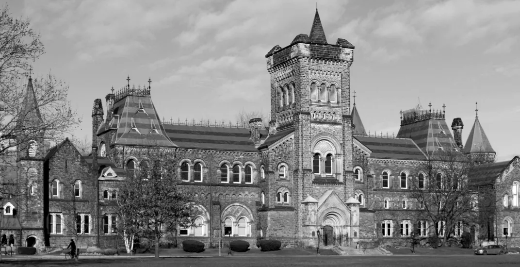
The re-set keeps the original proportions and order and changes two things. The Chinese name was white on yellow and all but disappeared; it is now slate. The Parliament Hill photograph survives only at preview size, so the campus picture from the inside pages takes its place.
02Contents
Six chapters,
one path.
Inside, every page carries the mark and the name at its head. On the contents spread a single yellow arch fills the left-hand page; the right-hand page lists the six chapters with their page numbers — about the firm, services, youth education, Canadian high schools, the Ontario nominee program and past cases.
目录
- 01关于我们P 02
- 02服务P 04
- 03青少年留学P 05
- 04加拿大高中以及申请P 06–11
- 05安省移民省提名计划P 12–15
- 06成功案例P 16–19
03Services
Three routes,
and a page for younger students.
The three services each get a rounded yellow panel — study and immigration, the foreign-worker stream, the start-up visa. Facing them, Youth Education (ages 13–18) pairs a campus photograph and a short paragraph with five dark tags for what the firm does for a young student: planning, school applications, the visa, guardianship and the agreement.
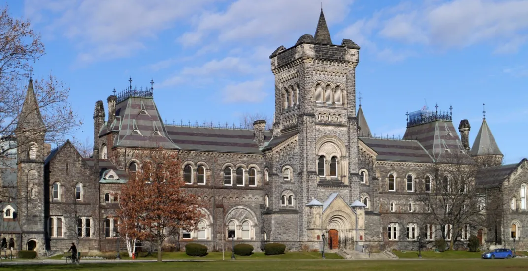
早一点出国读书,孩子能更早接触新的语言和文化,开阔视野,也在过程中锻炼自己的应变能力。
GLOBAL PROSPECTS
IMMIGRATION · 环景留学移民