KTVToronto · Hiring poster
A hiring poster
as bright as the room.


00The project
- Client
- G-Funk KTV
- Location
- Toronto
- Year
- 2023
- Format
- Long poster for phones
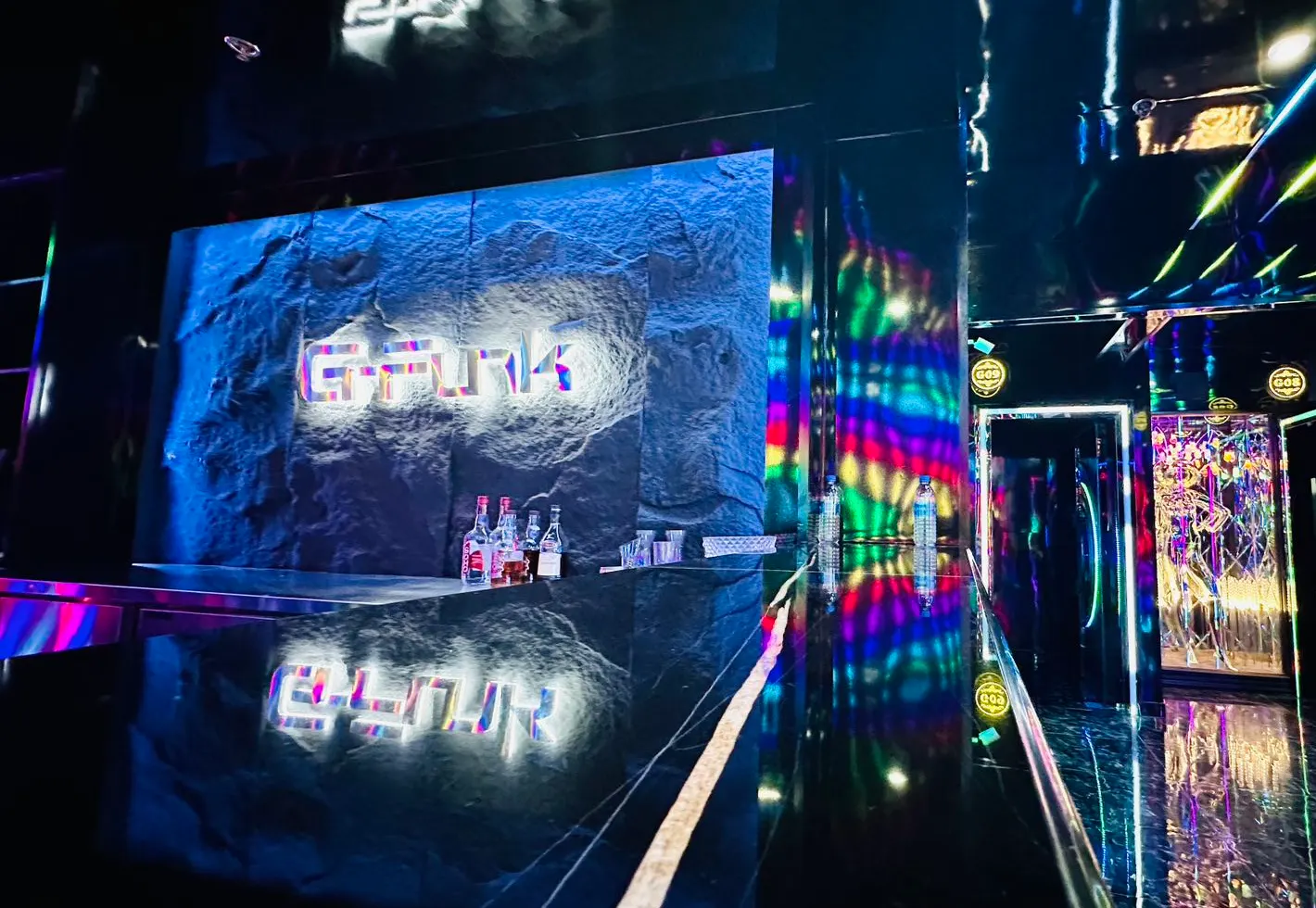
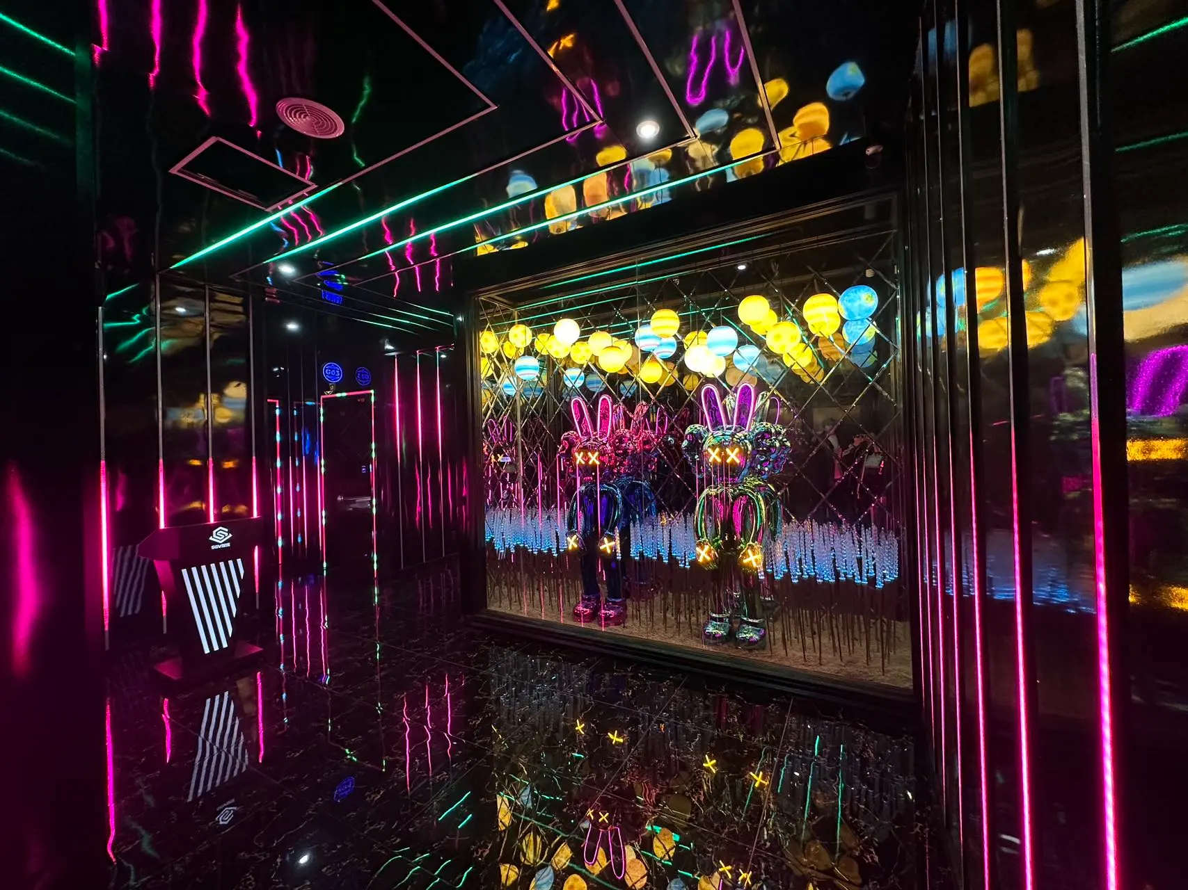
G-Funk is a KTV — a karaoke venue — in Toronto. In 2023 it was hiring part-time sales and floor staff, and the studio made a long poster to be scrolled on a phone. It reads less like a notice than a wall of the venue: mirror black, magenta and ice-blue light, chrome lettering.
- Long hiring poster, two versions
- 招聘 lettering effect
01The poster
Top to bottom,
in one scroll.
The poster opens on the wordmark, then the chrome 招聘 — “hiring” — in large type, then the two roles and what each involves, the perks, and it closes on two photographs of the venue and “Join us”. One thing per screen, so a thumb moving down meets the information in order.


多伦多 G-Funk KTV
欢迎有活力、热爱音乐的你
加入我们 · JOIN US
01销售兼职 · SALES
- 熟练掌握并推广公司产品和服务,提高顾客满意度
- 了解顾客需求,提供个性化的消费方案
- 维护顾客关系,建立良好的口碑
02服务员兼职 · FLOOR
- 负责客人引导、酒水传送、点单结账等基础服务
- 具备良好的沟通能力和服务意识
- 参与团队内部培训和分享,不断提升业务素养
公司福利
- 丰厚的薪资待遇
- 完善的培训体系
- 轻松愉快的工作氛围
JOIN US
- 01Wordmark
- 02招聘, “hiring”, in chrome
- 03Role one: sales
- 04Role two: floor service
- 05Perks
- 06The venue
- 07Join us
Re-set from the 2023 source file. The original’s contact details, address and hiring criteria are left out and the neon background is redrawn; the copy and the 招聘 lettering are the original’s.
02Lettering
Three layers
make a sign.
The 招聘 lettering is not a typeface but three layers: a blurred black shadow lifts it off the background, a magenta neon glow sits in the middle, and a chrome face goes on top. Together they read like the lit sign at the door.

03Colour
The colours
came from the room.
The poster doesn’t invent a palette. Magenta and ice blue come from the corridor’s light strips, black from the mirrored walls and floor, red and white from G-Funk’s own wordmark.