Design study · Furniture-shop posters
Grand opening,
solid and hollow.

00The study
- For
- An imagined furniture shop
- Year
- 2023
- Formats
- Letter poster · square post · Xiaohongshu portrait
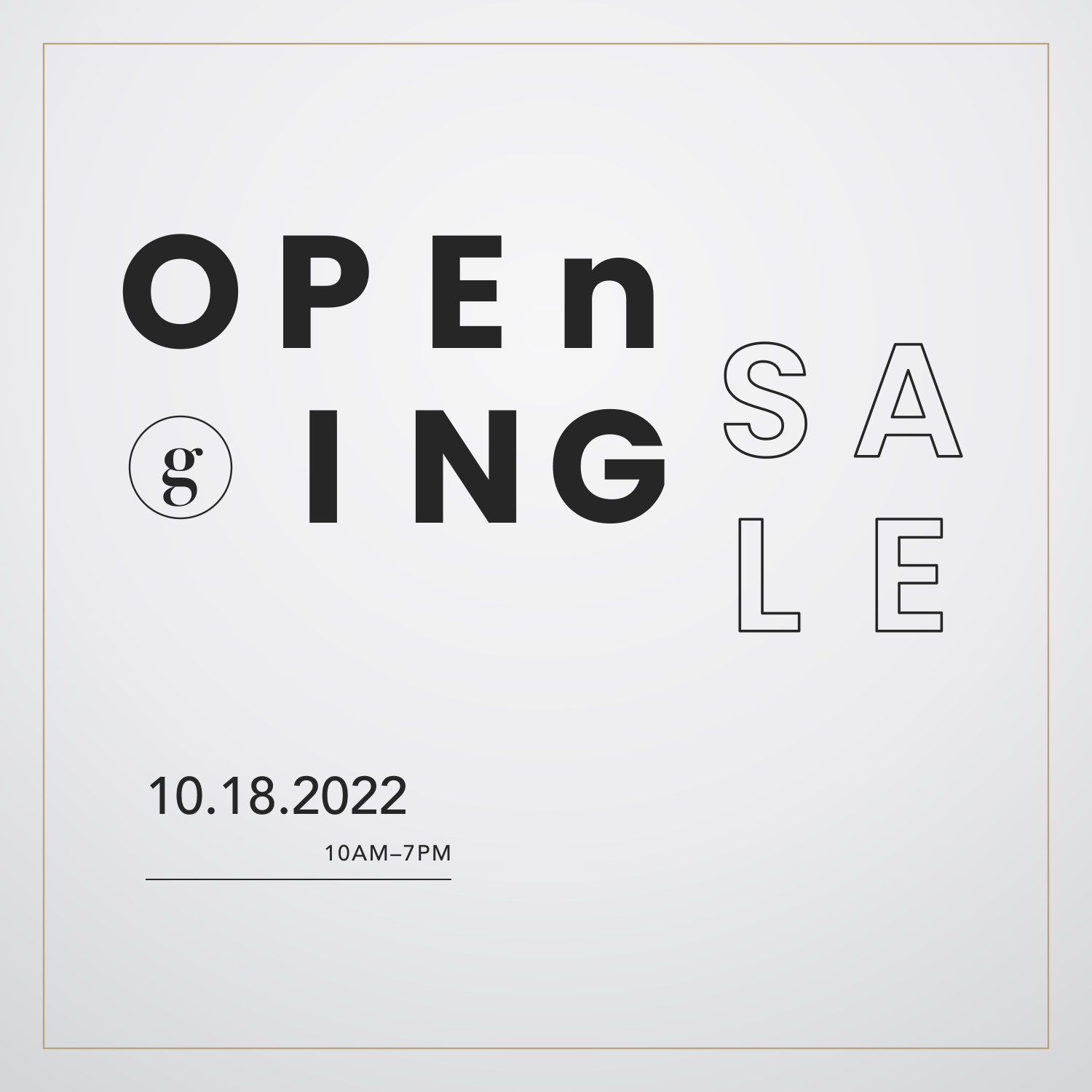
A studio design study, made without a client: in 2023 one of our designers made a set of grand-opening posters for an imagined furniture shop. What holds up is the type: bold capitals with a lowercase n and d slipped in on purpose, every letter dropped onto one grid, and SALE in outline on the last line; the date in Avenir, signed off with a Didot g. The original boards were crowded with stock furniture renders and props. We kept only the type and set it again.
- Grand-opening lockup
- Portrait poster
- Square post
- Serif poster
- Type pairing
01Type
Four typefaces,
one job each.
Poppins Bold sets the lockup, each letter centred on one five-column grid, the lowercase in GRAnd and OPEn loosening the capitals. The same family’s SemiBold appears only in outline, and only for SALE. Avenir takes the date and the hours, and a Didot g inside a hairline circle signs for the shop.
- Poppins BoldThe lockup, with a lowercase n and d
- Poppins SemiBoldOutline, kept for SALE alone
- Avenir MediumDate, time and the small print
- Didot BoldThe g in its circle
02Posters
Three sheets,
one opening.
Each of the study’s boards put a stock chair in the middle and pushed the type to the corners. Re-set, the chair is gone and the type takes the sheet: the portrait poster carries the whole lockup; the square post locks bold OPEn and ING against outline SA and LE, half a cell apart; the third turns to the study’s Didot and Zapfino, with Sale written in walnut.