Signage companyIdentity and wayfinding
Forward Signs — A clearer
way forward.

00The project
- Client
- Forward Signs
- Sector
- Sign making
- Sketches
- 2021
- System
- 2026
A company that makes signs needs a mark that reads at a glance. In 2021 we drew six versions of an F — geometric, square-cut, curved. Coming back in 2026, the three-part one looked most like it was moving. We left its lines alone, gave it a new wordmark and two colours, and set it to work doing what a sign company does every day: pointing the way.
- Logo sketches (2021)
- Lockup and wordmark
- Colour system
- Directory and directional panels
- Bilingual posters
- Digital poster
01Sketches
Six ways
to write an F.
The 2021 sheet holds six Fs: stacked parallelograms, a square cut with a red point, an outline, two curves, a curl, and three parts. The first three are about structure; the last three are about speed. They are redrawn here from the file’s own vector paths, in the navy and red of the day.
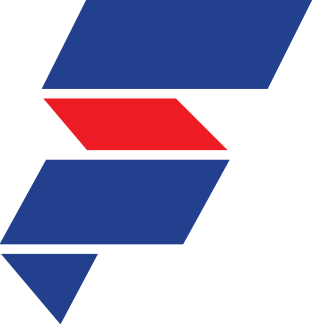 01Stacked planes
 02Square and point
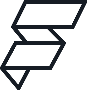 03Outline
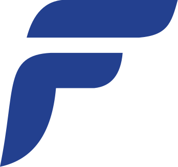 04Two curves
 05Curl
 06Three partsChosen
02The mark
Same strokes,
new colours.
The two original paths of the three-part F are untouched. We set a two-line bold wordmark the same height as the symbol, lifted the navy to cobalt, and added a yellow-green that belongs to arrows and direction alone. Ink and paper carry everything else.
One seven-point arrow. It turns; it never changes shape.
RGB 39 70 232
RGB 228 250 88
RGB 22 28 36
RGB 241 242 234
03Wayfinding
Direction first,
then the name.
The directory puts the arrow first and the destination right behind it, one rule between each line. The single panels blow one line up to a whole sign — Reception up, Studio right, Workshop left — and the last turns yellow-green so it separates from across a room.
04Posters
One line,
read two ways.
The English poster runs on cobalt with an arrow to the right, so the sentence reads straight on. The Chinese one turns yellow-green with an arrow pointing up, four characters taken in at once. A landscape digital version takes the same line to screens: ink, type and one arrow.