PoolsLogo design
A five,
cut into a star.

00The project
- Client
- 五星泳池 Five Star Pools
- Industry
- Pools
- Year
- 2017–2018
- Source
- Studio logo portfolio, 2018
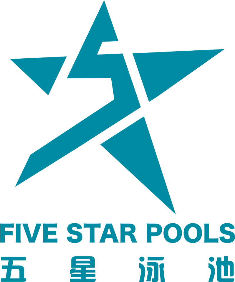
The name already holds the idea: five, and a star. The mark puts both into one shape — a five-pointed star with a 5 cut through its middle, so you see the white first and the number a moment later. One colour, pool teal; the English name in a heavy sans, the Chinese spaced out to the same width beneath it.
- Logo design
- Bilingual lockup
- Reversed and one-colour versions
01The idea
Five, plus a star,
makes one mark.
The original board opened with the whole argument in one line: a numeral, a star, and the two set into one shape. It is shown here as it was drawn, output from the original vector paths without a line changed.

02The mark
Read the white
and the five appears.
The star is not a regular one: its points are drawn long and its left arm is broken off, so the whole shape leans forward and moves. Through the middle a stepped cut draws the 5 — the top bar, the stem, then one long diagonal running out to the lower-left point. Nothing is added; the number is made by taking away.


03The lockup
Two scripts,
one width.
Beneath the mark, FIVE STAR POOLS in a heavy sans, and 五星泳池 spaced out to exactly the same measure. The board set it three ways: teal on white, reversed out of black, and black alone for one-colour jobs.

Pool teal#008BA2 · RGB 0 139 162
Black#000000 · RGB 0 0 0
White#FFFFFF · RGB 255 255 255