
ConsultancyIdentity
Four rings,
one key.

00The project
EnPower Business Solutions is a consultancy in Markham, Ontario, helping small and mid-sized businesses with strategy, business plans and commercial financing. In February 2022 we designed its identity: a mark of four interlaced rings that stands on its own or becomes the bow of a key, English and Chinese signatures, and the business cards, letterhead and slides the team works from every day.
- Client
- EnPower Business Solutions Inc.
- Sector
- Business planning and financing
- Location
- Markham, Ontario
- Year
- 2022
- Logo design
- English & Chinese signatures
- Key signatures
- Colour specification
- Business cards
- Letterhead template
- Presentation template
01The mark
Four rings,
held together.
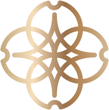
Four rings overlap to frame a four-point star. Each ring carries a small notch at its outer edge, like the ward of a key, giving each direction a point to land on. One line weight throughout: large enough to emboss as a seal, small enough to read at sixteen pixels.

02The key
Add a shaft,
and the mark becomes a key.
In the key signature the mark is the bow, the name rides on the shaft, and the bit closes the line. ENPOWER is set in wide-spaced serif capitals; BUSINESS SOLUTIONS INC sits under the shaft in a small sans. For a firm whose work is opening a client’s next step, the key needs no explaining.



03Two languages
One mark,
two signatures.
The firm has a Chinese name as well as an English one, so the Chinese signature was delivered alongside the English, lockup for lockup: stacked, horizontal, key and long key. 賦能咨詢 is set in a brush-edged kai face in traditional characters, standing at the height of the English capitals and, in the key version, riding the shaft the same way.



04Colour
Purple for weight,
rose gold for light.
The specification has three colours: rose gold, purple and a near-black. For screens and foil there are two gradients — purple running dark to light, and rose gold that catches a highlight and turns away again, like metal tilted to the light. The signature comes in four colourways, for white, purple, black and gold grounds.



RGB 201 162 121 · C21 M36 Y57 K0
RGB 63 54 92 · C81 M84 Y37 K28
RGB 38 38 38 · C69 M65 Y65 K69
05Stationery
From card to slide,
one line of gold.
The card’s back sets the stacked signature on purple; the front puts an enlarged, faded mark in one corner and the key signature in the other. Letterhead and slides share one footer: a line of rose gold over a purple band, with the key signature at the left. The card went out in print and digital versions, the letterhead as a Word template and the slides as a PowerPoint template, so the team could use them on their own.