Real estateToronto
A D that rises
into the skyline.

00The project
- Client
- Dream Living TO
- Trade
- Real-estate team
- City
- Toronto
- Year
- 2020 · 2021
Dream Living TO is a real-estate team in Toronto. In 2020 we drew it a D: solid on the outside, with three towers standing inside it in outline, and in the name, between LIVING and TO, the CN Tower. The finals went out as two lockups in four colourways, and onto the team’s business cards.
- Logo design
- Primary and stacked lockups
- Four colourways
- Team business cards
- 2021 monogram study
01The mark
Three towers
inside one letter.
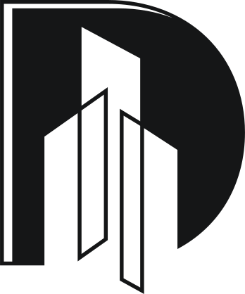
The D is solid on the outside and hollow at its heart: three towers stand inside it in outline, each roof cut at an angle, the tallest reaching the top of the letter. A hairline runs down the spine and across the top, like light catching the edge of a facade.
02Lockups & colour
Two lockups,
four colours.
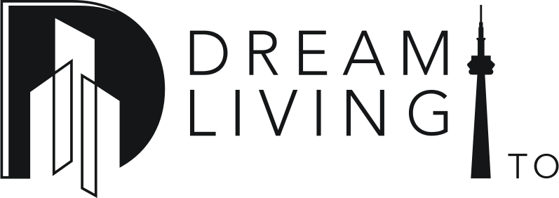
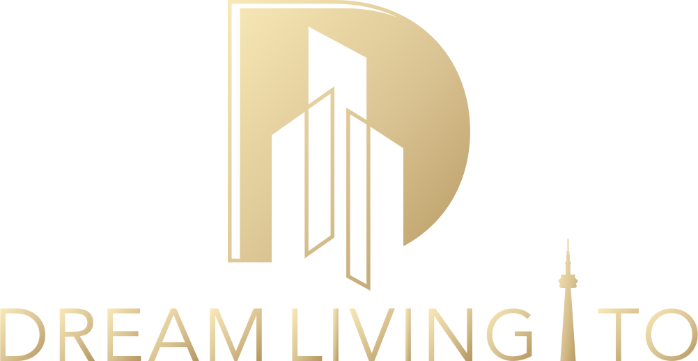
The primary lockup sets the D above the name; the stacked one sets the name in two lines beside it, the CN Tower running from DREAM down to TO. Both went out in black, white, Tiffany blue and a gold gradient; the cards took the blue.

- Tiffany blue#0ABBB5
- Gradient light#3ACBC6
- Charcoal#282828
- Gold gradient#F9E9B8 → #B89C69
03Business cards
The back of the card
belongs to the city.
Every card in the team shares a Tiffany-blue back: one carries the lockup alone, the other draws the D and its towers large in outline across the card. The fronts carry each agent’s photo and contact details, so they stay out of this page.
04Process
The roads taken
before the D.
The archive keeps the search: a serif dL drawn on two circles, a house in gold line, a skyline of hairlines, a Deco DL, and on the last sheets the D with its towers taking shape. Gold on forest green had its turn before the brighter Tiffany blue won.
- 01
- 02
- 03
- 04
- 05
- 06
Working files, August–September 2020
052021 · A study
A year on,
a quieter monogram.
In July 2021 we drew a serif LD monogram in black and sand for a more upmarket listings direction, cut by two diagonal breaks. The archive keeps it as a study; whether the team adopted it isn’t recorded.