Mushroom foods · Identity & packaging
Mountain delicacies,
drawn in ink.
舌尖盡覽畫中意美味之後莫山珍

00The project
- Client
- Creations By Nature
- Products
- Matsutake, morel, black truffle
- Year
- 2022
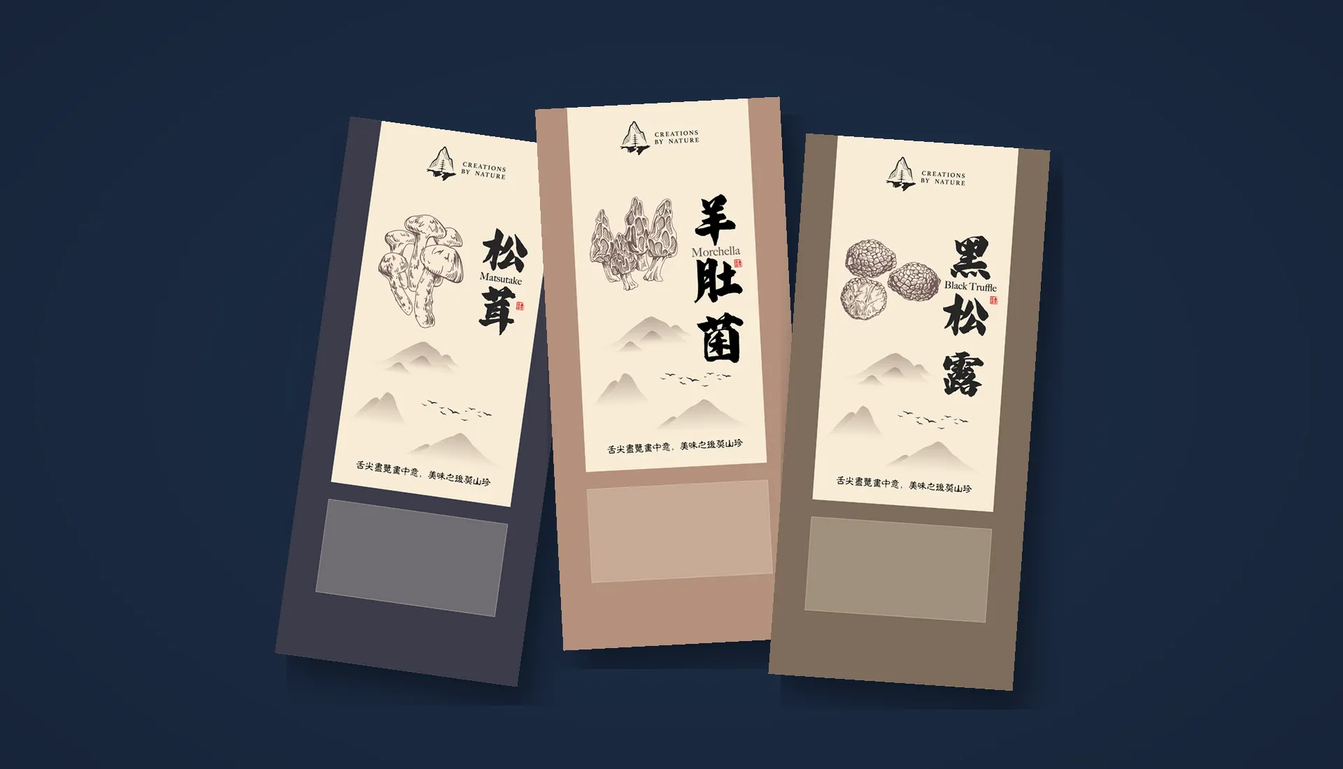
Creations By Nature sells matsutake, morels and black truffles. In 2022 the studio drew its mark, then its first packaging: three tall pouches that read like hanging scrolls — ink-wash hills, names written with a brush, and one colour for each mushroom.
- Three logo routes
- Final logo files
- Packaging for three products
- Print artwork on the pouch template
01The mark
Three routes,
one mountain.
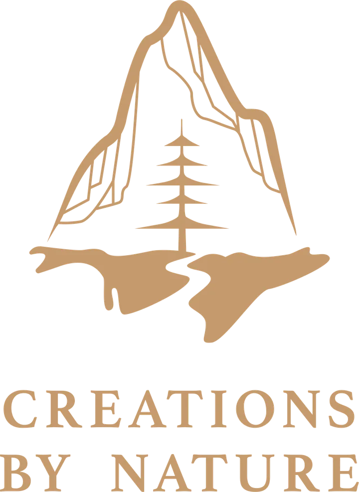
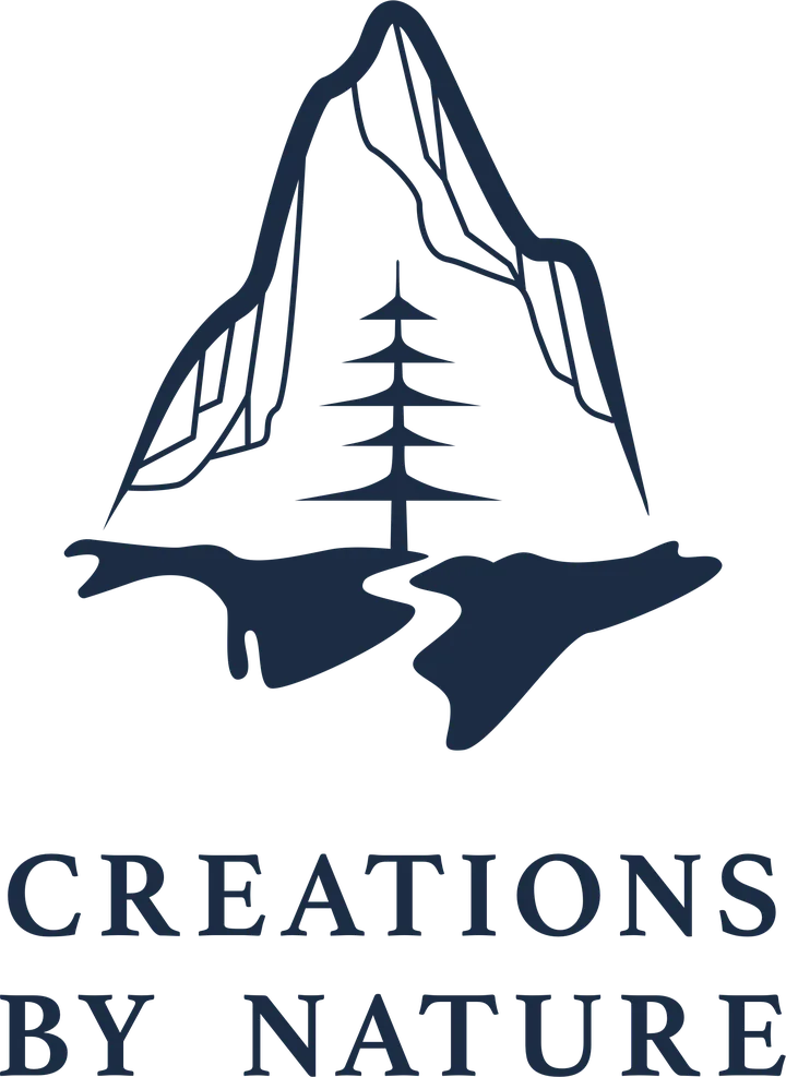
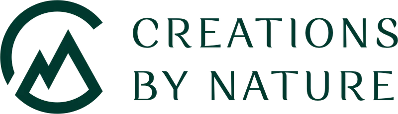
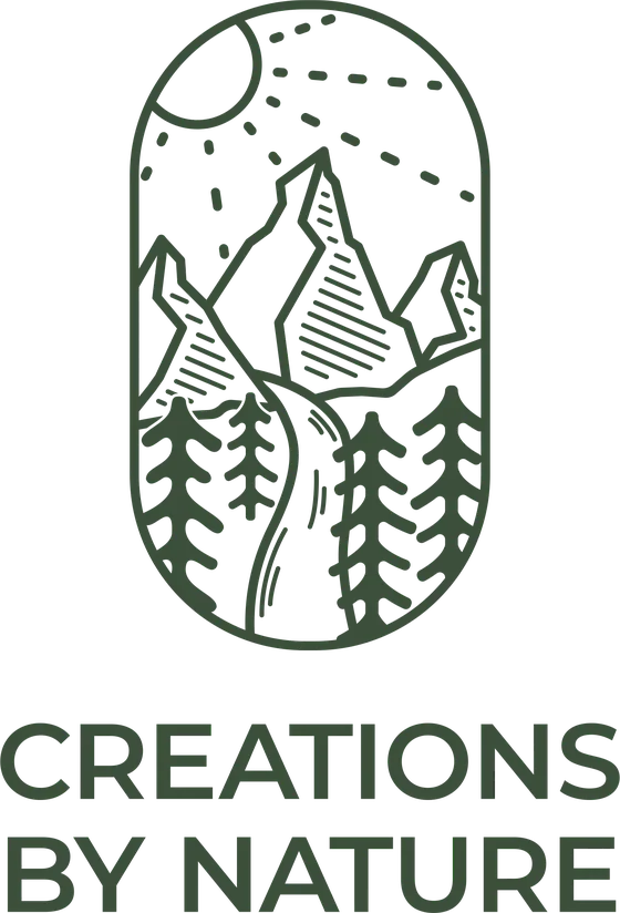
August 2022, three routes: a monogram folding a C around a peak; a landscape emblem in an arched frame; and a single mountain with a pine and a river at its foot. The emblem was finished first, with final files and mockups. The final files of September carry the mountain and pine instead — navy and sand, over a widely spaced serif wordmark — and that is the mark on the packaging.
02The packaging
A landscape
on every pouch.
A parchment label runs from the seal down to the window: the mark at the top, the mushroom drawn in line, its name written with a brush beside the English name and a small red seal; below, ink-wash hills, a line of birds and one line of verse. Only the bag changes colour — slate for matsutake, rose clay for morel, earth brown for black truffle.
03The names
Names written
with a brush.
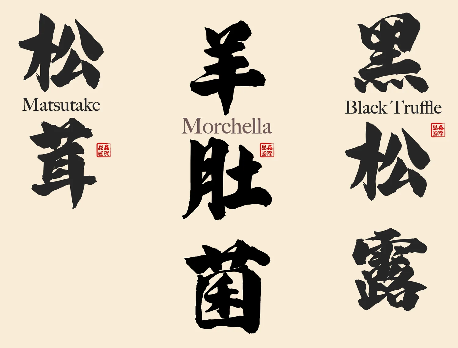
Each name is heavy brush calligraphy, read top to bottom like the inscription on a hanging scroll, with the English name set between the characters and a small red seal beside it. The verse at the foot of every pouch changes to an old print-style face, a quieter second voice beside the brush.
04Construction
Drawn to the bag,
to the millimetre.
The artwork was laid out on the pouch template: 140 mm front and back, 70 mm side gussets, 310 mm tall, with 34 mm left at the top for the seal. The back carries the brand story in English and French, a QR code and the nutrition table; a window is left below the label.