Wordmark · 2018
One line of script,
one line of capitals.

00The project
- Client
- Chic Life Style
- City
- Toronto
- Year
- 2018 · redrawn 2026
- Scope
- Wordmark
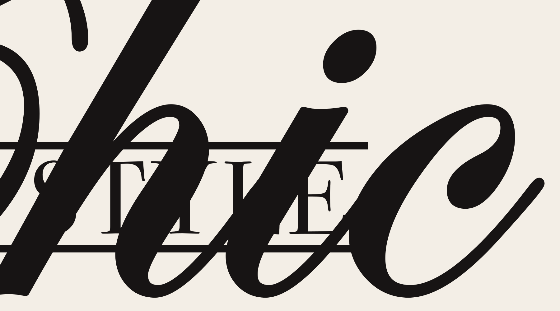
The name comes in three layers: Chic in script, LIFE STYLE between two rules, and TORONTO underneath. The 2018 design ran the band of capitals straight through the script. All that survives is a 227-pixel image, so we drew it again: same structure, with a slimmer, lower band that leaves both halves of the script showing, so Chic reads again.
- Wordmark (2018)
- Vector redraw (2026)
- Positive and reversed versions
01Anatomy
A band of capitals
runs through the script.
Chic, the biggest word, is written in script. LIFE STYLE is set in fine serif capitals between two rules and passes straight through the middle of it. TORONTO, the smallest, sits on the centre axis. Where the band crosses, the script is cut — but its top and bottom halves still line up, and the eye joins them.
- 1ScriptEdwardian Script ITC, thickened so it holds its own against the band.
- 2The bandTwo rules around Bodoni 72 capitals, with clear space outside them where the script breaks off.
- 3Centre axisThe band and TORONTO share one centre line.
- 4x-heightThe band sits at the middle of the x-height, so half of each h, i and c shows above it and half below.
02The redraw
The idea kept,
every line redrawn.
The original exists only in the studio’s 2018 logo collection, as a 227 × 129 px grey image — no vector file, no colour on record. Its band was heavy and high, and covered most of “hic”. The redraw slims the band, moves it to the middle of the x-height, opens clear space around the rules and sets the script in a fuller face; the crossing, the two rules and TORONTO stay as they were.


03Versions
Ink on paper,
bone on black.
No colour survives for the 2018 mark, so it comes in two tones: ink for light grounds, bone for dark. As it shrinks, the rules and the script’s hairlines go first; at 100 pixels wide Chic and LIFE STYLE still read, and TORONTO is down to texture.
 400 px260 px160 px100 px
04Where it came from
First row,
fourth mark.
In 2018 the studio gathered that year’s marks into a collection, twelve to a page. Chic Life Style is fourth in the first row of page 2, on a page shared with Veltro, Proligence and Luxlogic — and that page is the only place it was kept.
Every mark in the collection is grey; none carries colour. The page set the rule for the redraw: take the structure from it, assume nothing about colour.