BrokeragePre-construction campaigns · March–July 2021
Fifty launches.
Three languages.

00The project
- Client
- Century 21 King’s Quay Real Estate Inc.
- Period
- March to July 2021
- Output
- 50 releases · 148 files
- Languages
- English · Simplified · Traditional
Between March and July 2021 the King’s Quay brokerage promoted fifty pre-construction releases across the Greater Toronto Area and southern Ontario. Each went out in English, Simplified and Traditional Chinese, set in one frame that works within Century 21’s franchise standards — so a reader of any of the three finds the project, its status and the brokerage at a glance.
- Trilingual campaign frame
- 50 project releases
- Flyers and square social posts
- English, Simplified and Traditional typesetting
01Language
One line,
three readers.
Every post turned on a single status line. English read “Coming soon”; Simplified readers saw 欢迎预定 or 即将上市, Traditional readers 歡迎預定. The words changed; the position, size and weight did not — so the three versions read as one campaign, not three.
- ENComing soon
- 简欢迎预定
- 繁歡迎預定
- 简即将上市

02The frame
One frame,
fifty projects.
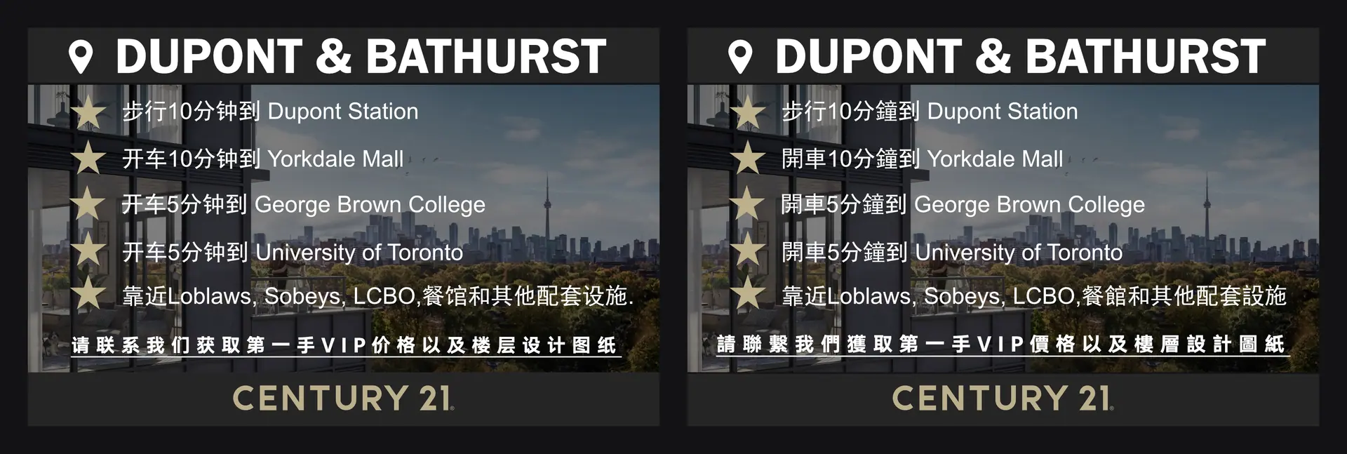
The developer supplied the rendering and the project mark; the frame did the rest. Status, a price or size line, then the brokerage signature on Century 21’s grey bar in gold — always at the foot, always the same height. March and April ran as tall flyers with a list of nearby transit and shops; from May the posts went square, for the feed.
- 1Project mark — the developer’s
- 2Status line — changes with the language
- 3Rendering — the developer’s
- 4Site map and developer’s mark
- 5Price and size — 2021 figures
- 6Brokerage signature — Century 21 standard
03Five months
March to July,
ten a month.
Ten releases a month, three files each — 148 finished files in the folder by the end of July. Below, the season as it was delivered.
March2021
- 90 Queen
- Bayview
- Buckingham Condo
- Grand Festival Condo
- Joy Station
- M4
- Oscar Residences
- One Delisle
- The Bright Side
- The Garden Series
April2021
- Bay Port Resort
- BEA
- Bright Water Towns
- Emerald Crossing
- Glenway Urban Towns
- LakeVu Phase Two
- Leftbank
- Modern Luxury Towns
- Realm Condos
- Smart Towns
May2021
- Bayview
- Brooklin Heights
- Cornell Rouge
- Crosstown Tower
- Dufferin Vistas
- Eagle’s Rest
- Keewatin
- Linbury Hill
- The Capitol Yonge
- Vic Towns
June2021
- Alias Condos
- Crown Condos
- Heritage Village
- King Terraces
- The Mason
- Royal Oaks
- Saisons Villas
- The Hill
- The Whitfield
- Westline
July2021
- Artwalk Condos
- Cielo Condos
- Danny Danforth
- Gourmet City
- Harris Gate
- Markdale Towns
- Queen Central
- UC Tower 2
- Vincent Condos
- Westgate on Main