Fish & chips takeaway · Logo study
The hook
is in the H.
00The project
- Name
- Captain’s Fish & Chips
- Sector
- Fish & chips takeaway
- Year
- 2023
- Status
- Studio logo study
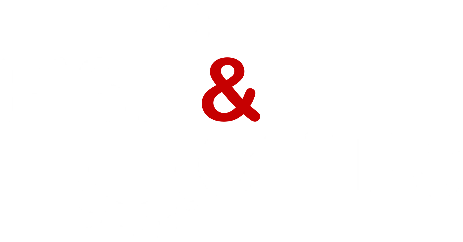
Captain’s Fish & Chips is set in a round, friendly sans in black, with one thing hidden in it. The second stem of the H in FISH climbs past the letters into the eye of a fishing hook and drops below them into the bend and barb, so the hook also carries the eye from FISH down to CHIPS. The ampersand is the only red, and CAPTAIN’S follows the curve of the hook beneath.
- Logo
- Three colourways
- Colour values
01The mark
One stroke,
two jobs.
The letters and the hook share one line weight, so the hook reads as part of the word before it reads as a picture. Three colourways came with the file: black with a red ampersand for light grounds, white with a red ampersand for dark ones, and all white on red.


- The H’s second stem rises into the eye of the hook
- It drops through the line into the bend and the barb
- CAPTAIN’S runs along the bend

02At size
Smaller,
still a hook.
The hook is drawn at the letters’ weight, so it doesn’t thin out or vanish first as the lockup shrinks. Here is the same lockup at four widths: at the smallest, CAPTAIN’S along the bend turns to texture, but the hook and the red ampersand still read.