CaféLogo concept
A coffee bean
inside the B.


00The project
- Brand
- BREWOLOGY Cafe Shop
- Sector
- Café
- Year
- 2023
- Status
- Studio logo concept
BREWOLOGY is a logo concept for a café. The mark is a slab-serif B whose middle bar has become a coffee bean, split down its crease. A geometric sans carries the name, CAFE SHOP sits beneath in open capitals, and the whole thing runs in one warm rust on cream.
- Logo
- Stacked and horizontal lockups
- Type and colour
- Cup and bag applications
01The mark
One letter,
one bean.
The bean is an ellipse laid across the two bowls of the B. Its S-shaped crease stands in for the letter’s middle bar, so the B still reads at a glance and the bean only shows itself on a second look. Slab serifs at top and bottom give the letter a steady, typewriter-like footing.
- 1Slab serifsOne at the top, one at the foot, reaching out like the base of a piece of type.
- 2StemA single heavy stem holds the letter up; the bean grows from its right side.
- 3The beanBoth halves belong to one ellipse, cut by the crease, each tucked into a bowl of the B.
- 4The creaseA wave that runs from the stem to the outer bowl — the bean’s crease and the B’s middle bar at once.
02Lockups
Stacked for the cup,
side by side for the counter.
The original file arranges it two ways: the B above the name for squarish spaces — cups, bags, avatars — and the B beside it for long, narrow ones like a card, a shelf strip or a website header. BREWOLOGY is set in Poppins SemiBold; CAFE SHOP in Avenir, widely spaced.


The crease still reads at 16 pixels, small enough for a favicon or an avatar.
03Colour
Rust and cream,
with a dark roast.
The logo uses one colour, a warm rust, on cream or white. The dark roast is the near-black of the cup lid in the original set, used here to give a layout its weight.
RGB 169 83 30
RGB 241 231 214
RGB 34 23 15
04In use
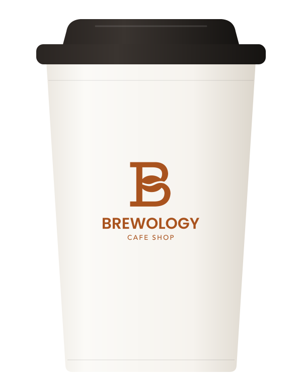
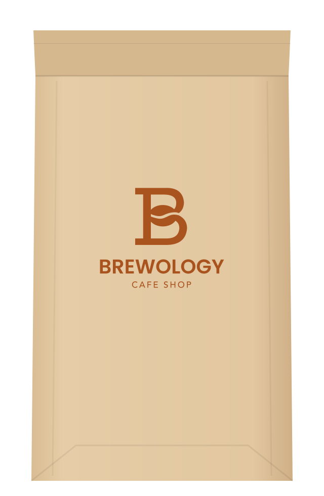
On a cup,
on a bag of beans.
The original set put the stacked logo on a white takeaway cup and a kraft coffee bag. Both are redrawn here as flat elevations, with the logo placed and sized as it would be printed.