Flowering teaMark · tubes · lids
Tea that blooms,
in black and gold.

00The project
- Client
- Blossom Era
- Product
- Flowering tea, six blends
- Year
- 2022
Blossom Era sells flowering tea: hand-tied balls of leaves that open into a flower in hot water. In 2022 we gave the range its look — a flower drawn in a single line as the mark, set in a ring as a seal; charcoal paper tubes; and on every lid a gold drawing of its own, six teas, six drawings.
- Mark & seal
- Tube packaging
- Six lid labels
01The mark
One flower,
held in a ring.
The mark is a single flower drawn in an even line, with a leaf behind it. On its own it signs every lid; inside a ring lettered BLOSSOM ERA and FLOWER TEA it becomes a seal. Two colours carry the range: charcoal for the ground, a soft gold for the drawings and names, white for the signature.

Tube and lid
Drawings, names, seal
Signature and name
 BLOSSOM
ERA
The signature on every lid: the mark and the name in two lines.
02The six
Six teas,
six names.
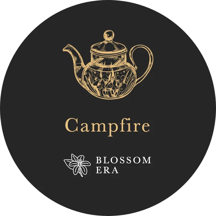
Each tea is named for what it becomes in the glass. The photographs are the client’s own, taken as each ball opened. All six share one charcoal tube, the name around its shoulder over the gold seal; the lid tells them apart, with the tea’s name and a drawing of its own. Beside every glass is its lid.
01
Campfire
It opens like a campfire — a name for evenings outdoors.
02
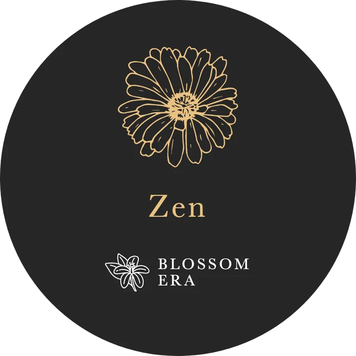
Zen
It opens like a chrysanthemum, the flower closest to Zen.
03
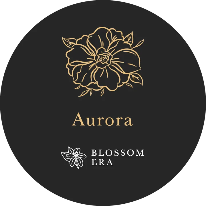
Aurora
It unfurls in the shape of the northern lights.
04
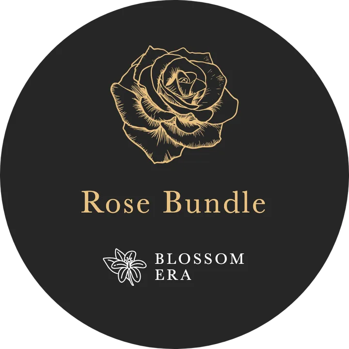
Rose Bundle
A bunch of roses in the glass.
05
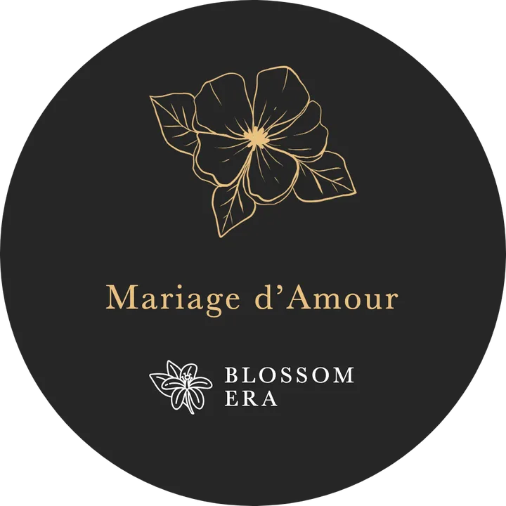
Mariage d’Amour
Named for the piano piece. Pale petals, like a wedding dress.
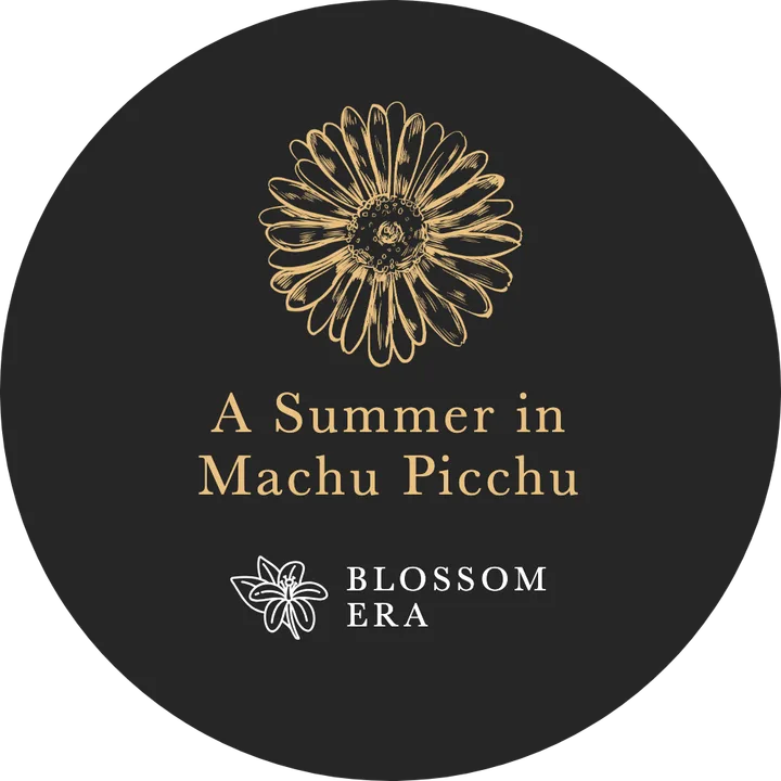
06
A Summer in Machu Picchu
A sunflower for the Inca city of the sun.
Pour, and wait.
It opens.
The six lids, re-set from the 2022 design file