Art educationIdentity study · 2023
Three letters,
eight shapes.

00The project
- School
- BLK · Black Art School
- Sector
- Art education
- Nature
- Studio identity study
- Year
- 2023
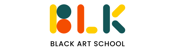
An art school’s name, written with the first things a child picks up to draw: circles and sticks. BLK is built from two circles and six round-ended bars in just three colours — yellow, orange and deep teal — and the same shapes grow into soft corner forms, a handful of small marks and one line: “Creativity starts here.”
- Mark
- Colour
- Graphic shapes
- Tagline
- Social posts
- Poster
01The mark
Two circles,
six sticks.
B is an upright and two circles; L, an upright and a short bar laid flat; K, an upright and two bars set at 45 degrees. Every bar is the same width and rounded at both ends, like a single stroke of a crayon. The three colours rotate through the letters, so no letter is made of one colour alone.
- 2
- circles
- 6
- round-ended bars
- 3
- colours
- 1
- stroke width
02Colour
Three colours,
white for paper.
Yellow, orange and deep teal: paint-box colours. White is not counted: it is the paper, the space left for drawing. Teal carries the words, orange the large accents; yellow is kept for grounds and shapes, never for type on white.
RGB 255 205 0
RGB 244 77 1
RGB 19 86 87
03Shapes
A handful
of small marks.
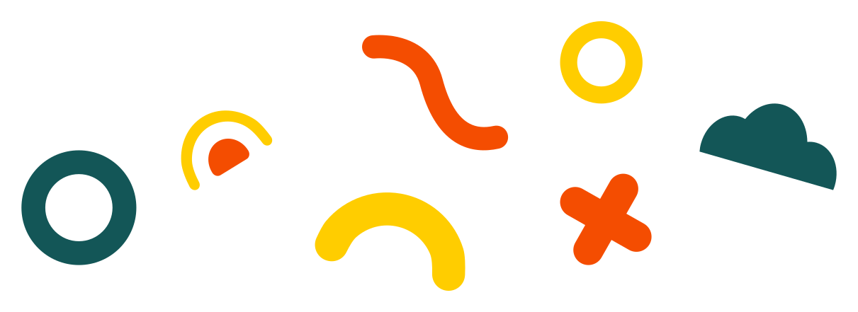
Beyond the mark there are two kinds of shape. Large soft forms reach in from the corners of a page, like paint just poured out. And eight small marks — rings, a squiggle, an arch, a cross, a cloud — scatter like stickers on a table, around the tagline and the empty space.
04Posts and poster
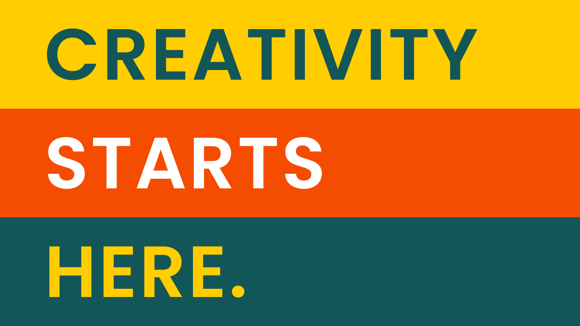
Creativity
starts here.
The boards try the same language a few ways: a square post with the corner shapes around the mark; the tagline in three colours with a handful of small marks; and a portrait poster that gives each word a band of its own. The original tagline post had a stock photograph of a child across its lower half; here it is left out, the tagline is set larger to fill the top and the small marks scatter below.