Day of Design
← All workBING FITNESS / 2021 → 2026

BING FITNESS / Identity refinement

Bing Fitness — Make every rep count.

Give strength a shape. Give repetition a rhythm.IDENTITY / CAMPAIGN / APPLICATIONS
An installation concept featuring the new Bing Fitness posters
Paired poster installation concept · AI-assisted mockupTypographic poster installation concept · AI-assisted mockup
From one rep to the next.

Strength builds through repetition. So does recognition. Rework the original B and dumbbell with a clearer silhouette, compact type and recurring orange, giving every application a familiar visual rhythm.

  • Symbol and wordmark redesign
  • Brand poster system
  • Archive photo art direction
  • Training record card
  • Sports accessory concepts
The newly redrawn B and negative-space dumbbell symbol01 / Redrawn brand symbol
Keep the idea. Rebuild the proportions.

A B with strength inside.

The original logo placed a dumbbell inside a B. The new design retains that idea, refining its outline, rounded bars and internal spacing. A compact uppercase wordmark keeps the identity clear from posters to small accessories.

The original Bing Fitness logo JPEG from the 2021 archive folderOriginal archive logo 2021 folder / JPEG
The reversed Bing Fitness identity

New identity lockup / 2026 visual refinement

Focus navy#183A50
Active orange#ED5D16
Warm white#F1F0E9
02 / Give the message weight

Repetition builds recognition.

One poster leads with an oversized symbol; the other builds rhythm through compact type. Shared logo placement and margins connect the pair, with orange as the recurring visual cue.

Native artwork for the orange symbol-led poster

Native artwork for the orange symbol-led poster

01 / Symbol first
Native artwork for the navy Make every rep count typographic poster

Native artwork for the navy Make every rep count typographic poster

02 / Type first
03 / Texture from the real space

Grounded in the everyday.

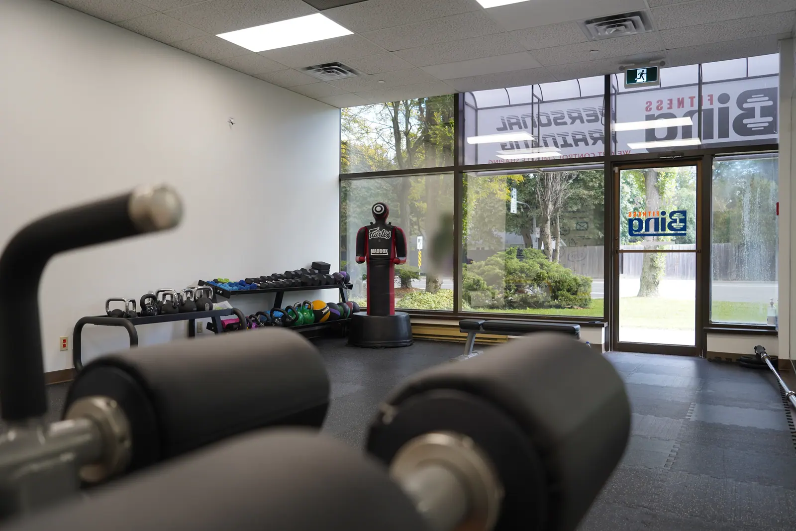
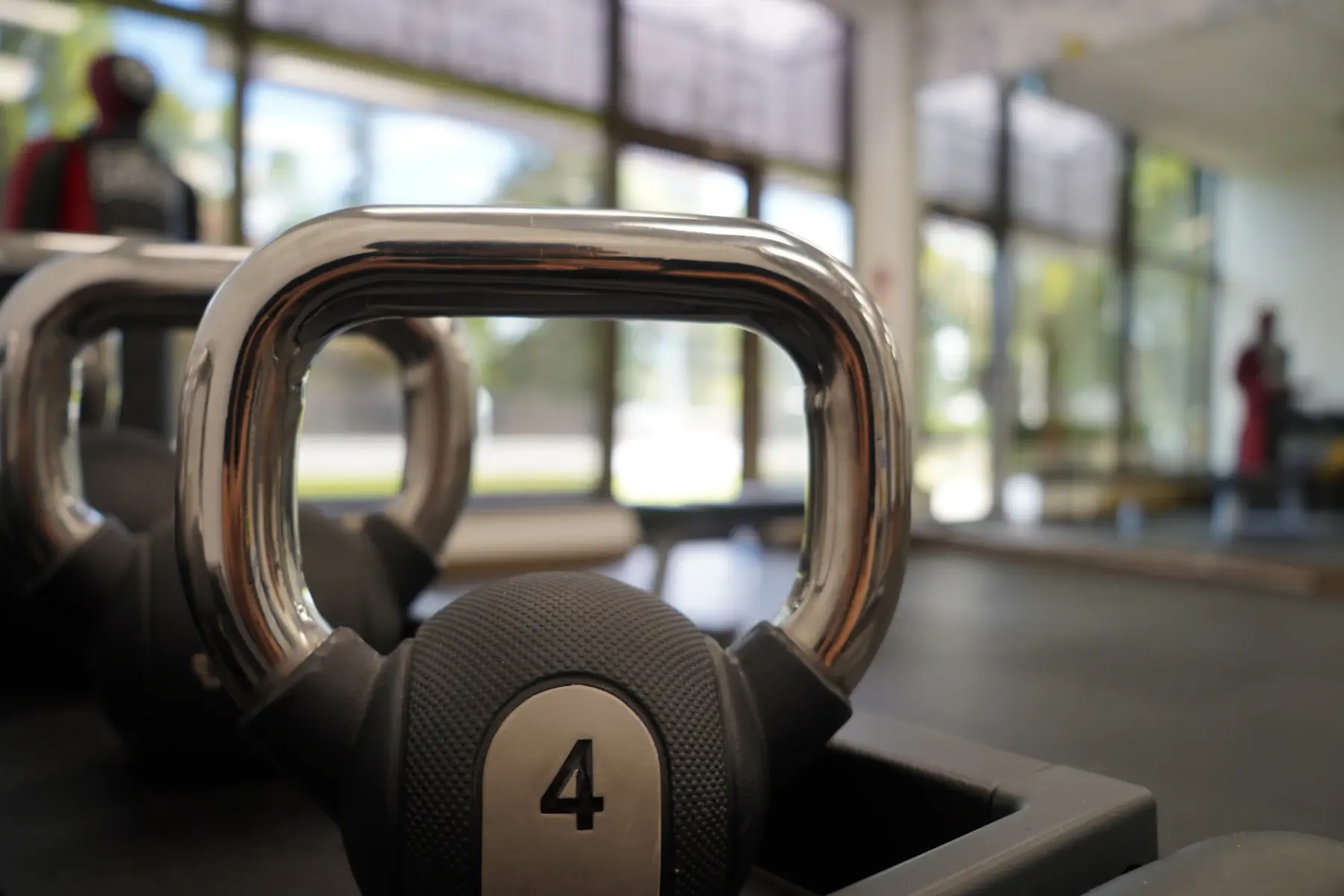
Metal, rubber and window light define these original photographs. Equipment details alternate with the complete space; the new identity and colour blocks bring the archive into a coherent visual system.

Find your rhythm: the full original kettlebell photograph combined with the new identity

Find your rhythm: the full original kettlebell photograph combined with the new identity

Original archive photograph of treadmills beside the windows
Archive photograph / Training by the windows
Original archive close-up of a weight plate
Archive photograph / Equipment detail
04 / An identity to carry

From the wall to the workout.

A navy gym sack carries the complete lockup; an orange bottle carries the symbol. On the training card, rounded bars become spaces for personal notes, bringing the same visual language into everyday use.

Navy drawstring gym sack and orange water bottle concepts for Bing Fitness
Sports accessory concepts · AI-assisted mockup
Show up: front artwork for a training record card

Show up: front artwork for a training record card

Record card / Front
Reverse artwork with seven spaces for a personal training record

Reverse artwork with seven spaces for a personal training record

Record card / Reverse
An identity board showing three Bing Fitness colour applications

An identity board showing three Bing Fitness colour applications

An orange-and-navy pattern of complete repeated B symbols

SHOW UP.
GO AGAIN.

Client
Bing Fitness
Archive / Refinement
2021 / 2026
Scope
Symbol and wordmark redesign · Brand poster system · Archive photo art direction · Training record card · Sports accessory concepts

Original sources: one logo JPEG and 19 photographs in the 2021 client folder. The symbol redraw, uppercase wordmark, specified palette, theme and applications are new 2026 portfolio designs. Selected archive photos are only resized and encoded; people, equipment and spaces are unaltered. Poster installations and sports accessories are AI-assisted application concepts. Adoption or physical production of the new designs is not confirmed by the archive.