← All workBenestone · 2026
Custom home builderGreater Toronto Area · Website & site assistant
Built better,
shown clearly.

00The project
- Client
- Benestone Construction
- Year
- 2026
- Built with
- Astro · Cloudflare Workers · Workers AI
- Languages
- English · Chinese
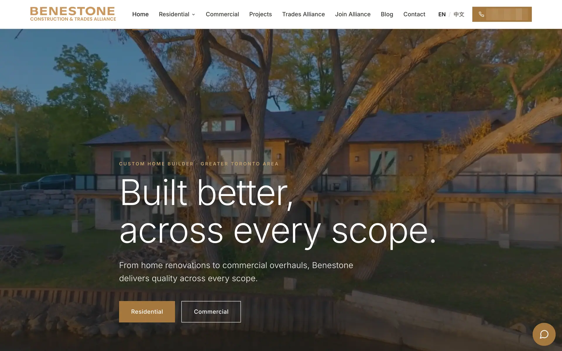
Benestone is a custom home builder in the Greater Toronto Area that also takes on additions, renovations and commercial work, for clients who read English and clients who read Chinese. Its old site was built on Wix. We rebuilt it as one site in two languages, page for page: four lines of work, a portfolio filed the same four ways, a page for every home — and a site assistant visitors can ask at any point, which answers only from what the site itself says.
- English–Chinese website (Astro on Cloudflare)
- Portfolio with a page for every home
- Content & media migration from Wix
- Site assistant (Workers AI)
01Structure
Filed the way
the work is done.
Benestone works in four lines: custom rebuilds, additions, renovations and interiors, and commercial. The navigation follows those four, and so does the portfolio — someone planning an addition sees the additions Benestone has built. The old site’s content and photographs were moved off Wix and re-filed into the new structure.
02Project pages
Every home
gets its own page.
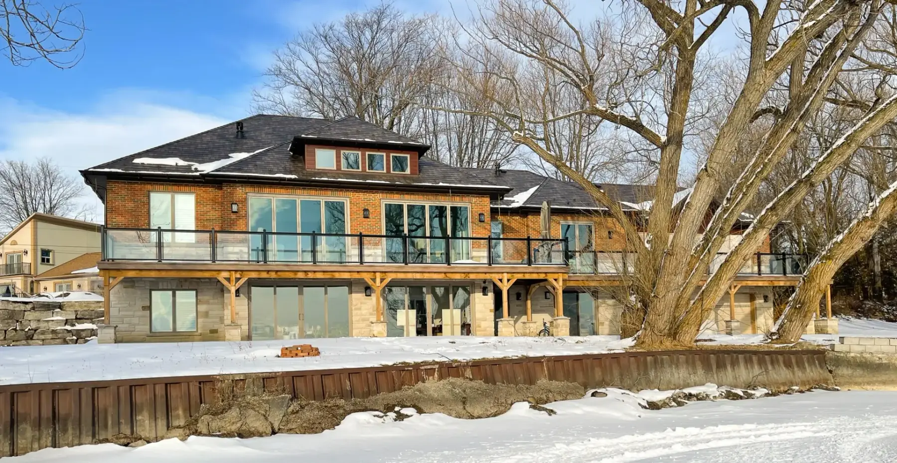
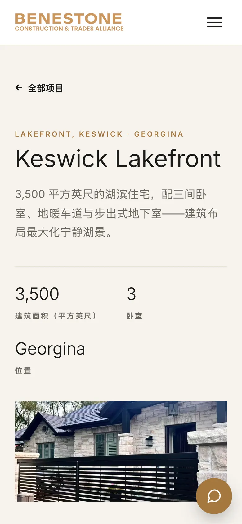
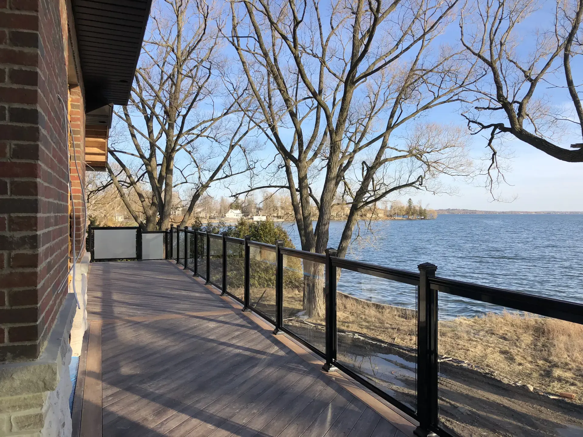
One page per project: the area, the floor space, the bedrooms, a sentence on the house — then the photographs take over. Little layout, light headings, so stone, timber and daylight do the talking. On a phone the order is the same, made for scrolling with one thumb.
03Two languages
English and Chinese,
page for page.
Every English page has a Chinese counterpart one /zh away, switched from the top corner. Both languages share one layout and one set of photographs, so a homeowner who reads Chinese never has to fall back to the English pages.
04Site assistant
Ask the site,
and it answers.
The assistant in the corner runs on Cloudflare Workers AI and answers only from the site’s own content: which areas Benestone serves, whether it builds custom homes, whether it takes commercial work, how to get a quote. For quotes, and anything it can’t answer, it points the visitor to the phone. On the Chinese pages it greets and suggests questions in Chinese.
- What areas do you serve?
- Do you build custom homes?
- Do you take on commercial projects?
- How do I get a quote?
05The homes on the site
All project photography supplied by Benestone.